interactive experiences,
as eloquent as
the eiffel tower.
Author: admin
the rambler
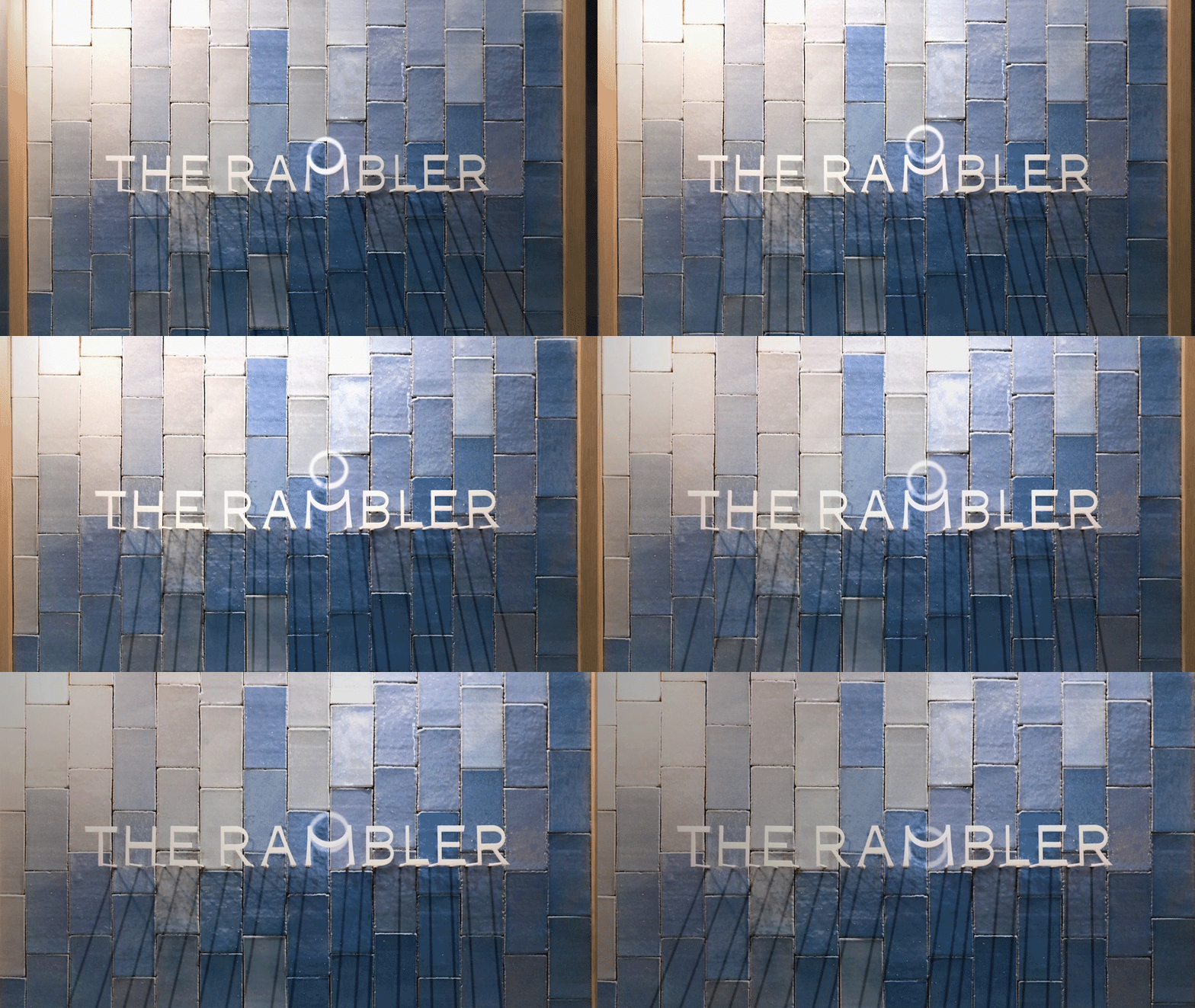
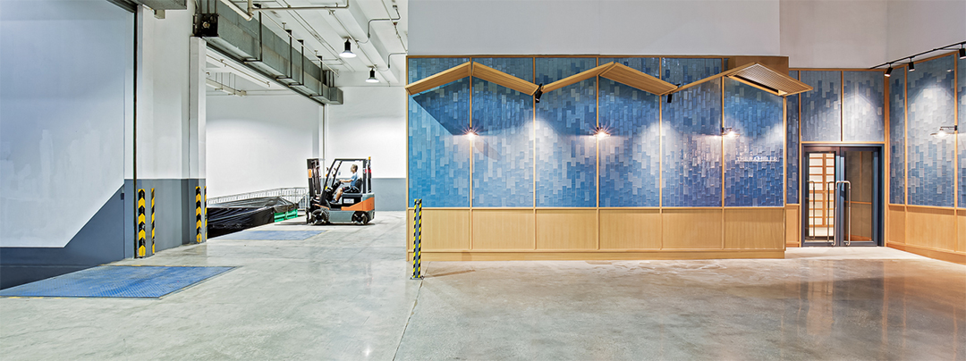
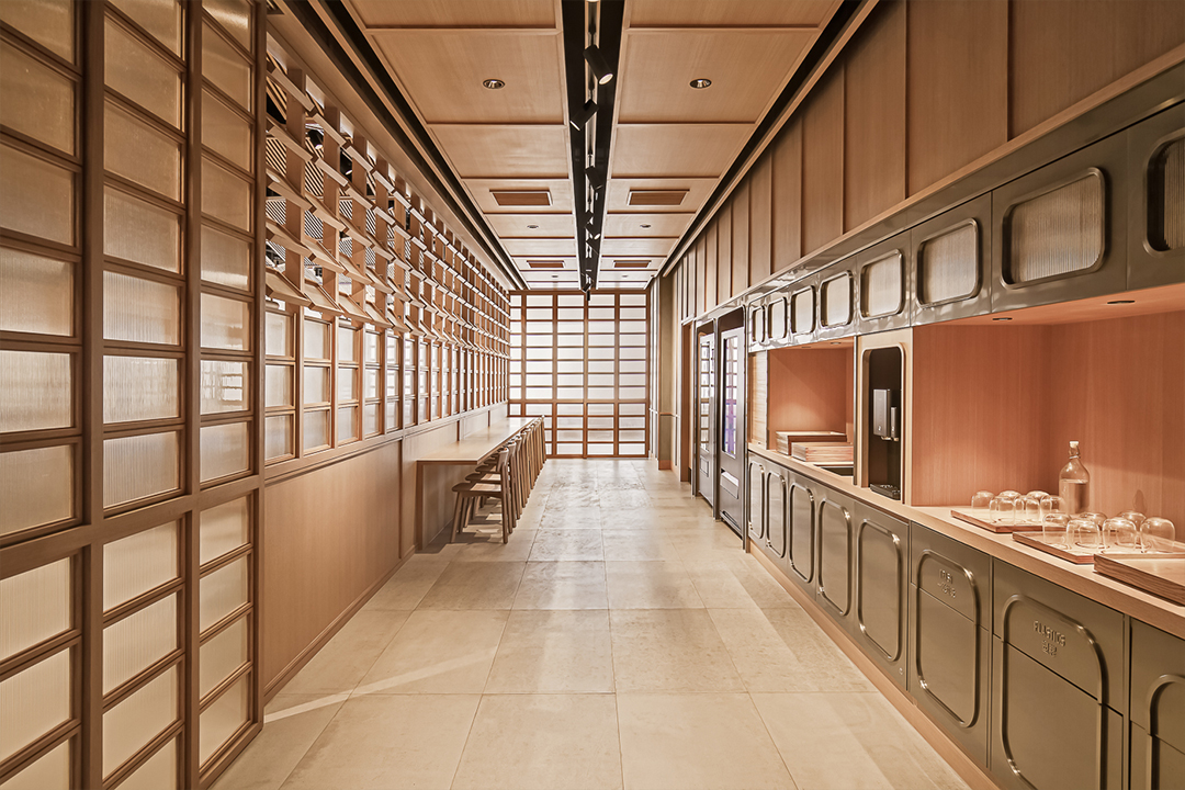
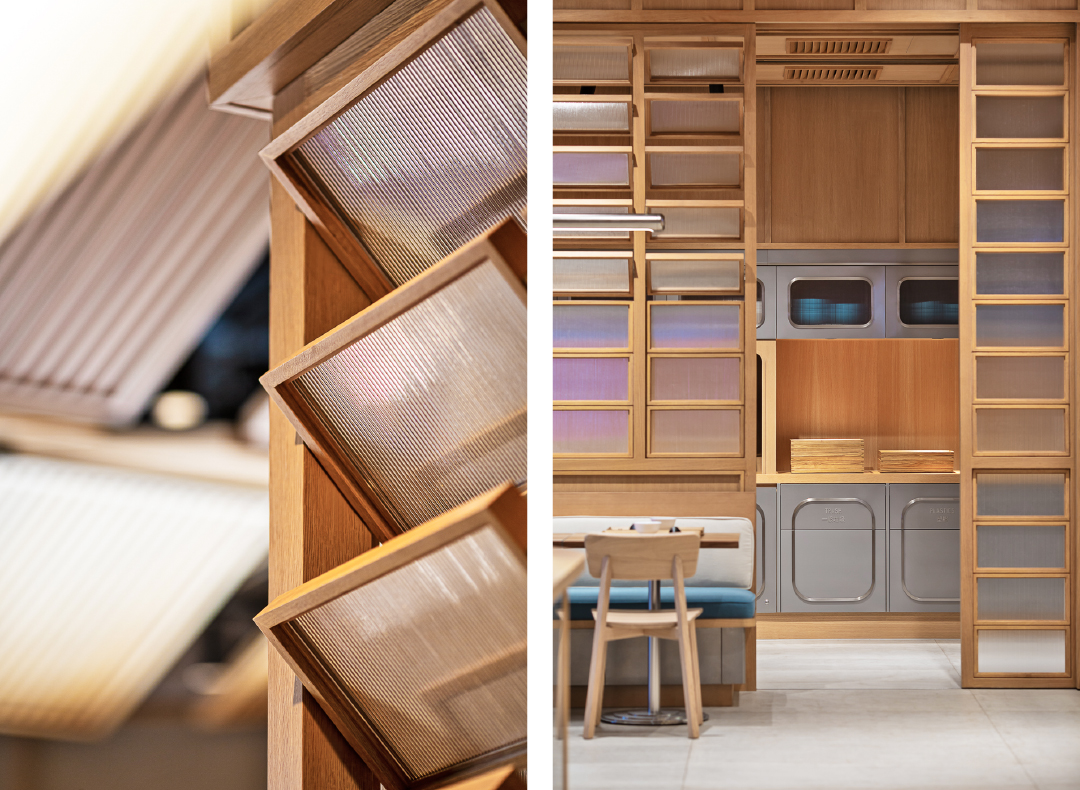
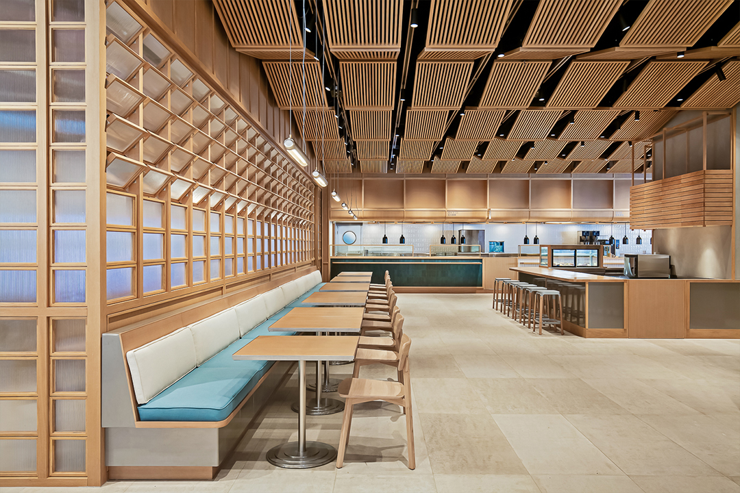
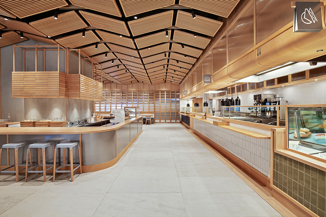
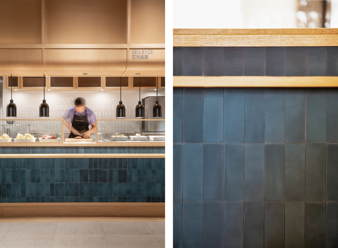
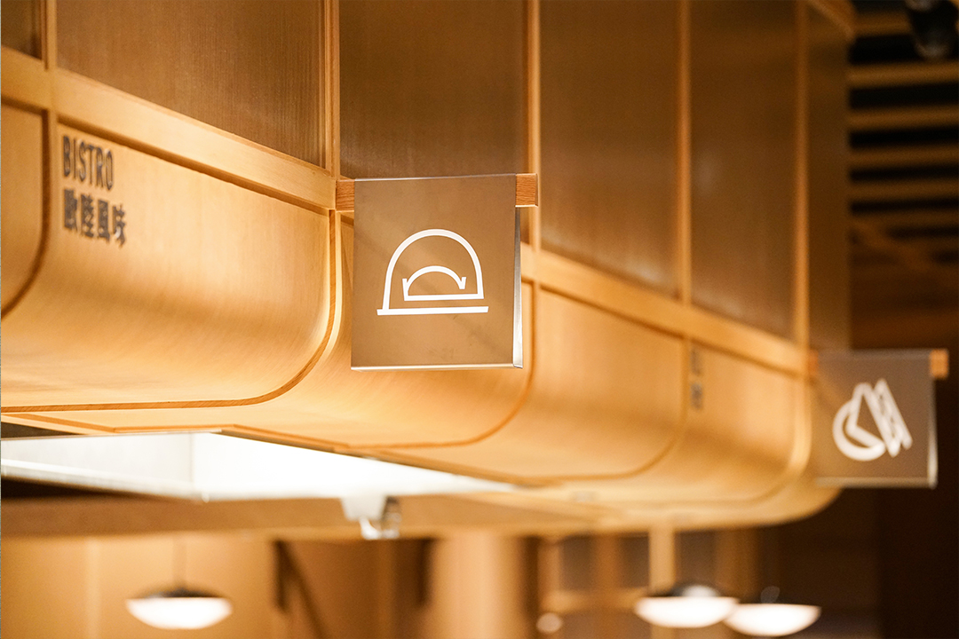
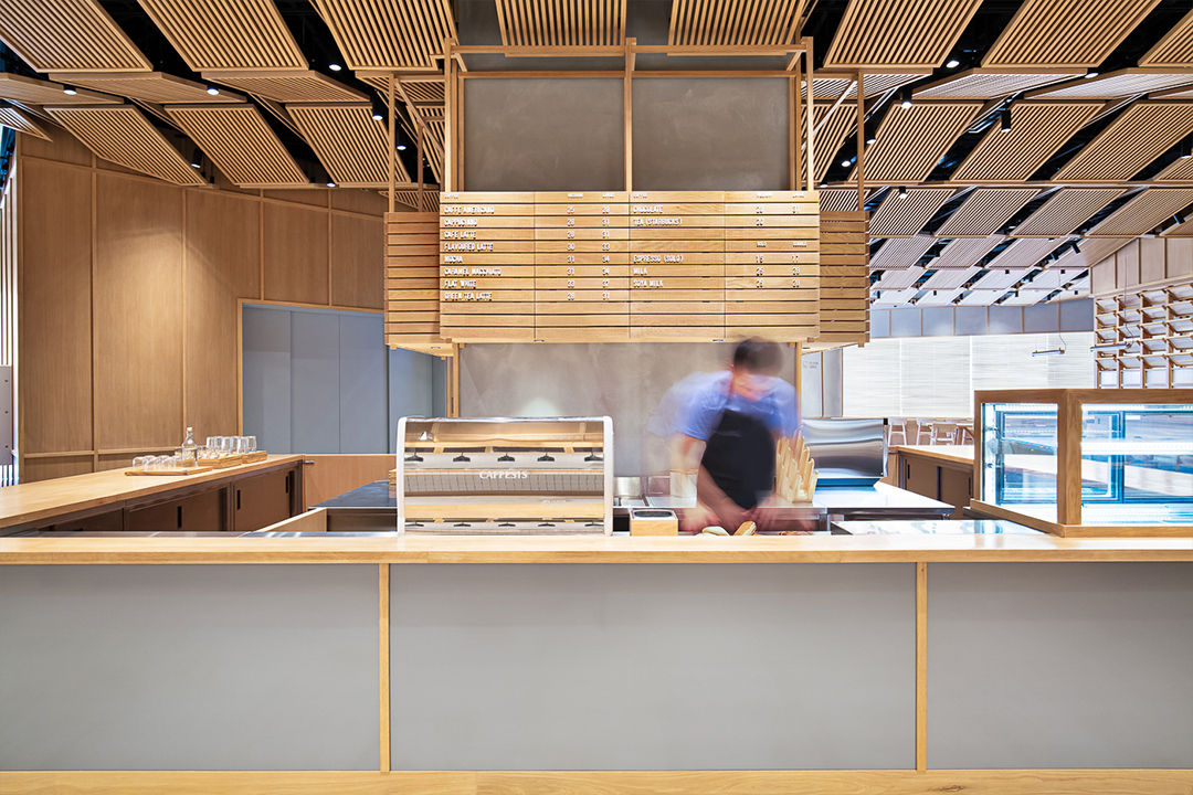
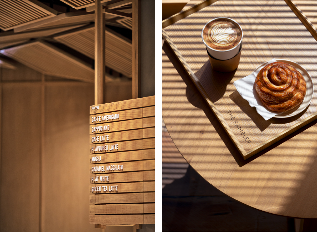
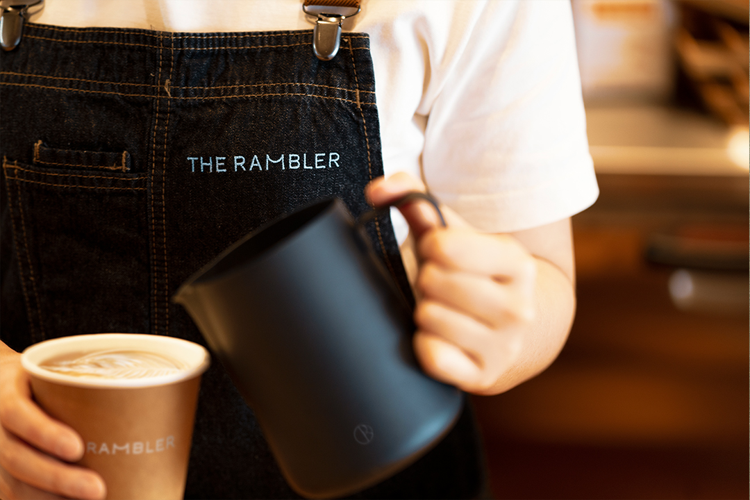
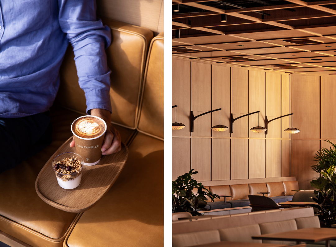
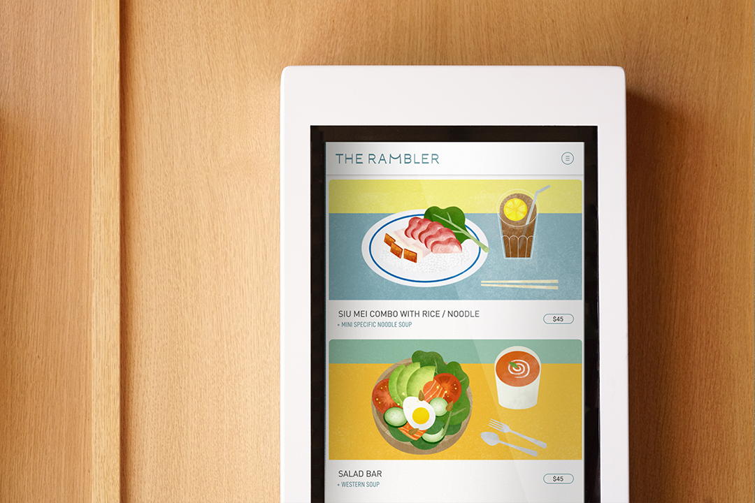
named after goodman interlink’s unique and strategic location in the rambler channel, the rambler is a new take on café design, offering a refreshing space for customers, their workers and their guests to meet, socialise and recharge.
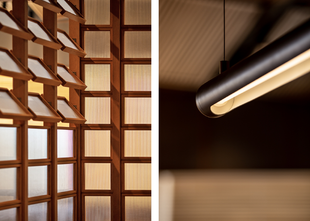
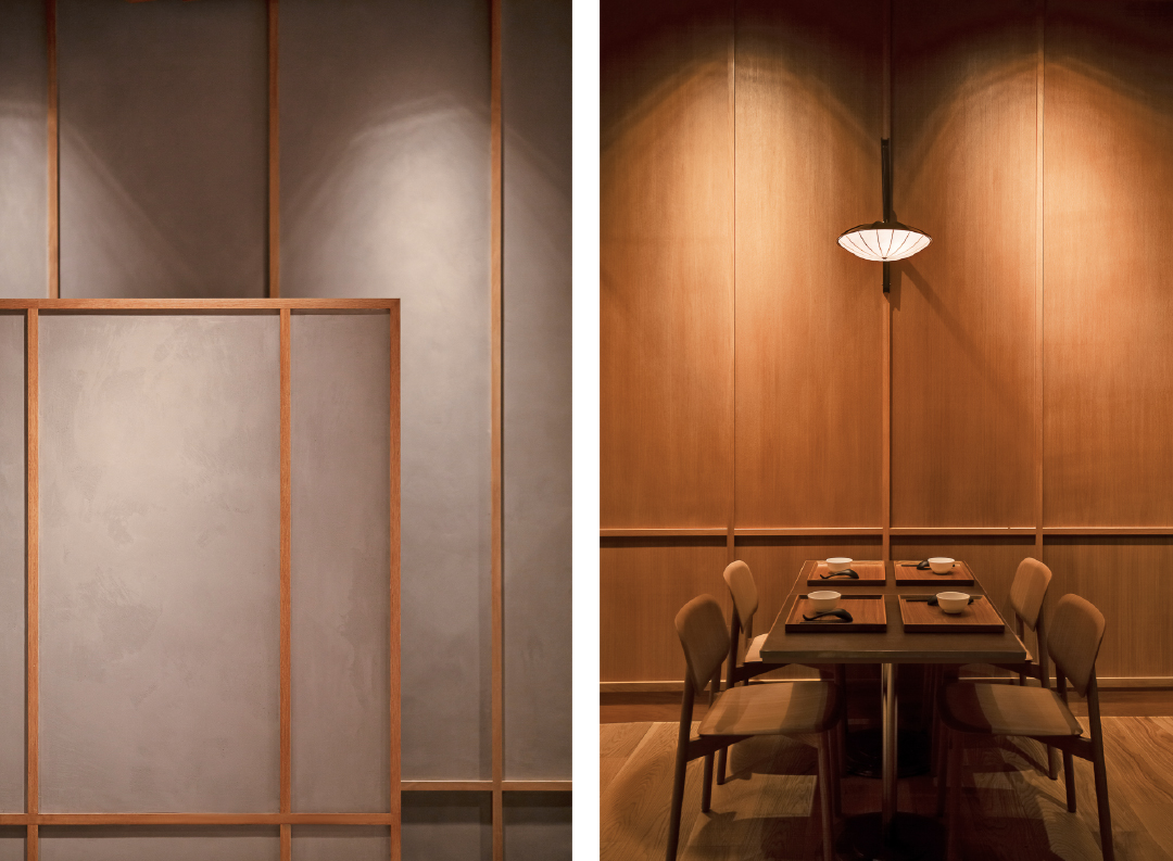
the selection of natural elements is a stark contrast to the industrial building the café resides in. a warm palette of materials interspersed throughout with timber wrapped around to nourish the soul and breathe life into the space – echoing the feel of a haven across day and night. the use of blue hues through a gradient of hand-glazed ceramic tiles reflects the lull of water and washes over with an air of contemplation.
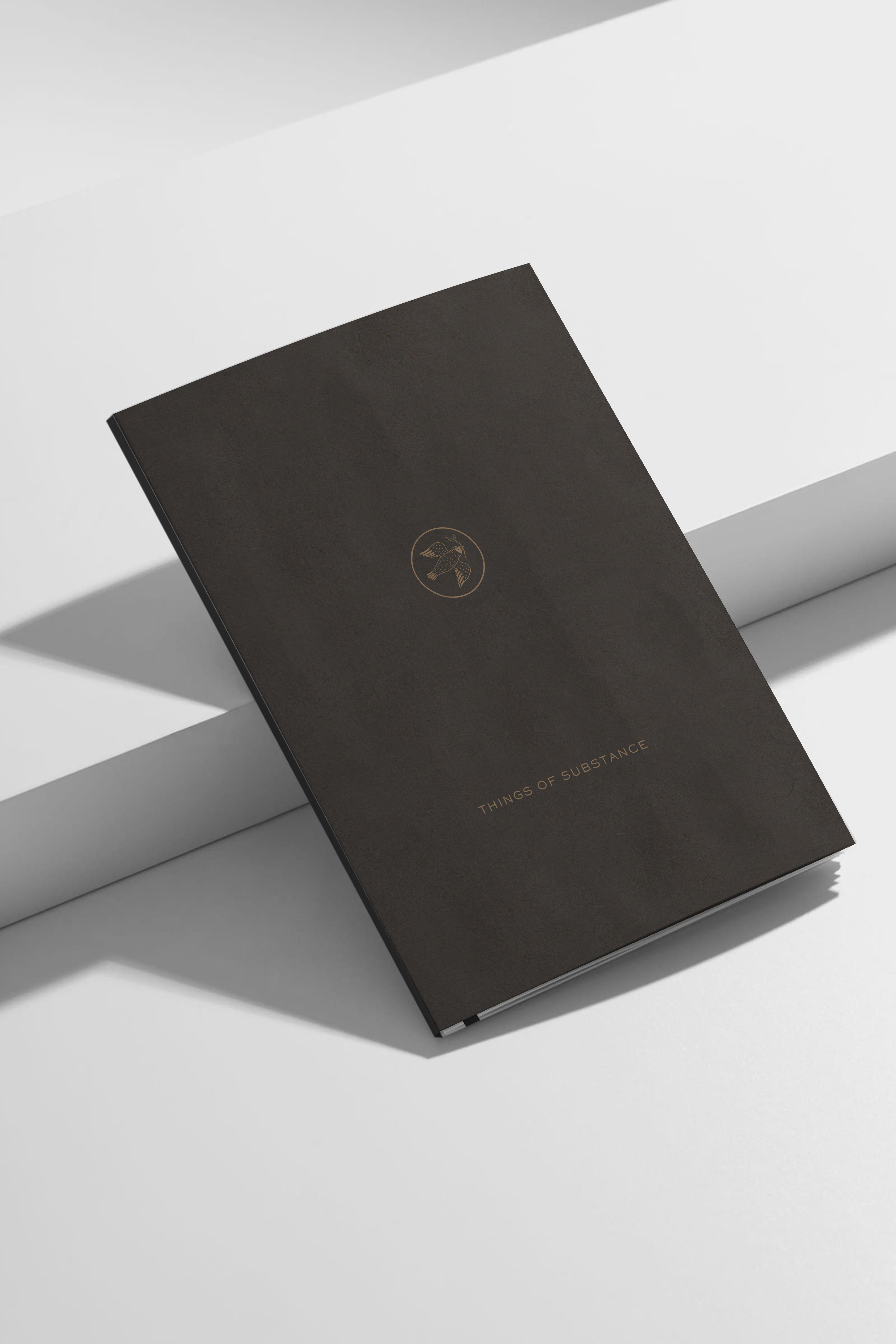
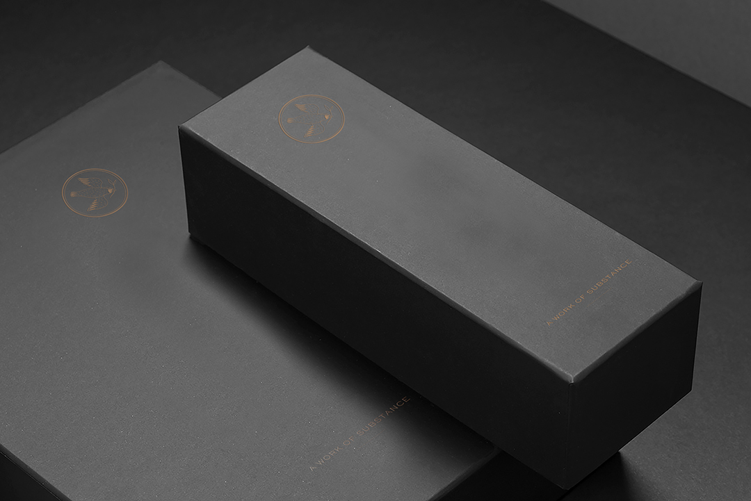
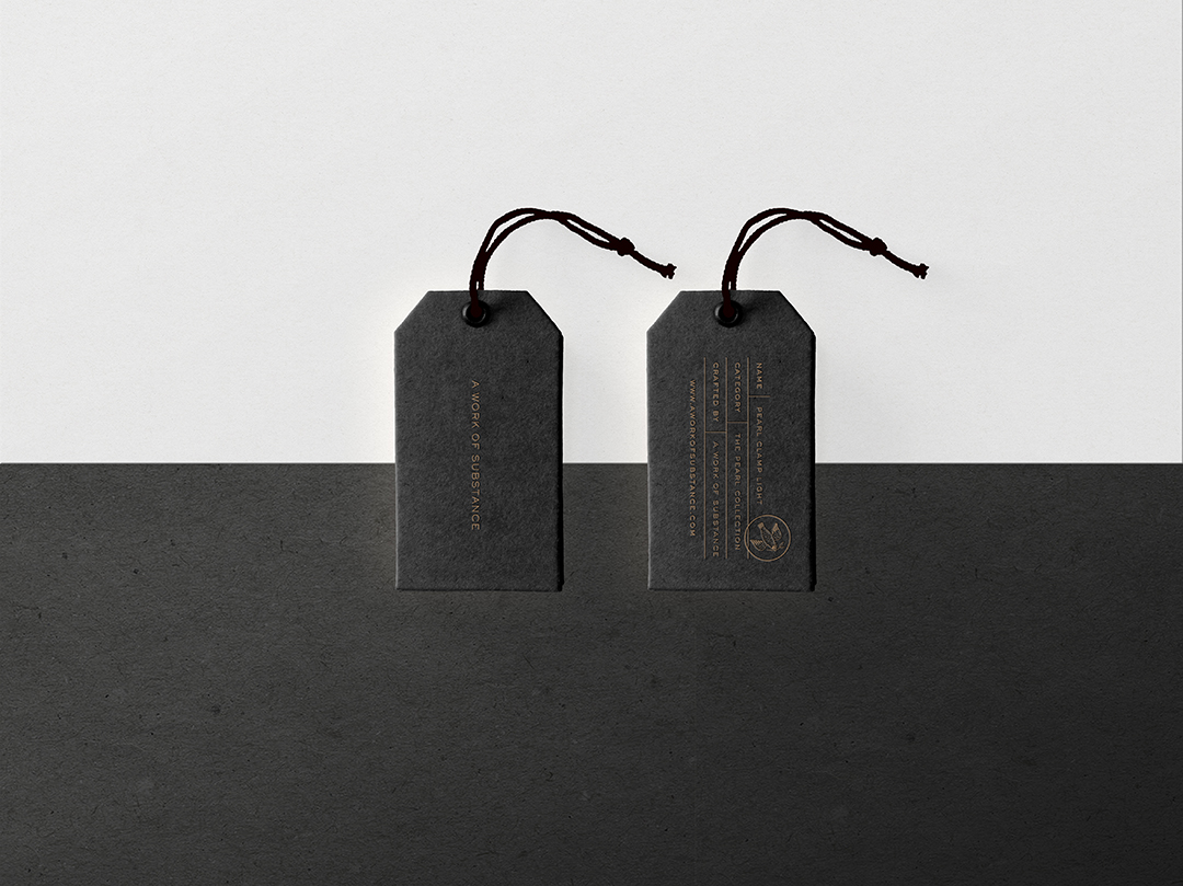
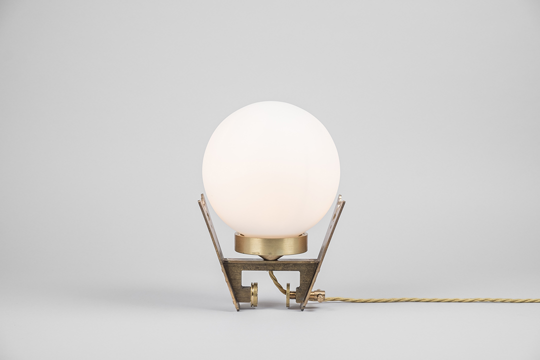
things of substance
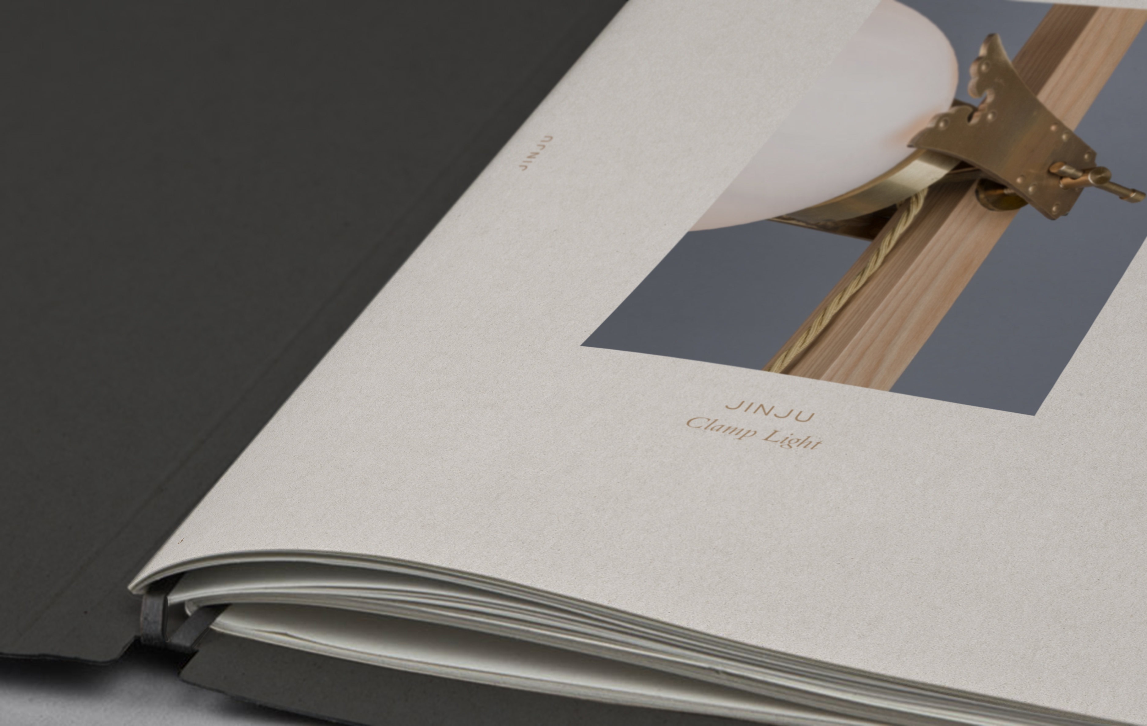
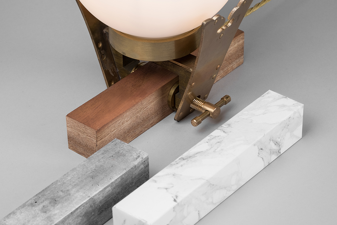
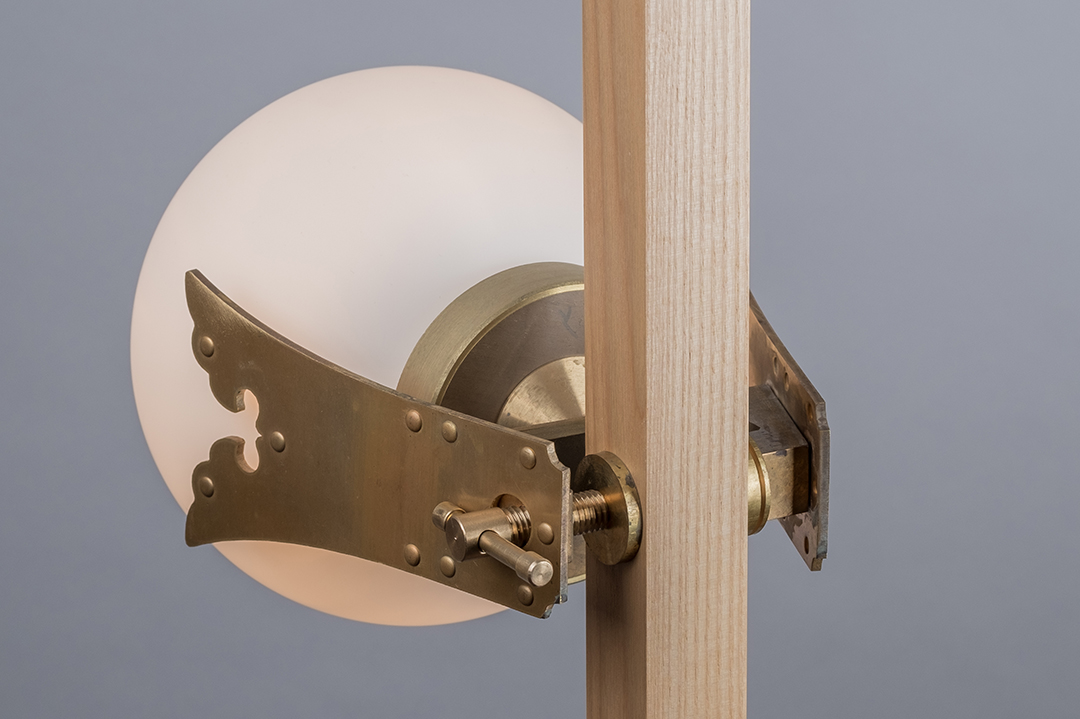
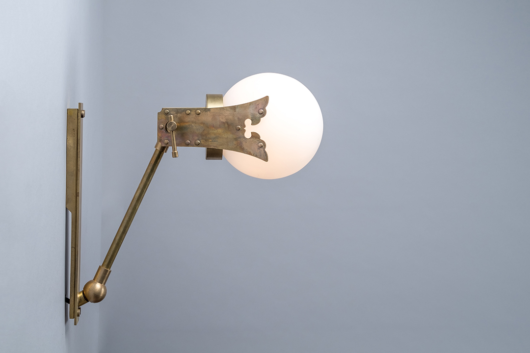
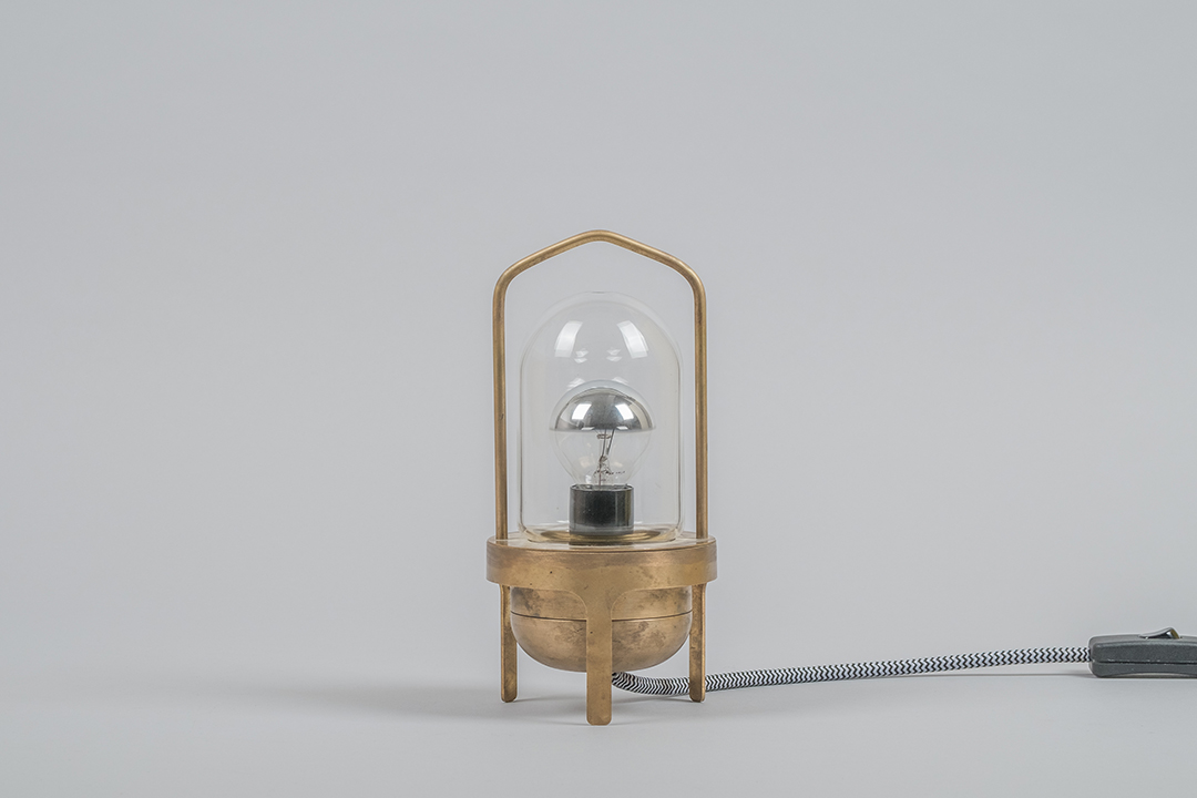
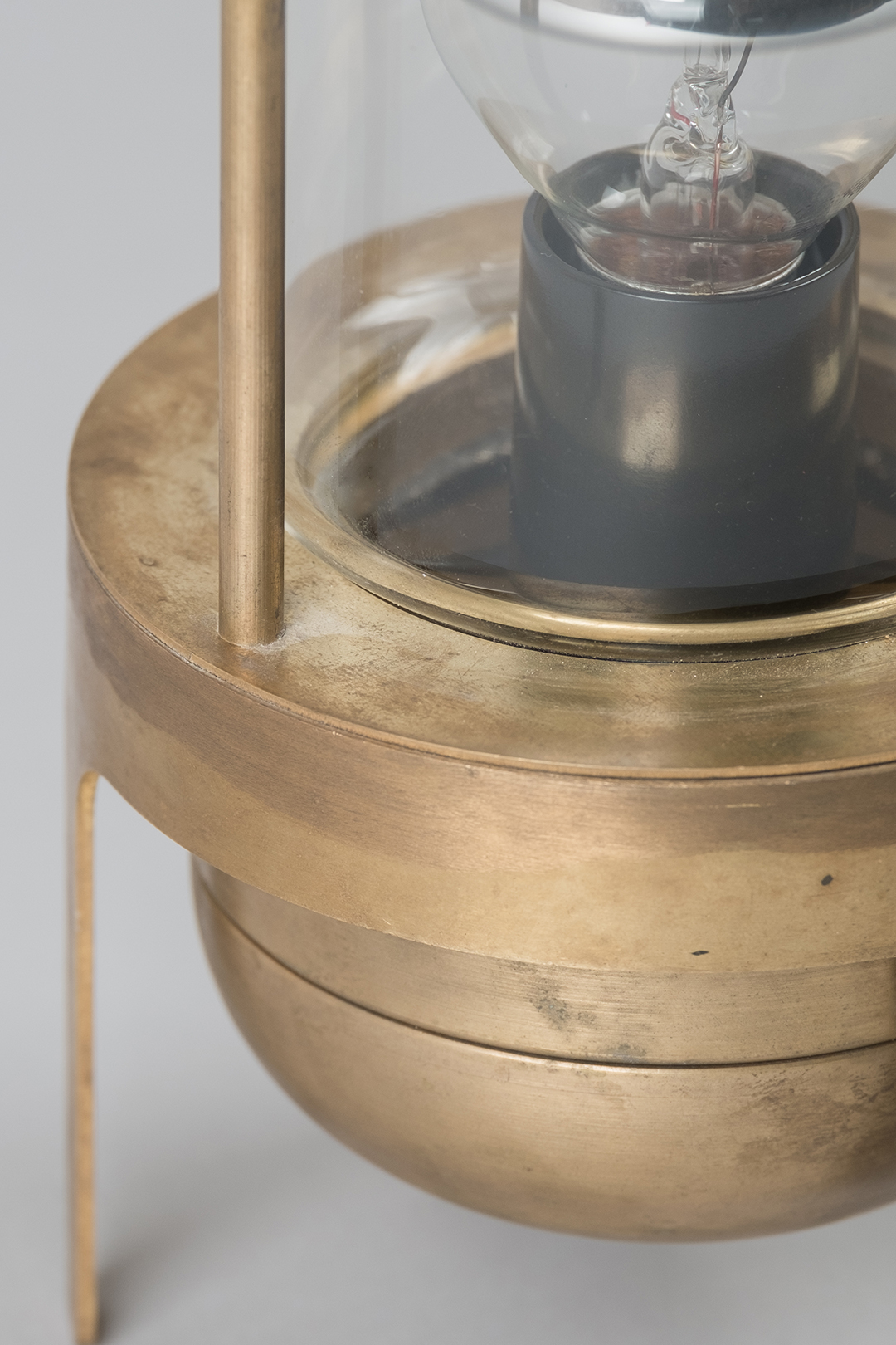
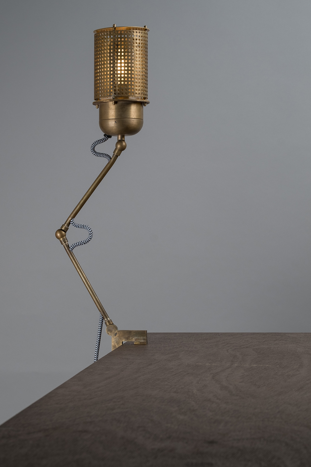
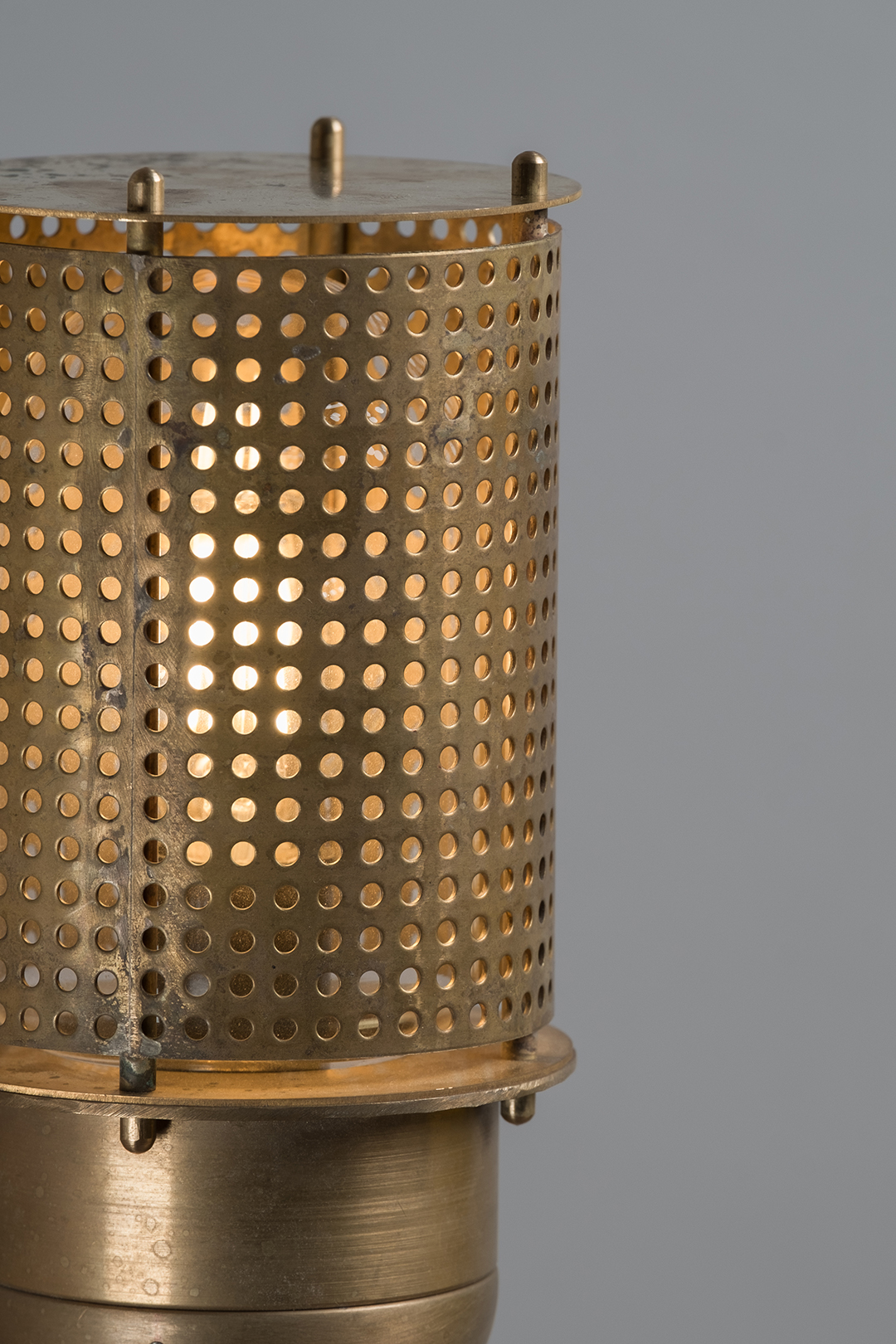
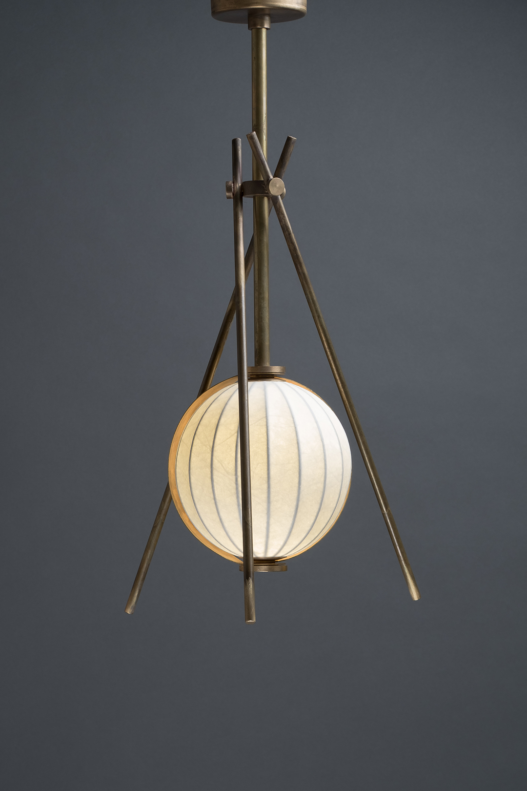
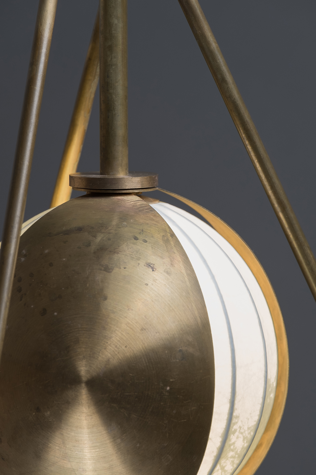
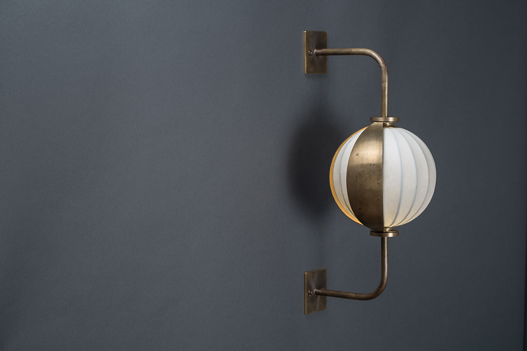
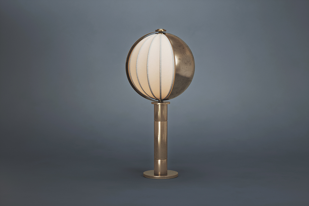
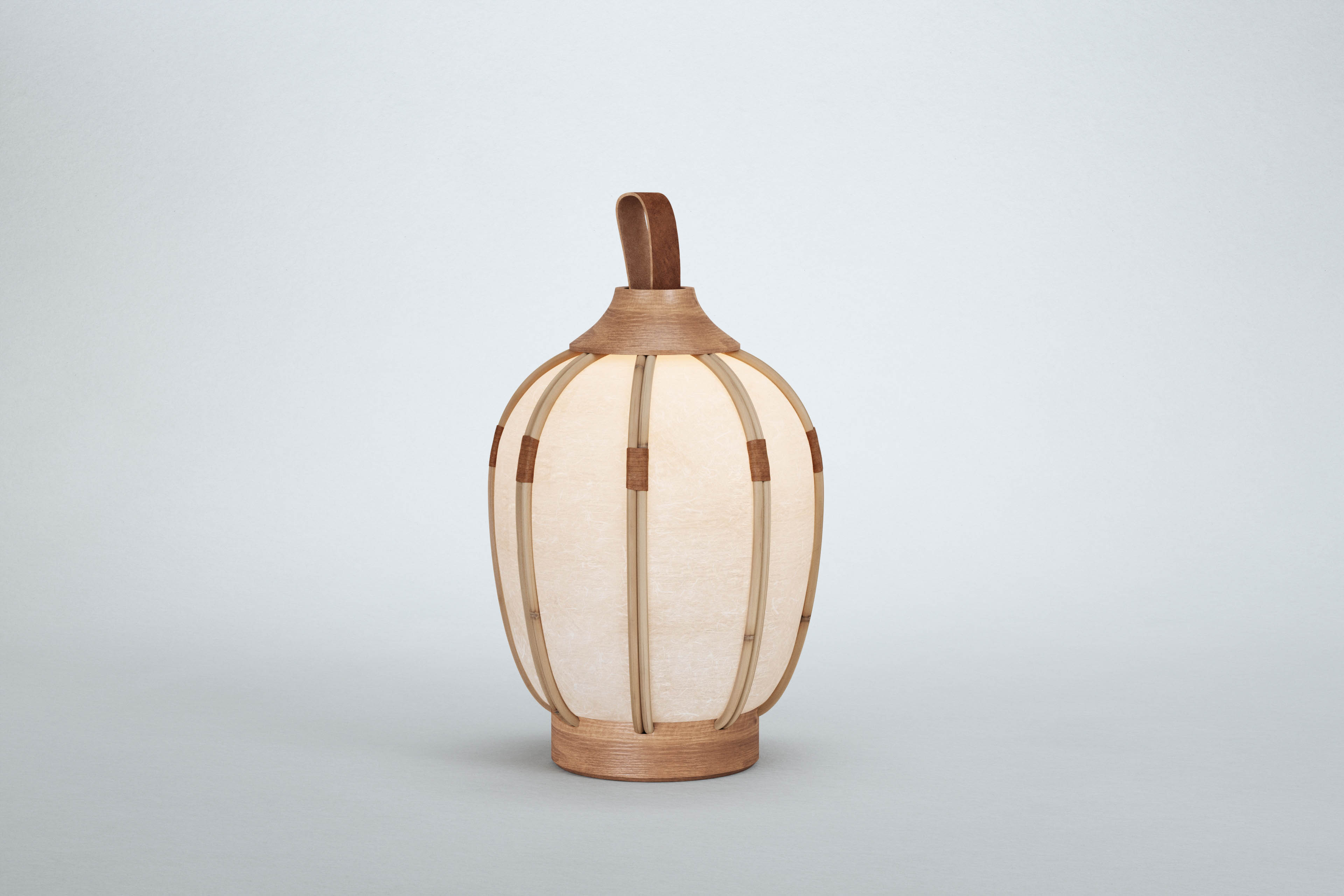
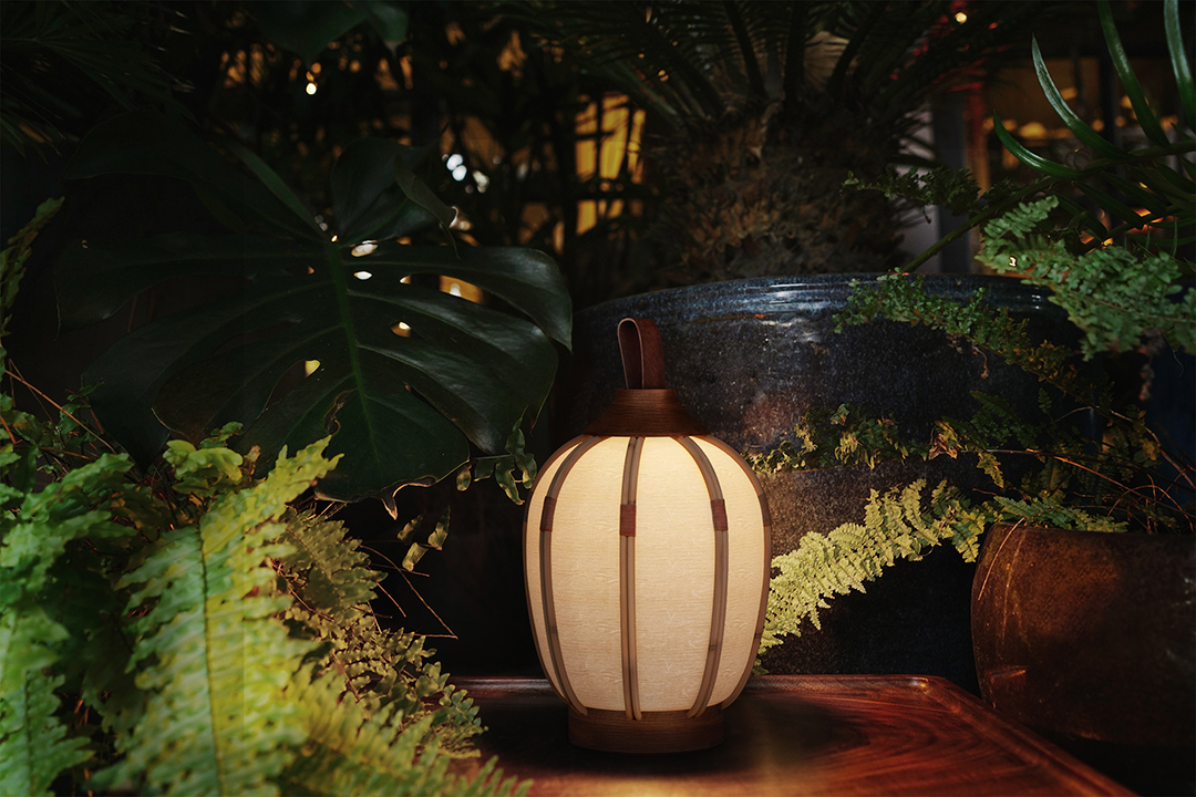
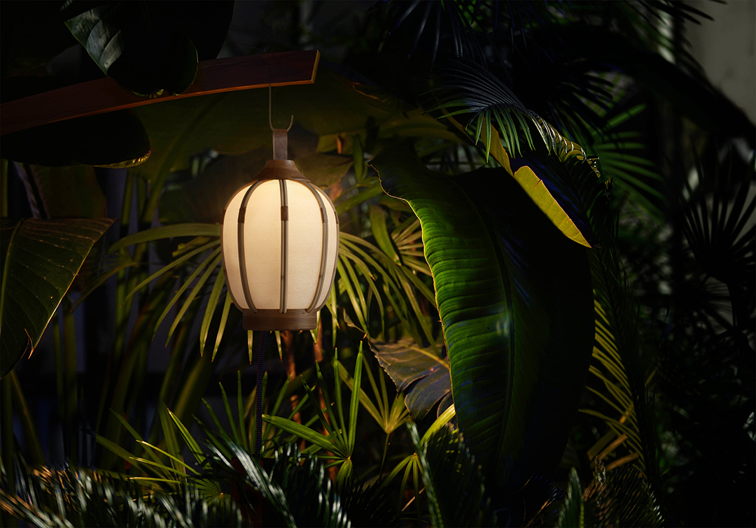
the significance of light throughout time remains unaltered. illuminating our perception of the world, light carries remarkable gravity in the rituals of our day. from cave-man campfires to light bulbs, light permits us to linger in a state of wonder from where we can freely realm in the world of our imaginations.
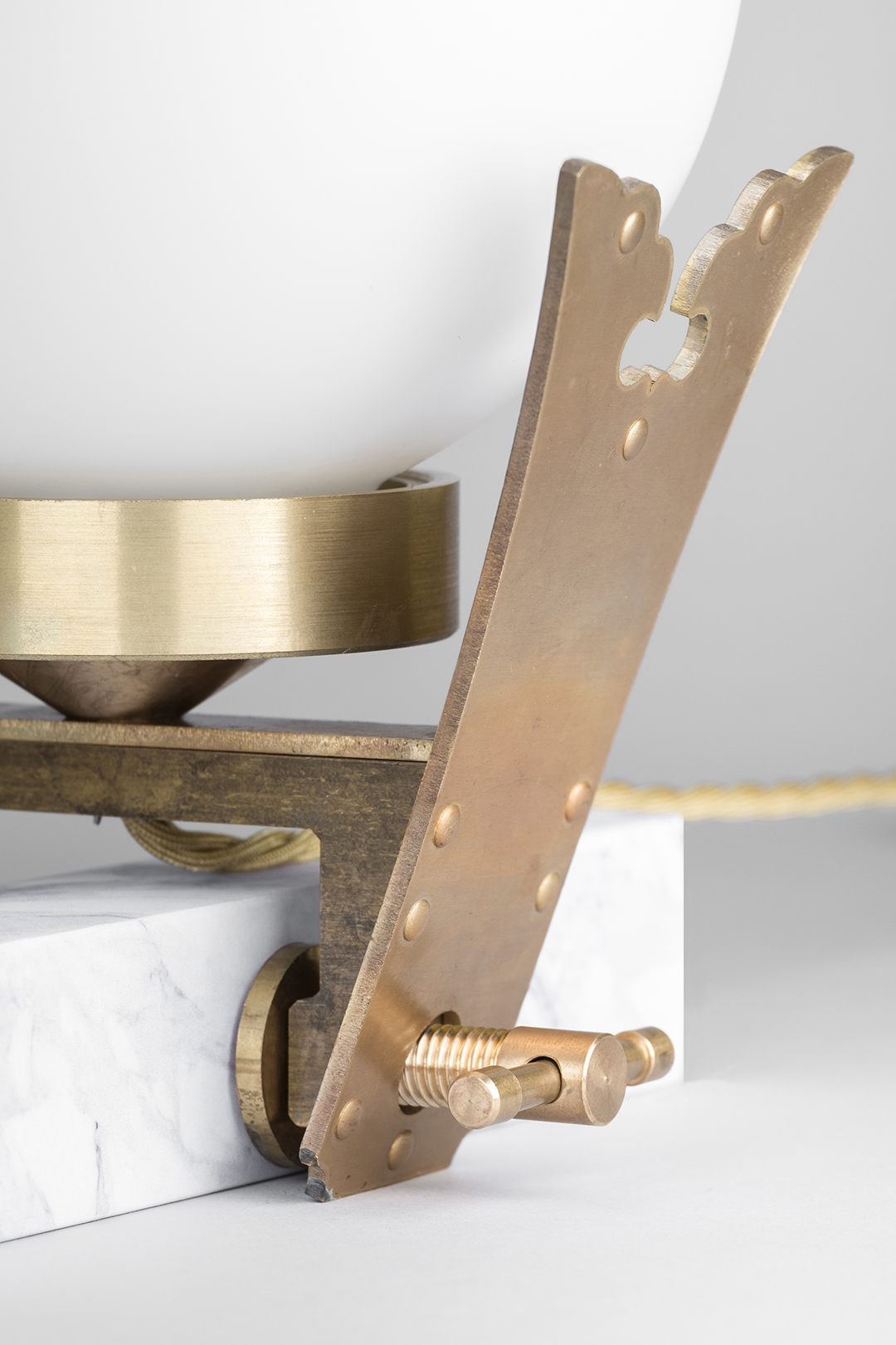
our lamps are metamorphoses of history in cultures transformed into products of art.
as a result every lamp carries with it the spirit by which it has been created, manifesting into things of substance.
singapore penthouse
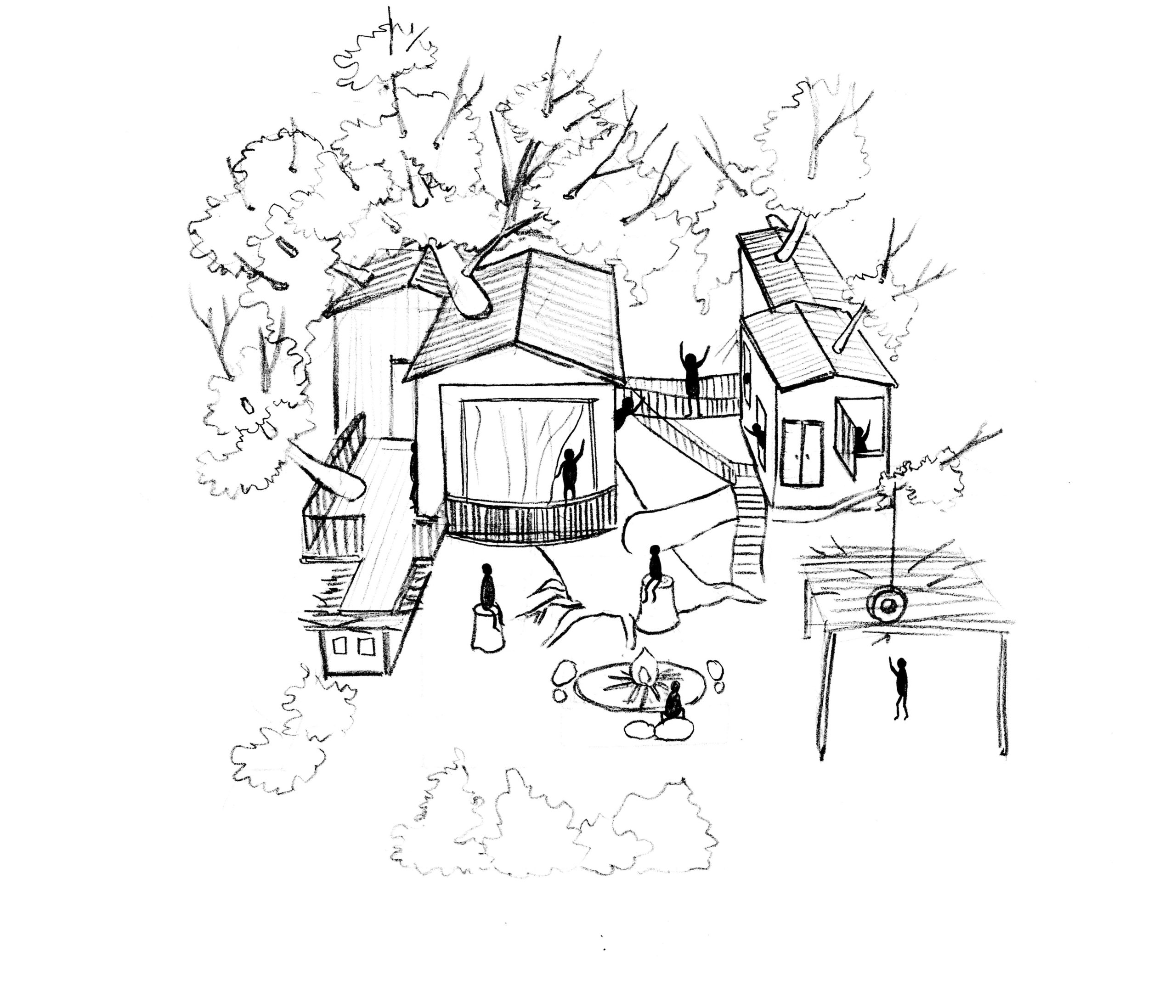
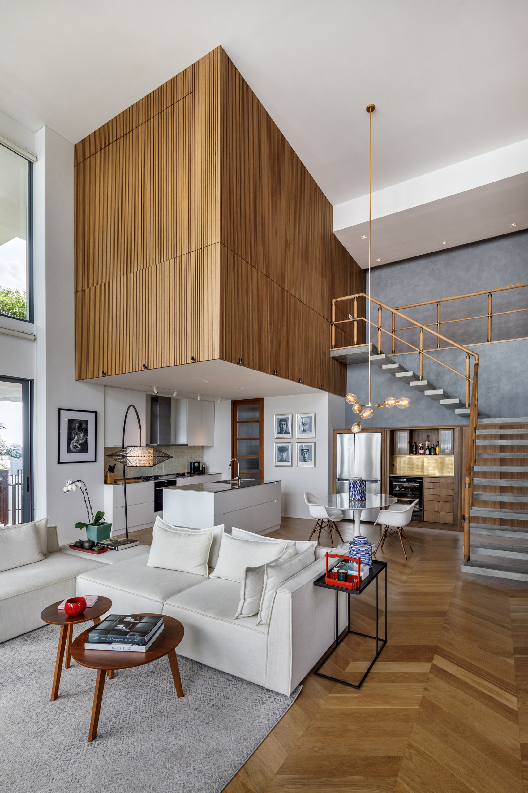
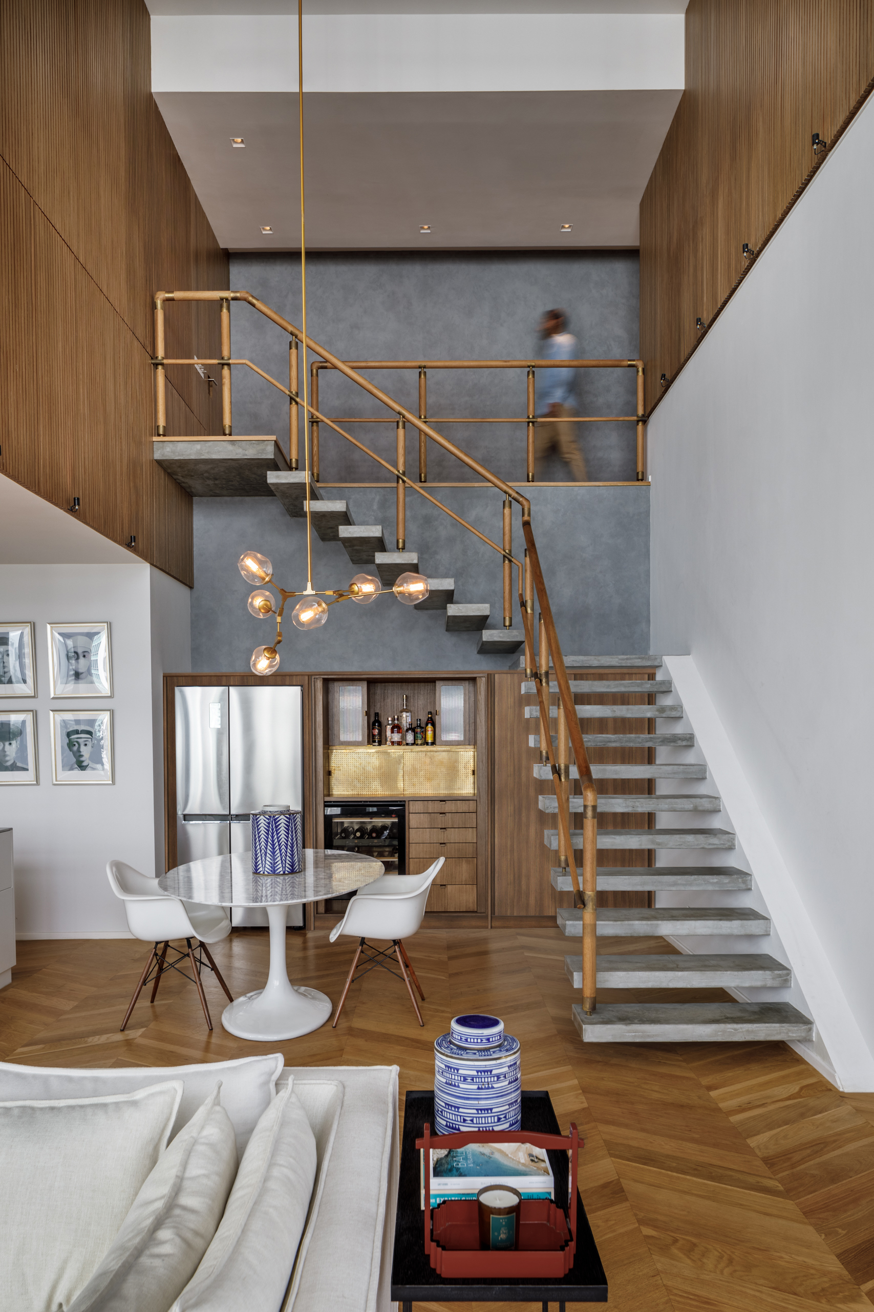
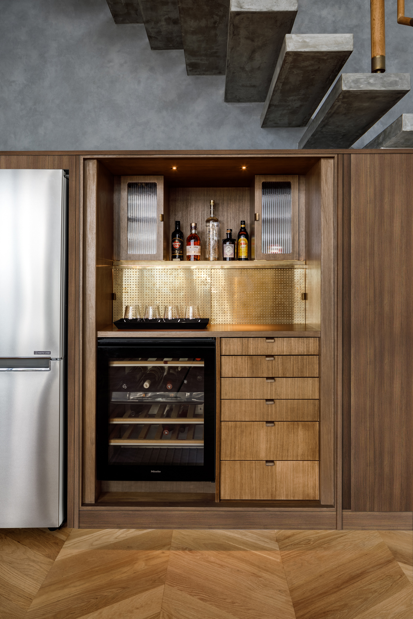
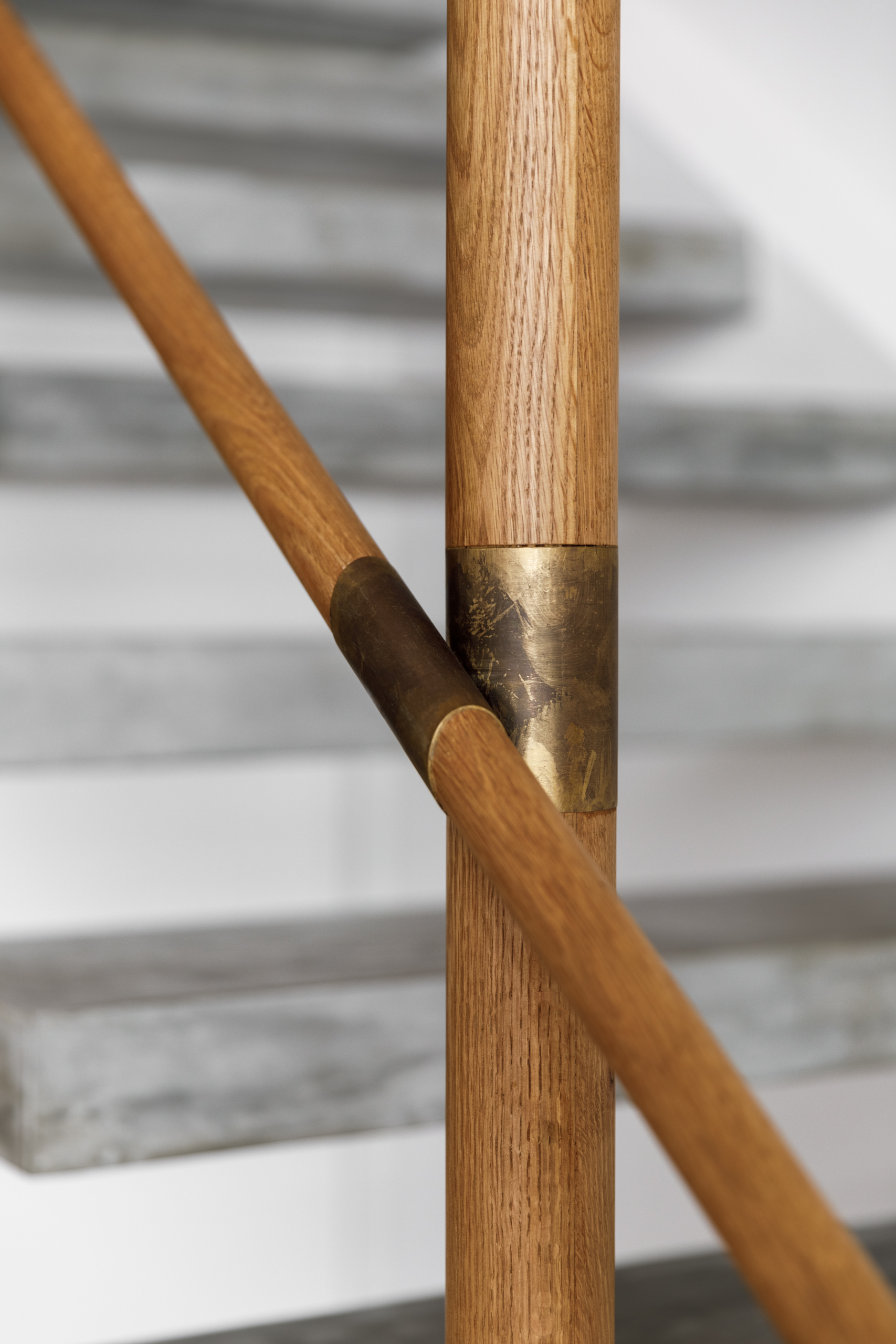
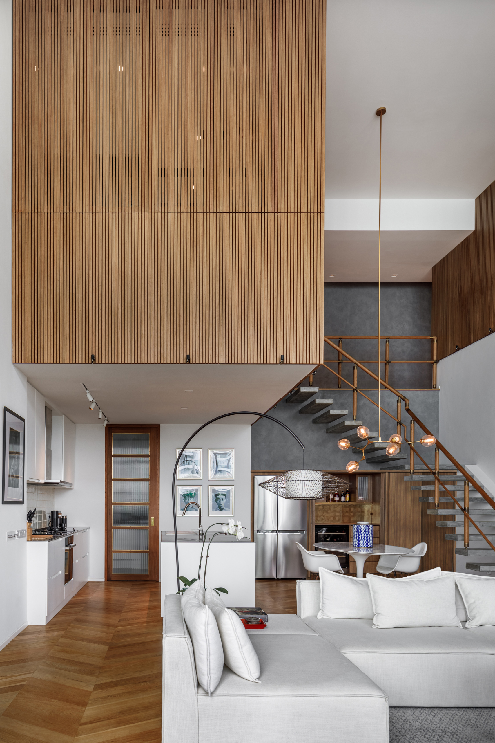
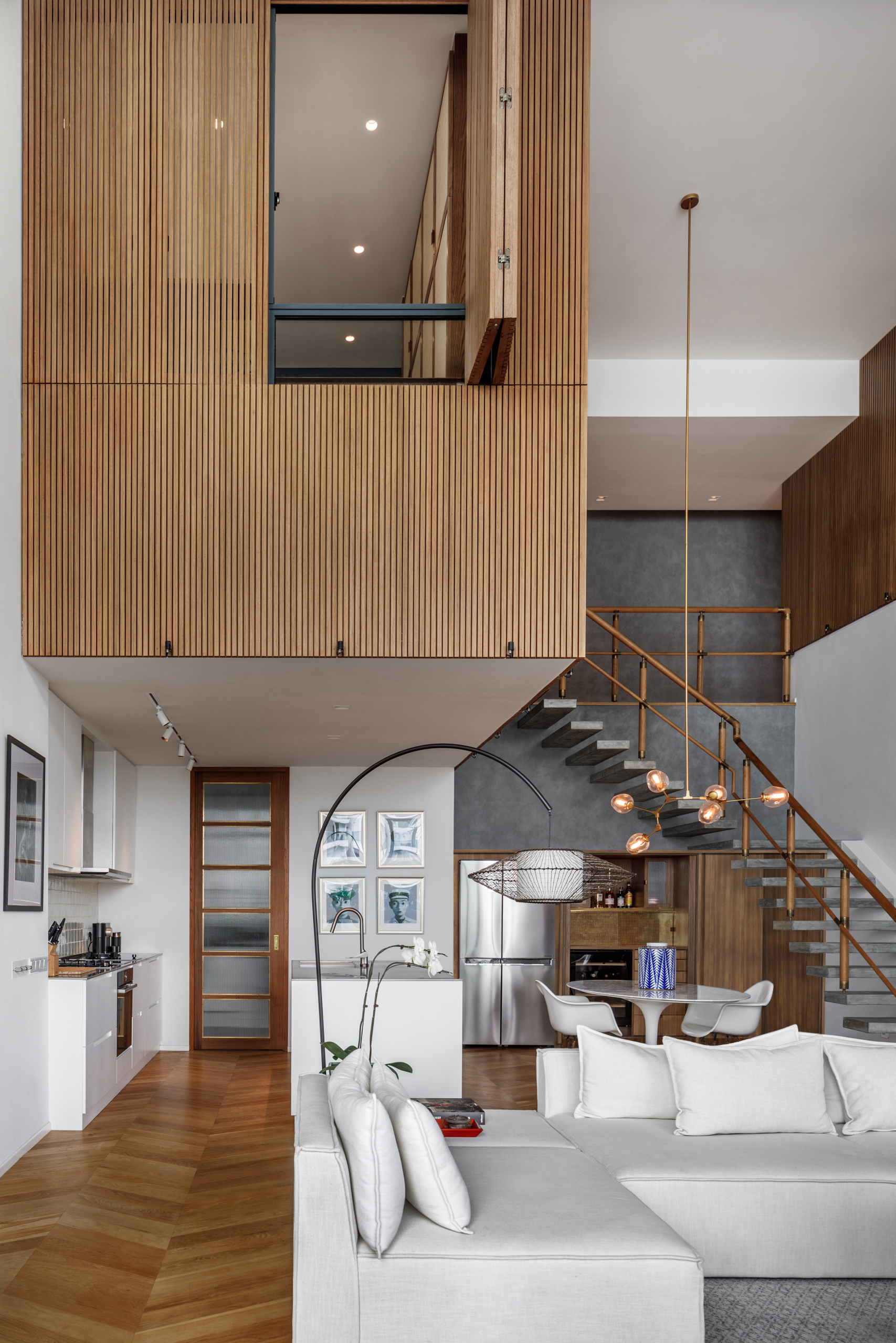
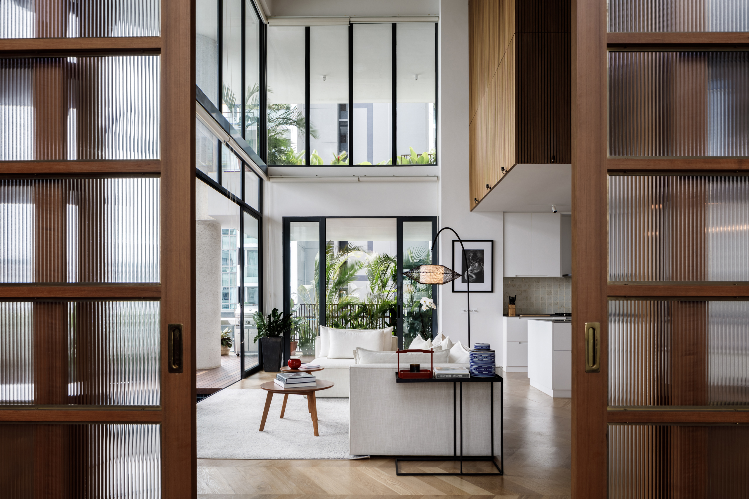
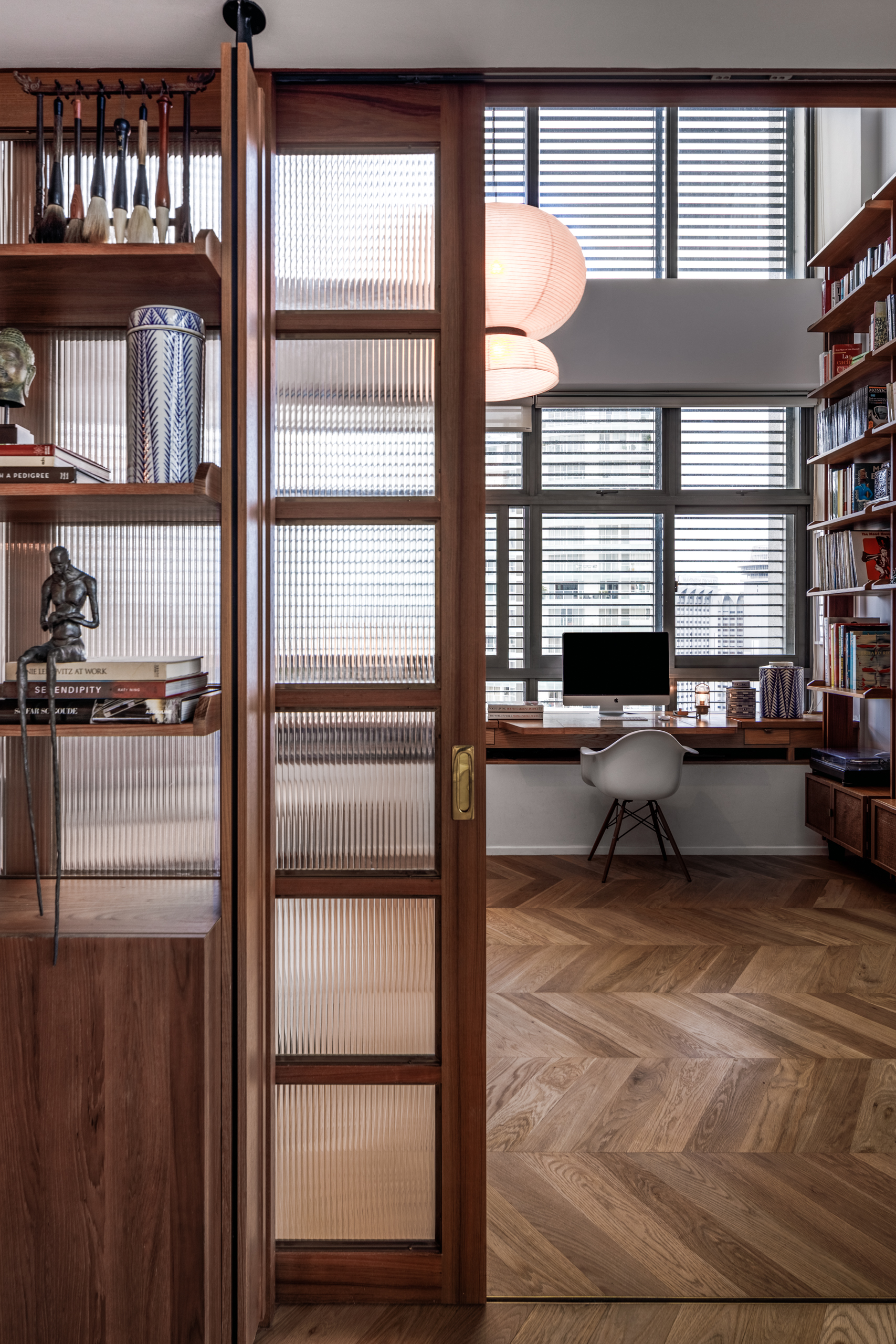
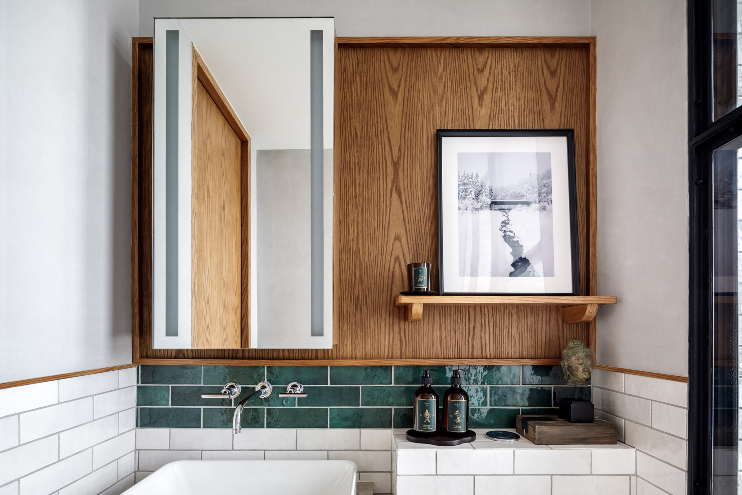
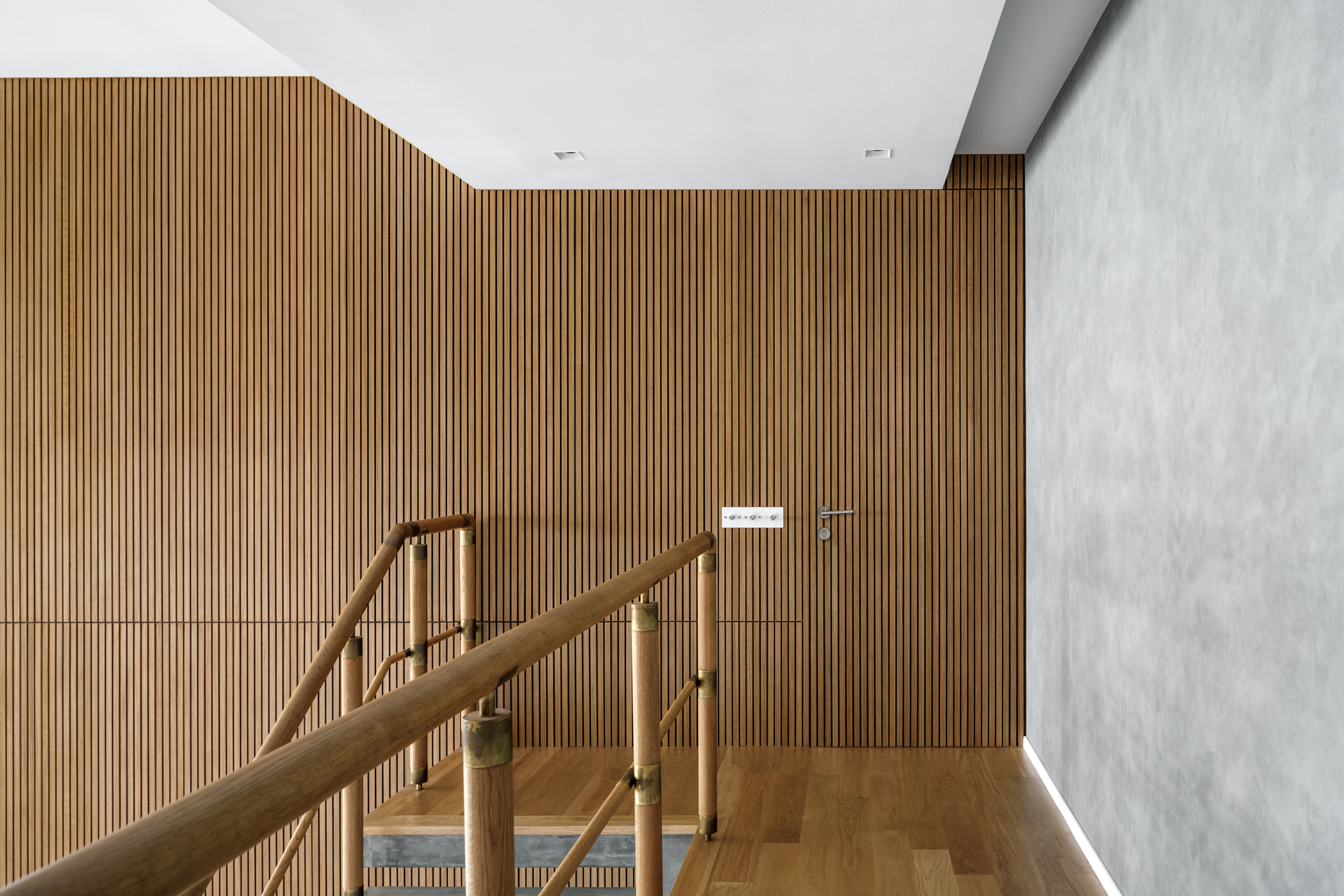
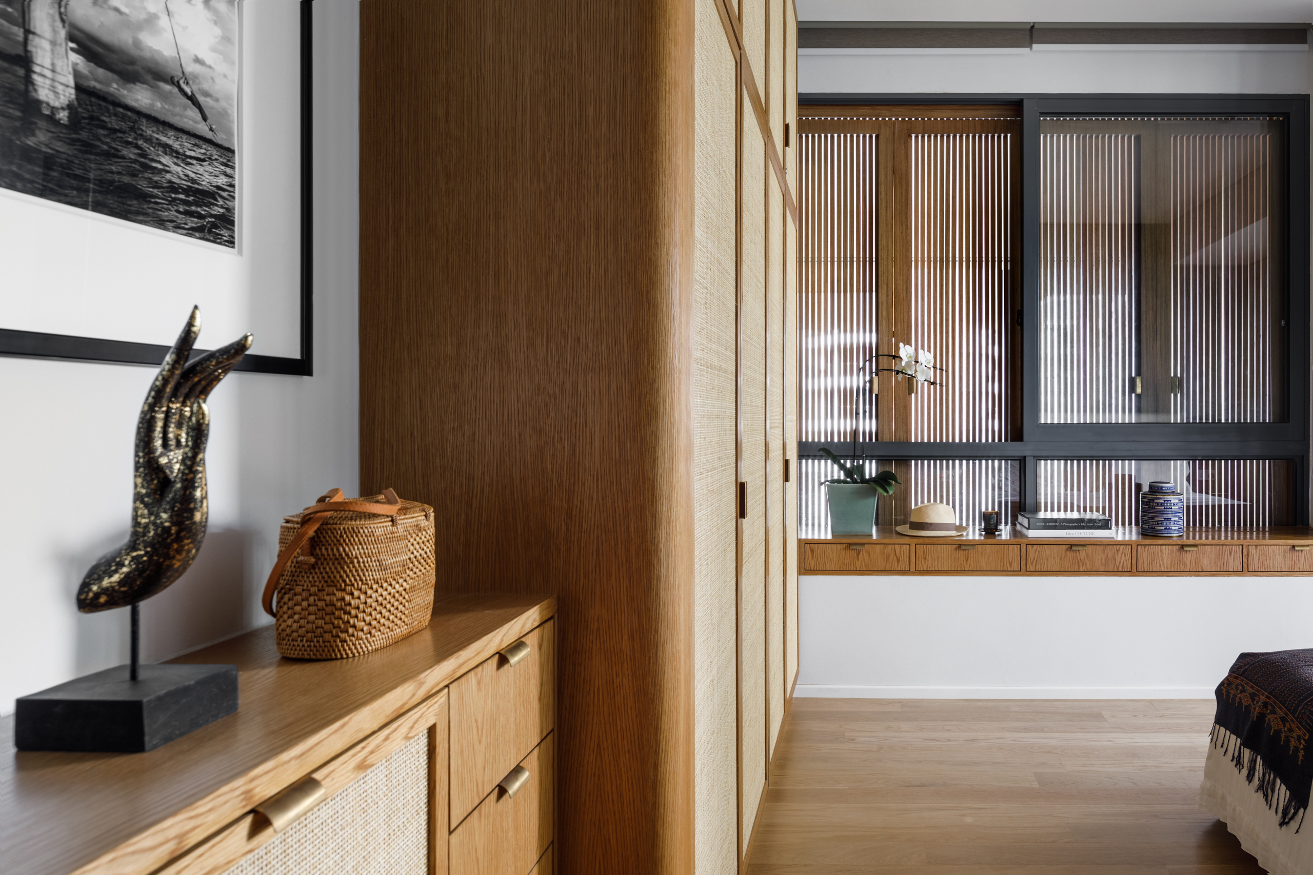
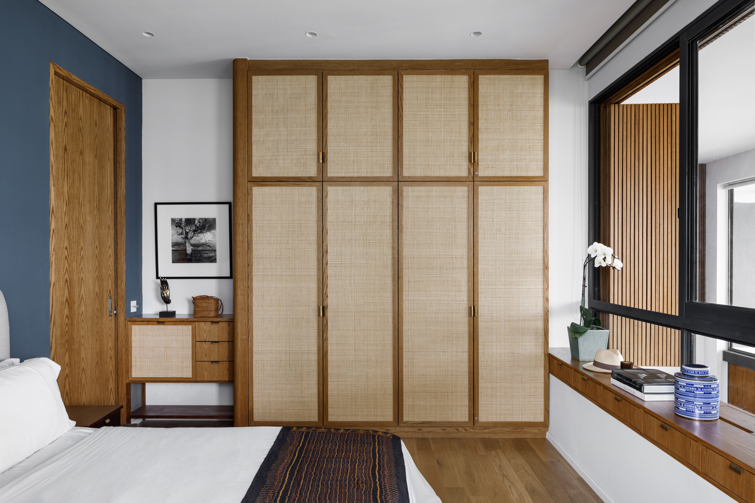
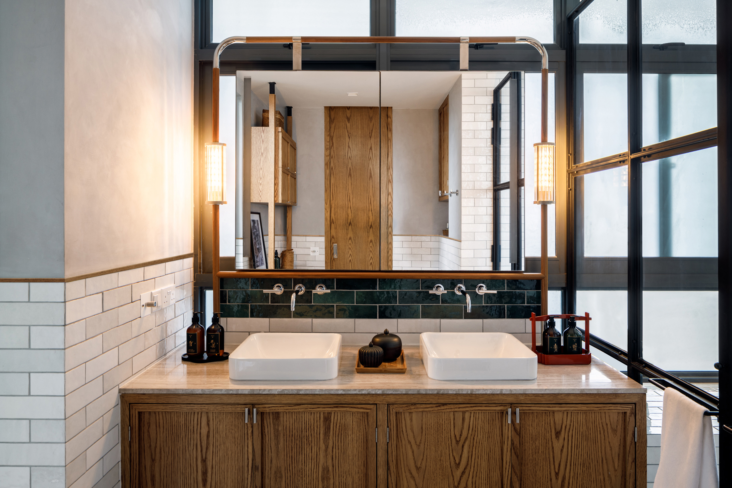
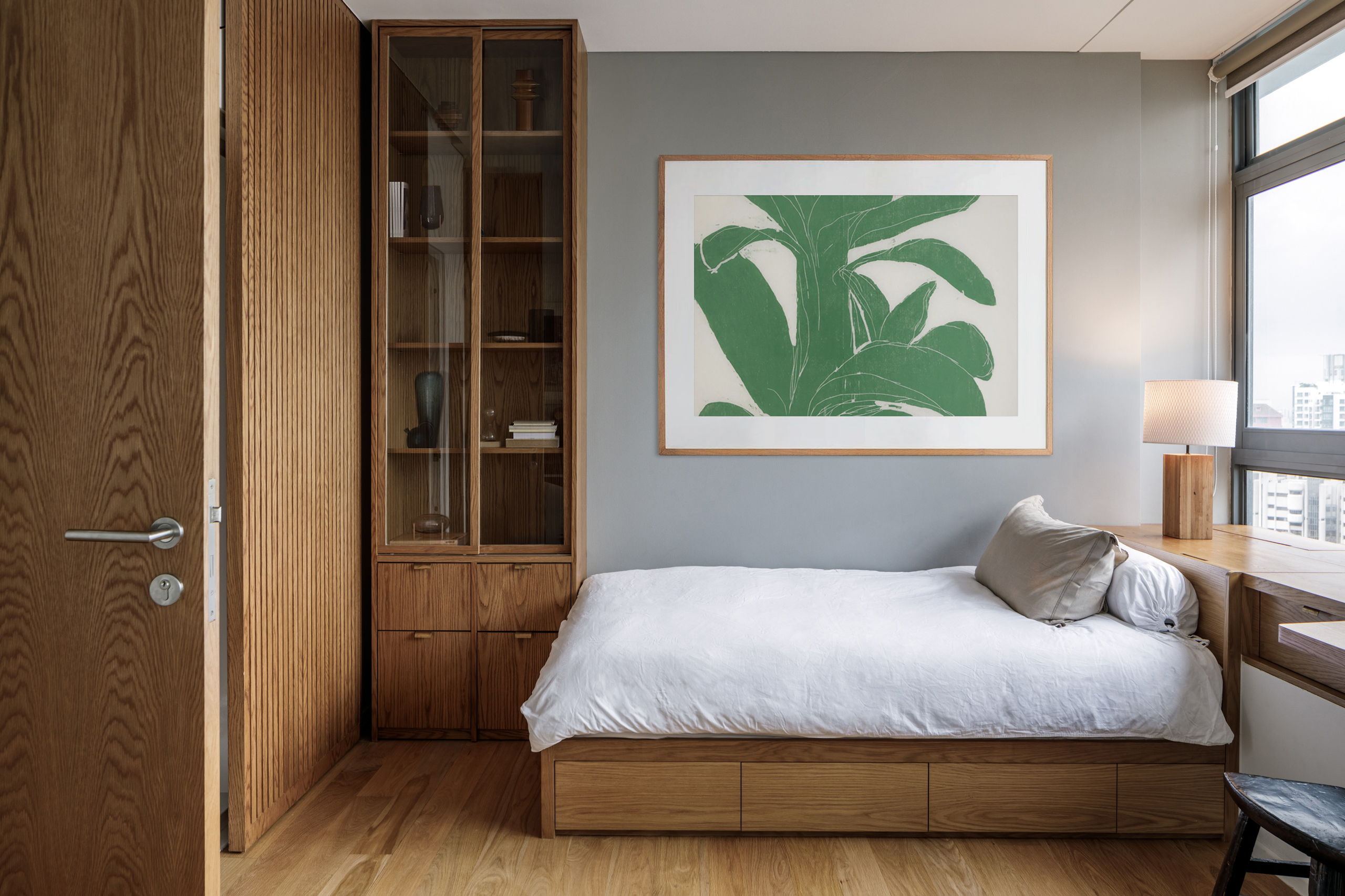
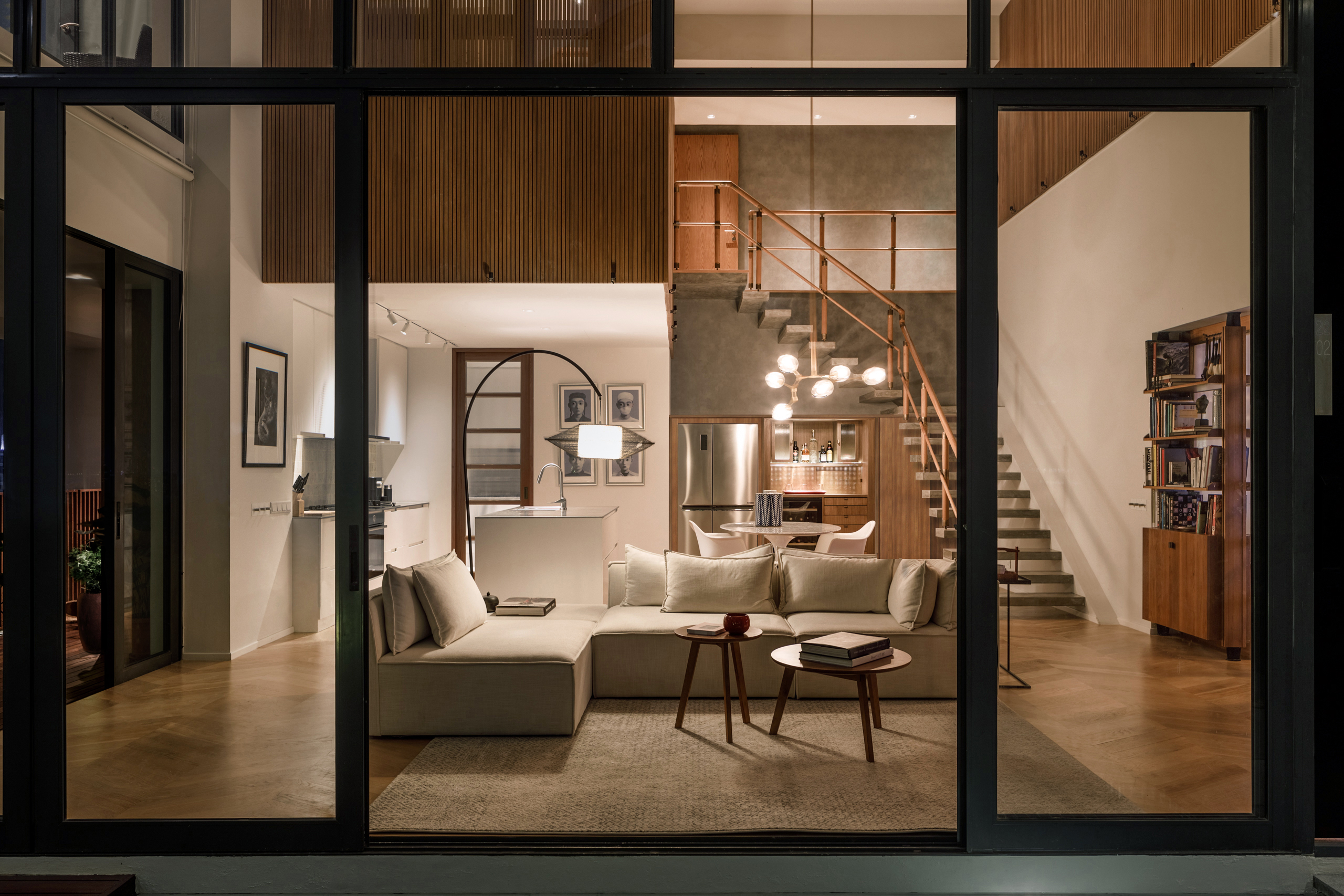
a house in the sky amongst concrete skyscrapers and lush greenery, this penthouse sits in harmony with its surroundings like a treehouse. having studied the personalities and routines of the family of four, we created private and social spaces accordingly. the existing architecture of the apartment provided a platform on the upper floor that serves as a protective canopy for the social space below, and to highlight this characteristic, the upper floor is wrapped in warm timber strips to evoke the nestled, elevated feeling of a treehouse.
different levels of privacy are created through the flexible windows and shutters, which can be opened or closed to expose or conceal the space. to reflect the more dynamic purpose of the ground floor living and dining room spaces, transparent materials and a lighter palette are used, and the entire glass façade can be opened up to the terrace, blending indoor and outdoor living.
with the main living area naturally lit through expansive windows, most of the lighting efforts are decorative or uplights used on landscape and wooden trellises.
Interiors
creating an ambience
ensuring you are the
last guest to leave.
marketing suite
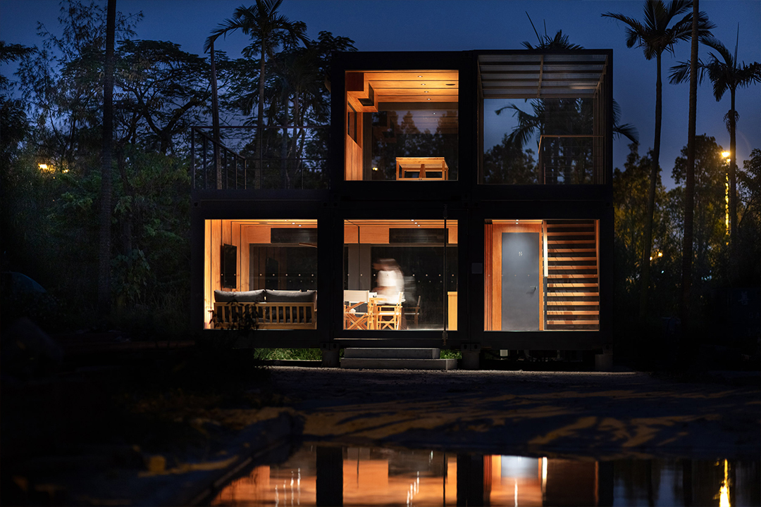
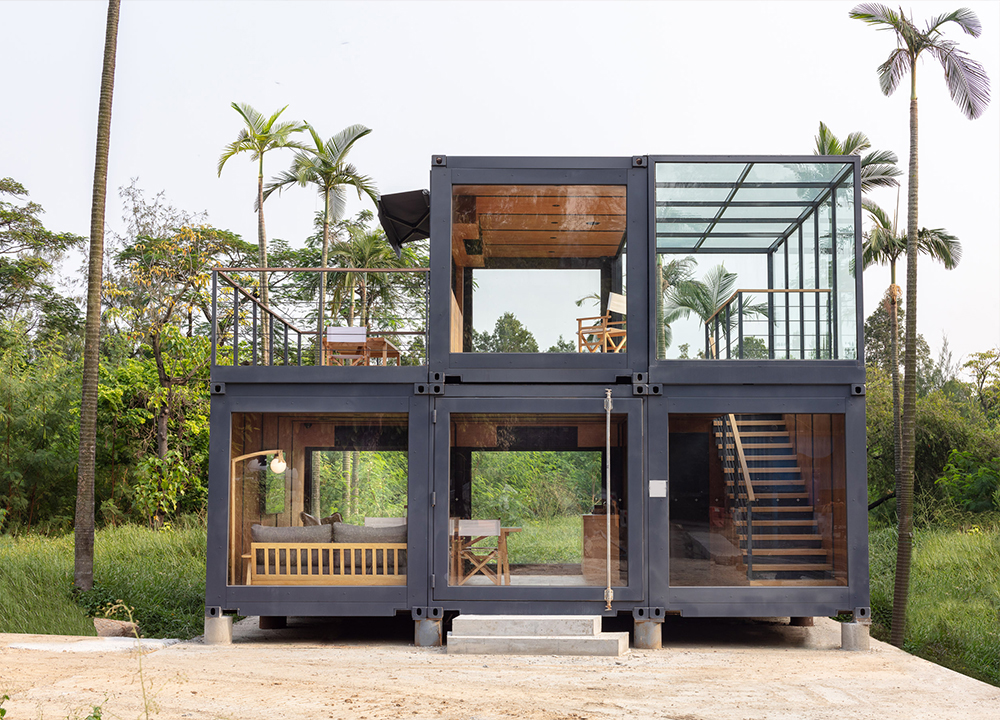
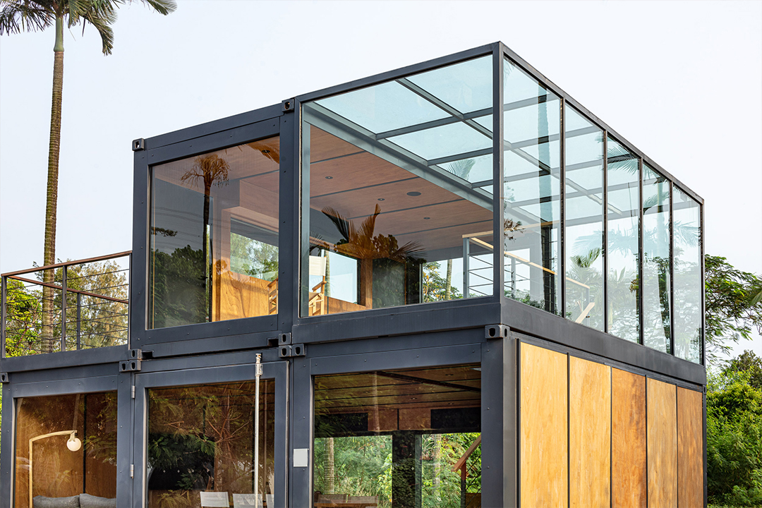
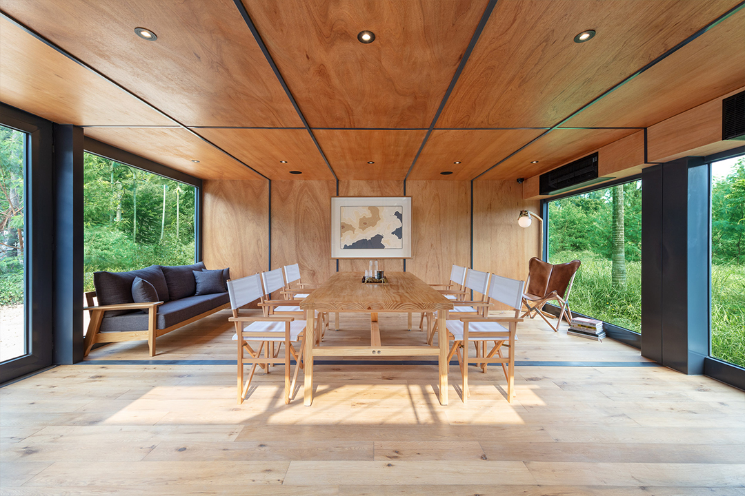
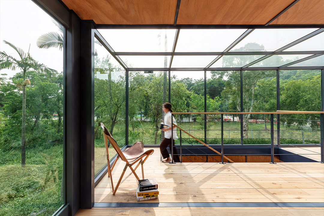
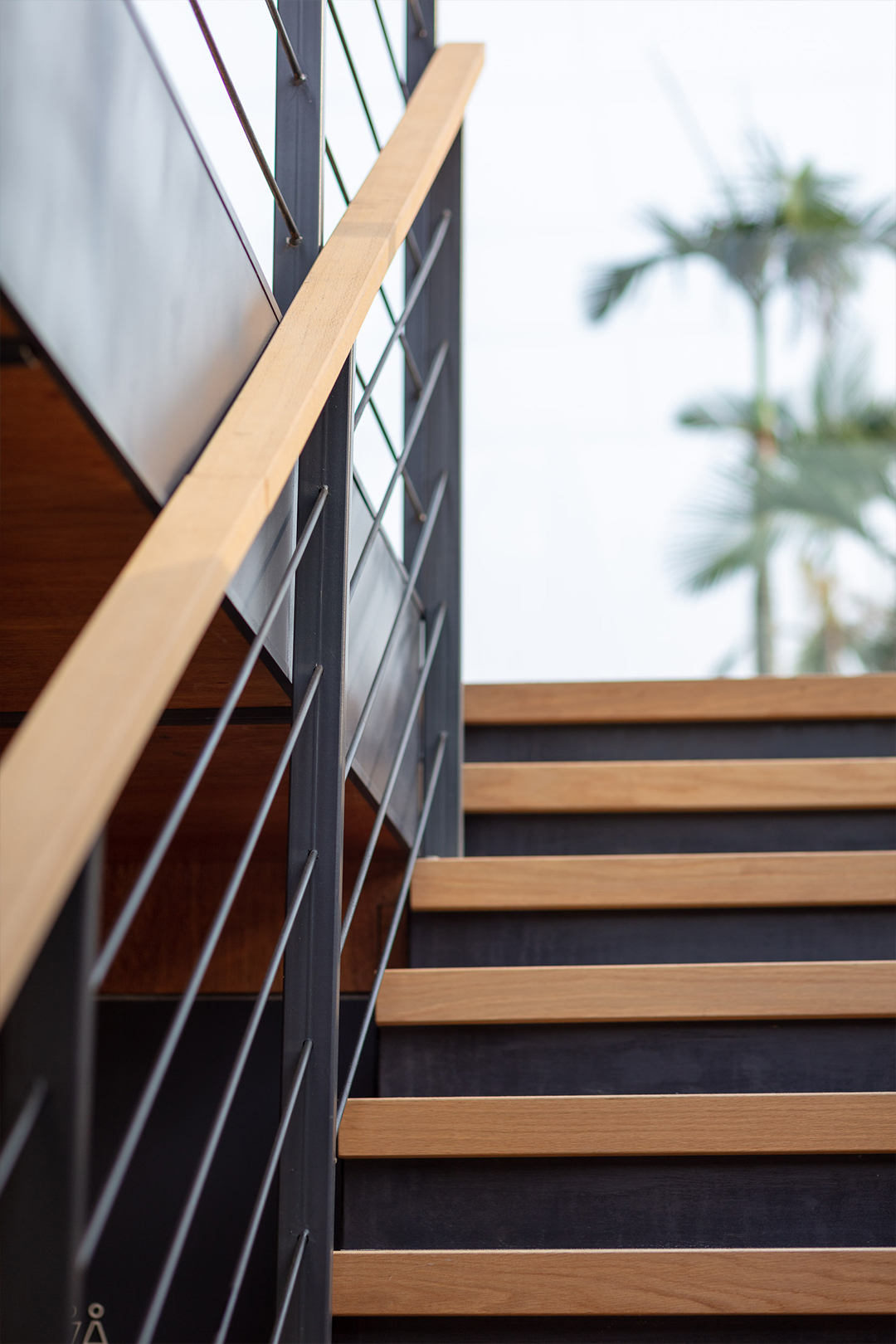
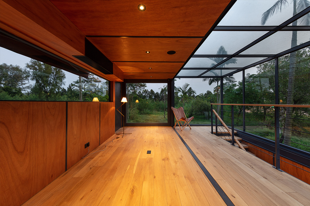
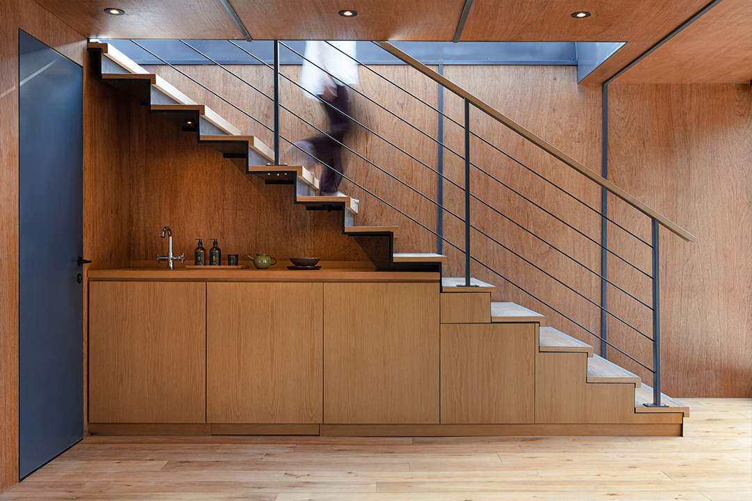
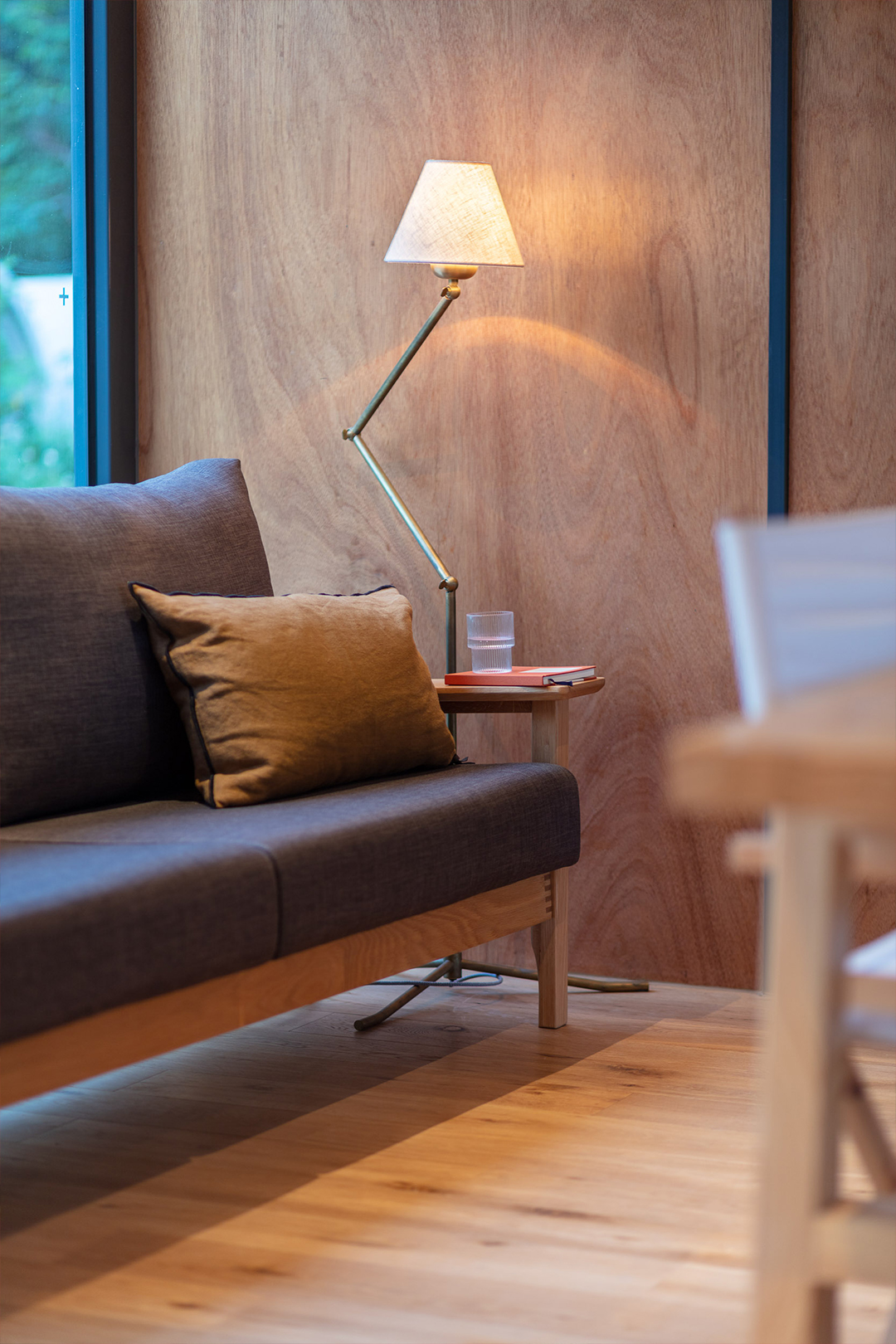
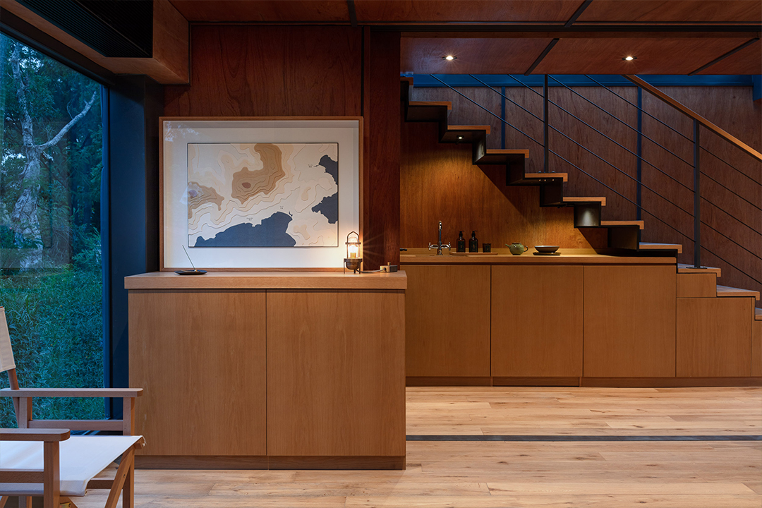
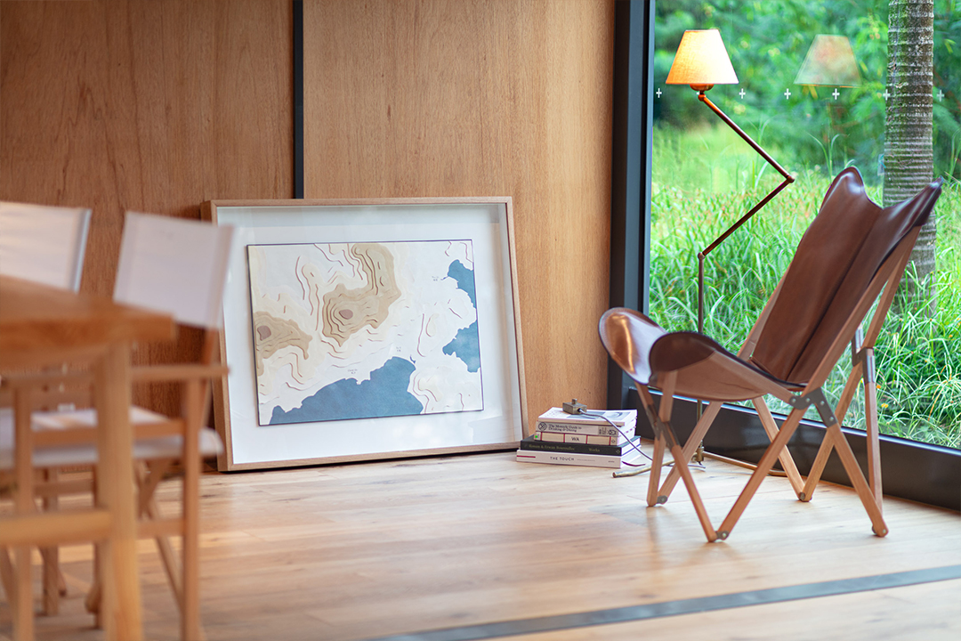
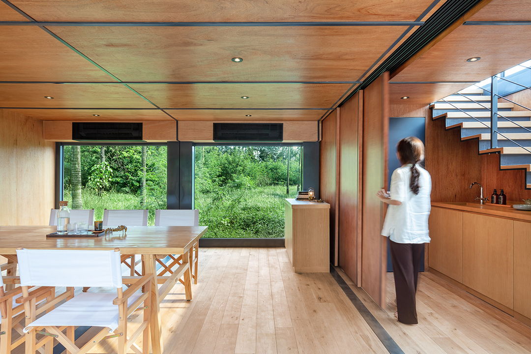
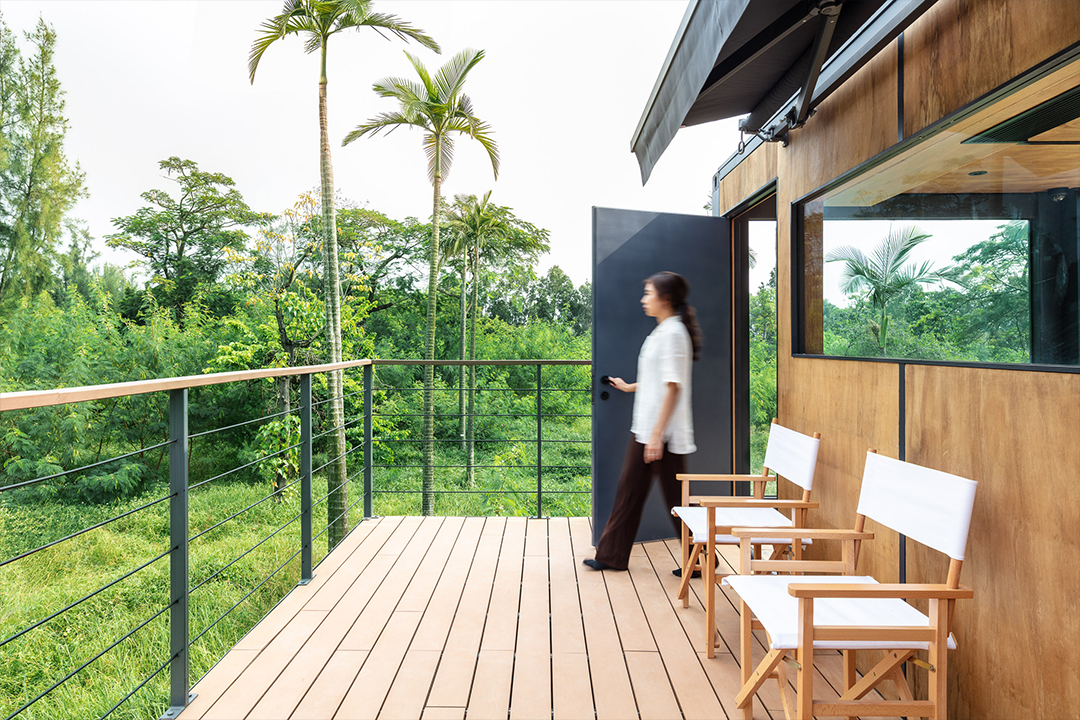
containers are multifaceted; a strong symbol of a logistics company and a celebrator of sustainable architecture. its modular construct naturally allowed us to use 4 containers to create 6 different spaces as a marketing suite, with the flexibility to adapt to an evolving site. we maximised the opportunity to have extensive glass openings, which allows potential clients to have an overview of the surrounds. the layering of timber and glass softens the features of an inherently industrial product, establishing harmony amongst nature whilst bringing in light and tropical backdrops into the space. at the end, the build can be collapsed and transported, leaving minimal imprint on the original landscape.
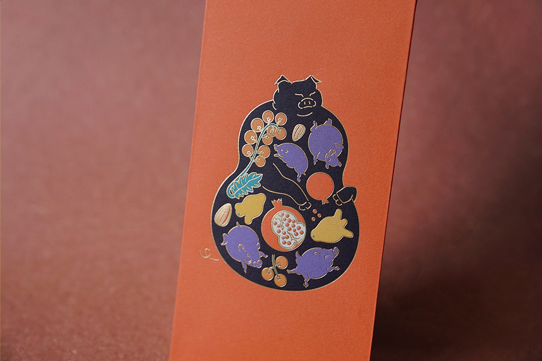
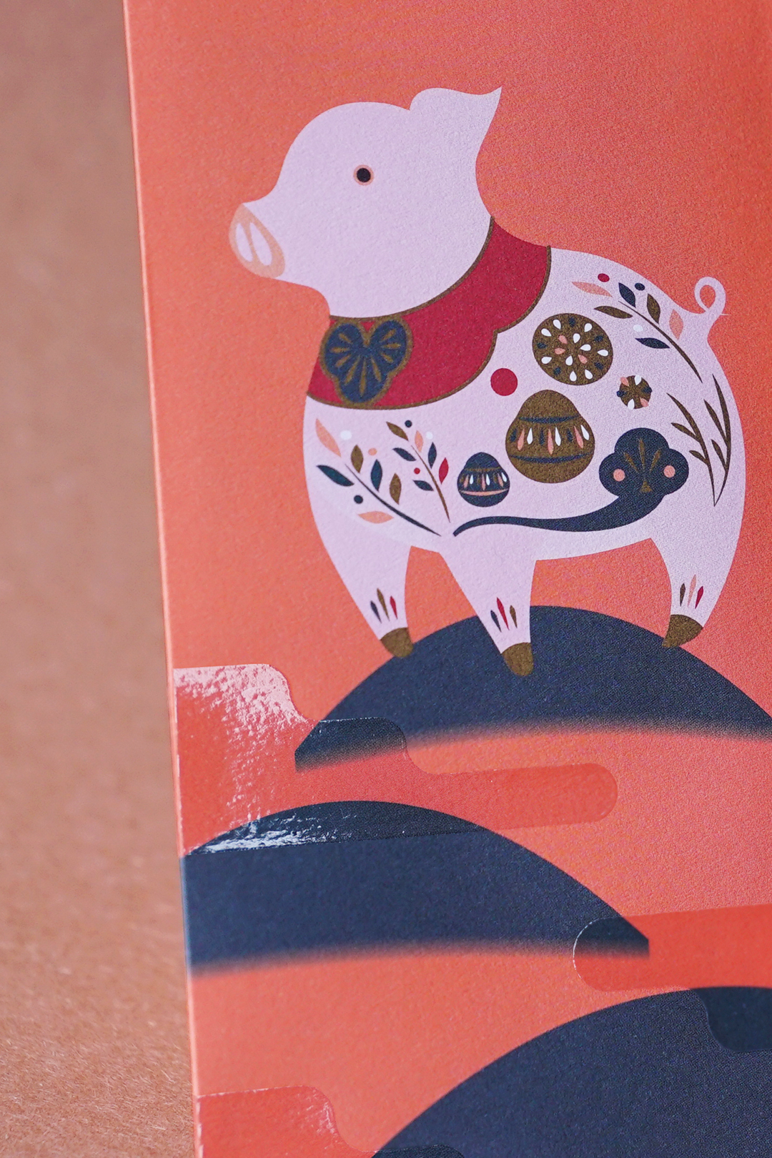
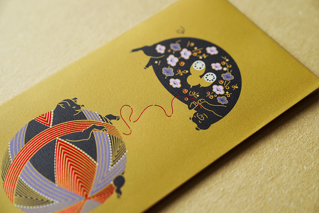
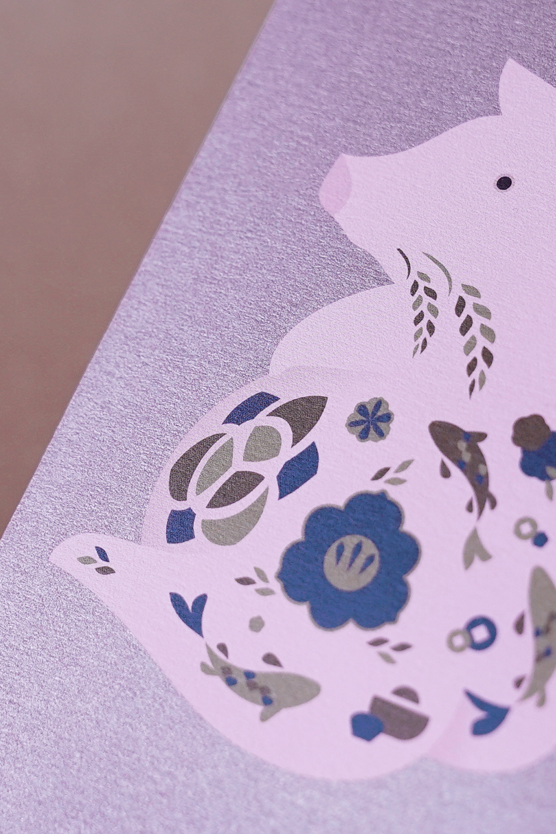
the year of the pig
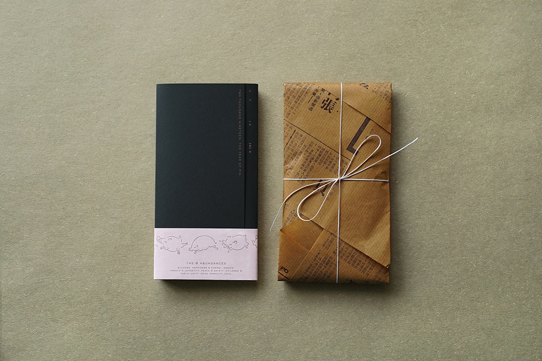
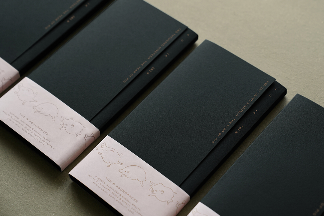
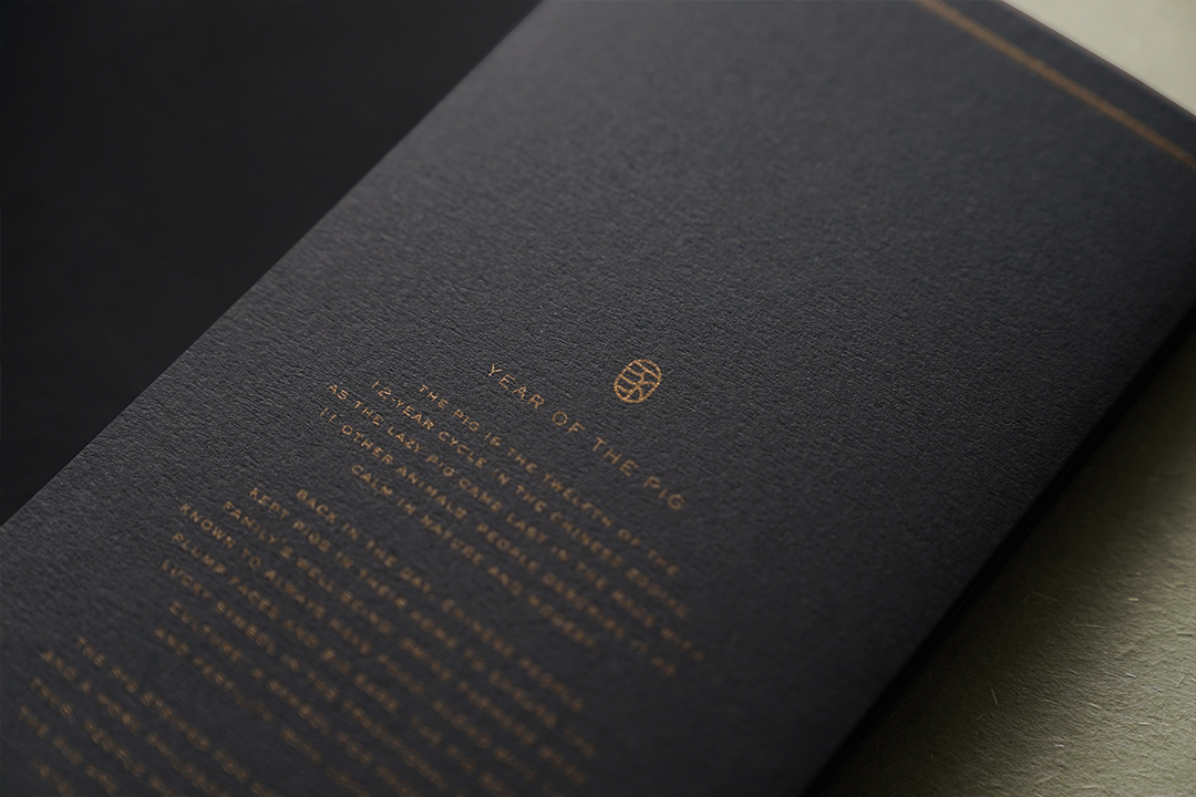
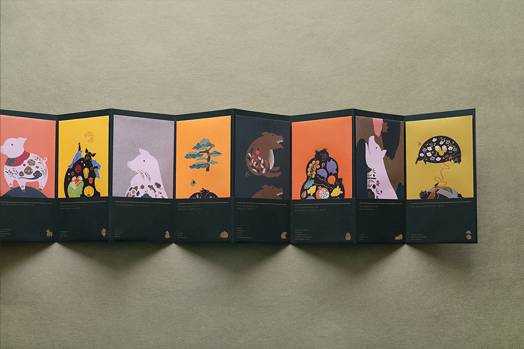
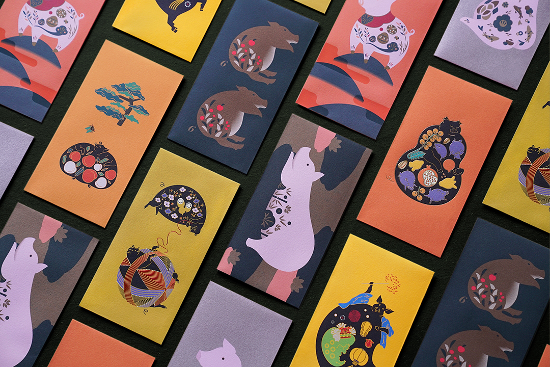
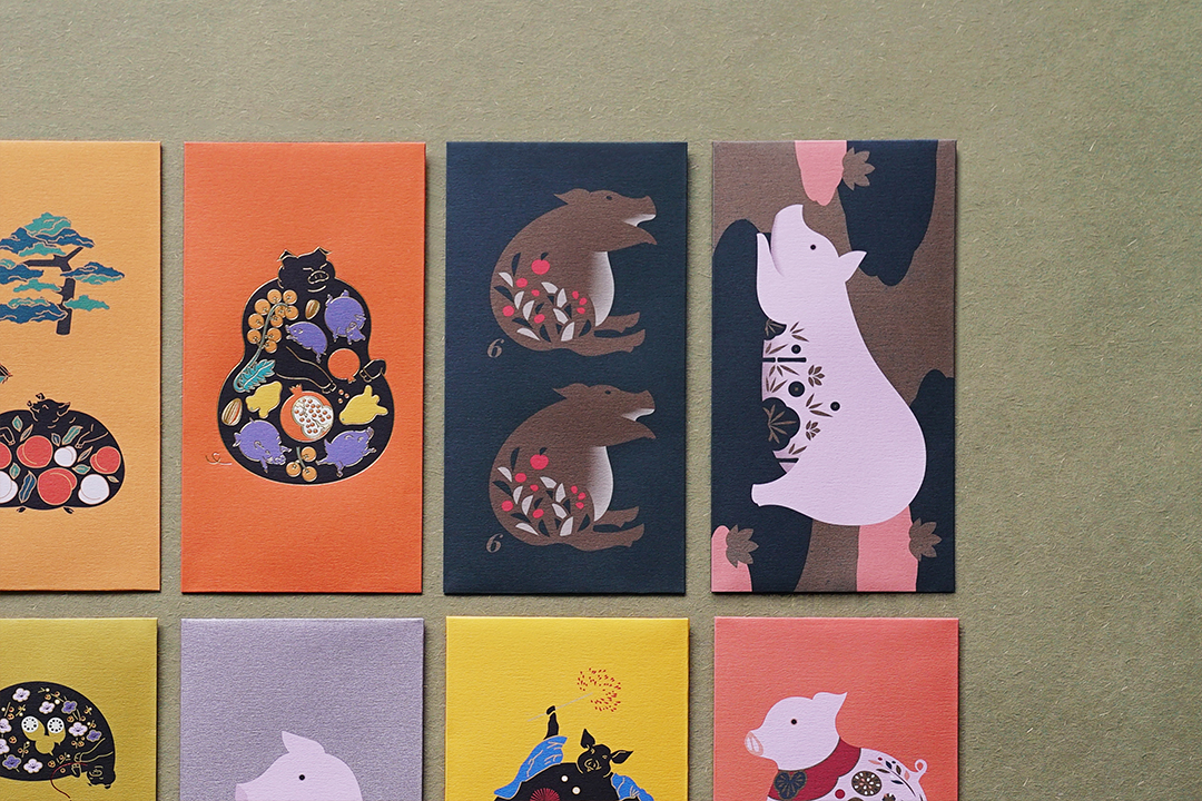
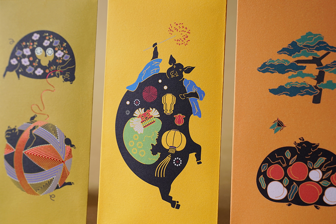
the year of the pig carries a symbol of “abundance”. this porky zodiac brings you prosperity, fertility and plenty of luck. to send blessings to everyone in the coming year, we designed 8 auspicious red packets that illustrate an array of fortunes treasured in the pig’s full belly: harmony, morality, happiness, longevity, love, peace, success and wealth. gold stamping and spot uv finishing was applied to bring a sense of crafted opulence with each packet individually hand wrapped in ribbed kraft paper, ready to be gifted to friends and family.
photographs by: judy chen
fukuro
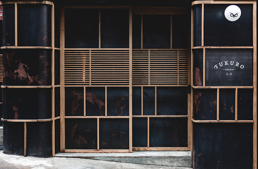
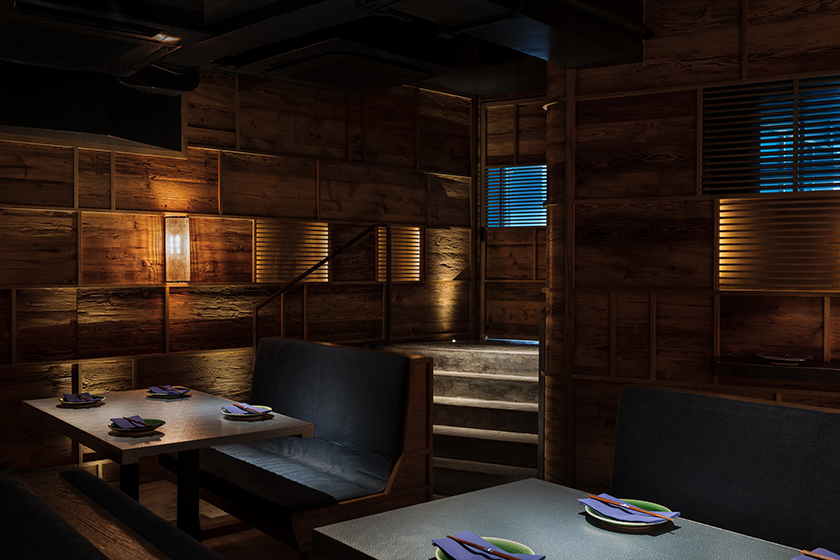
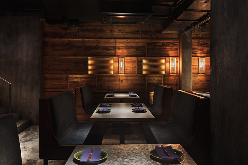
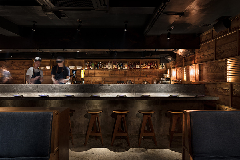
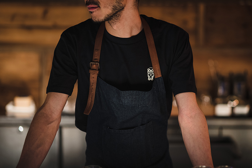
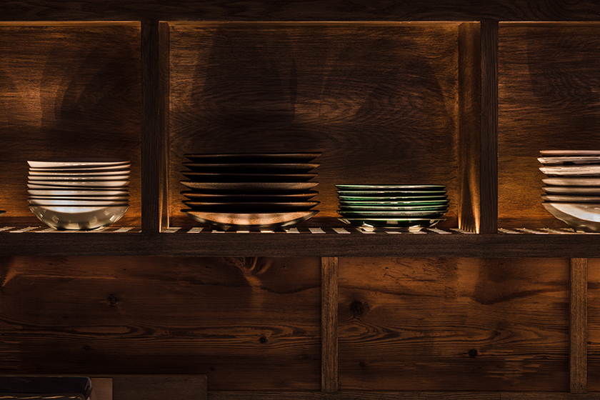
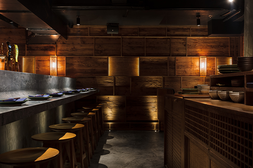
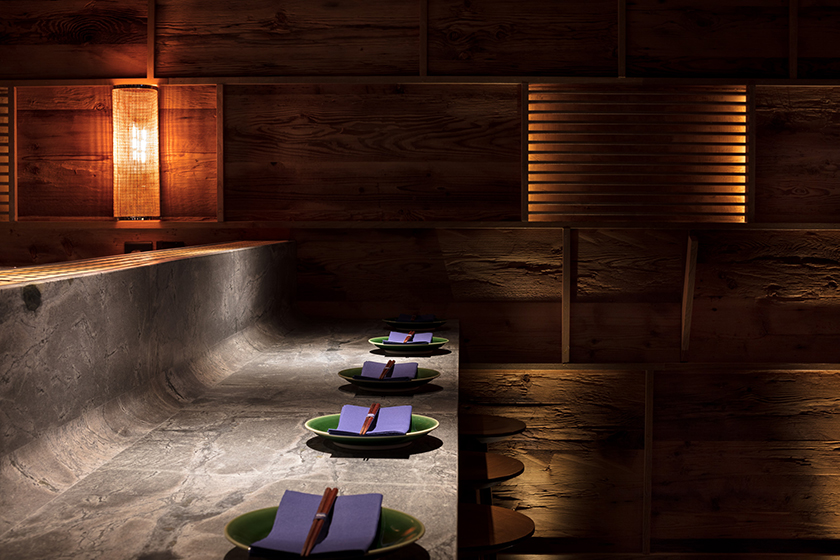
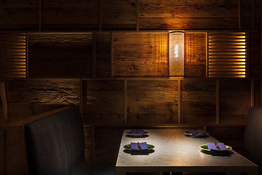
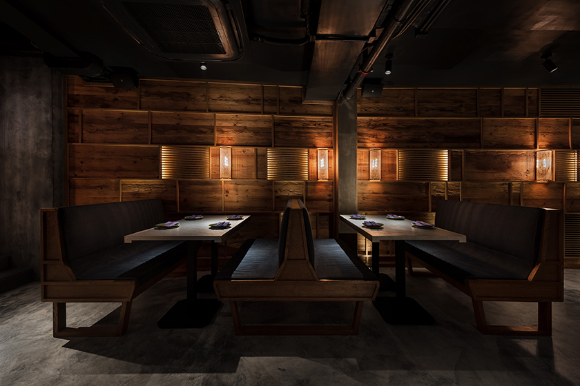
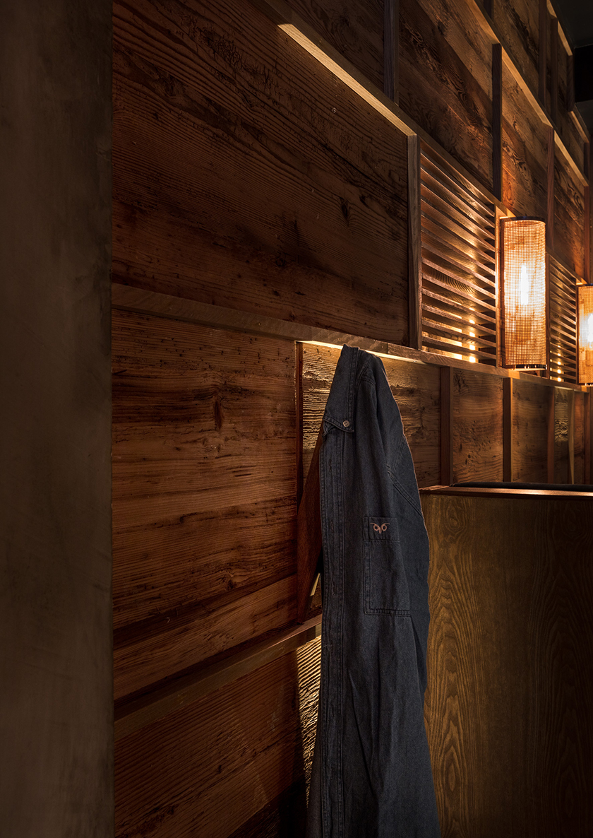
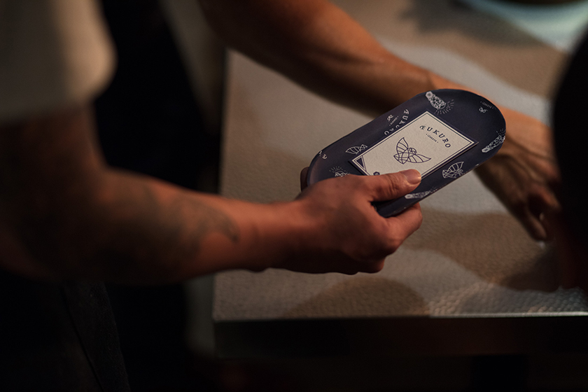
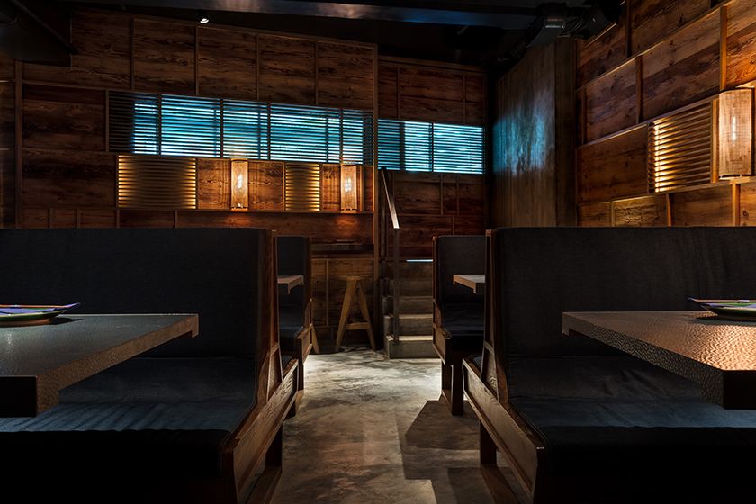
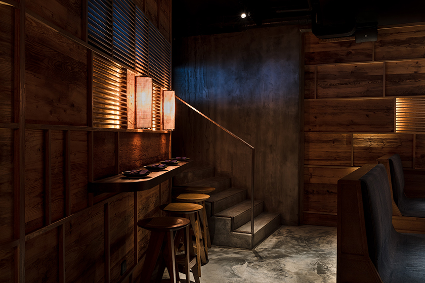
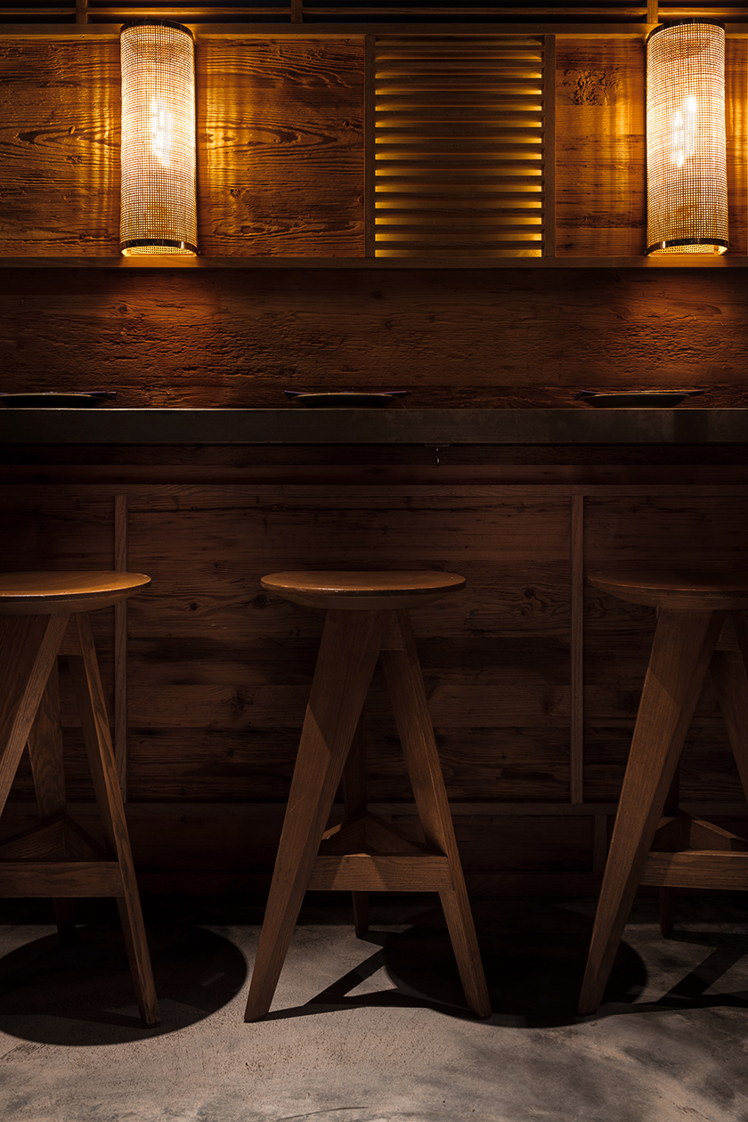
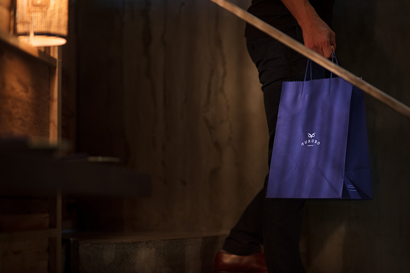
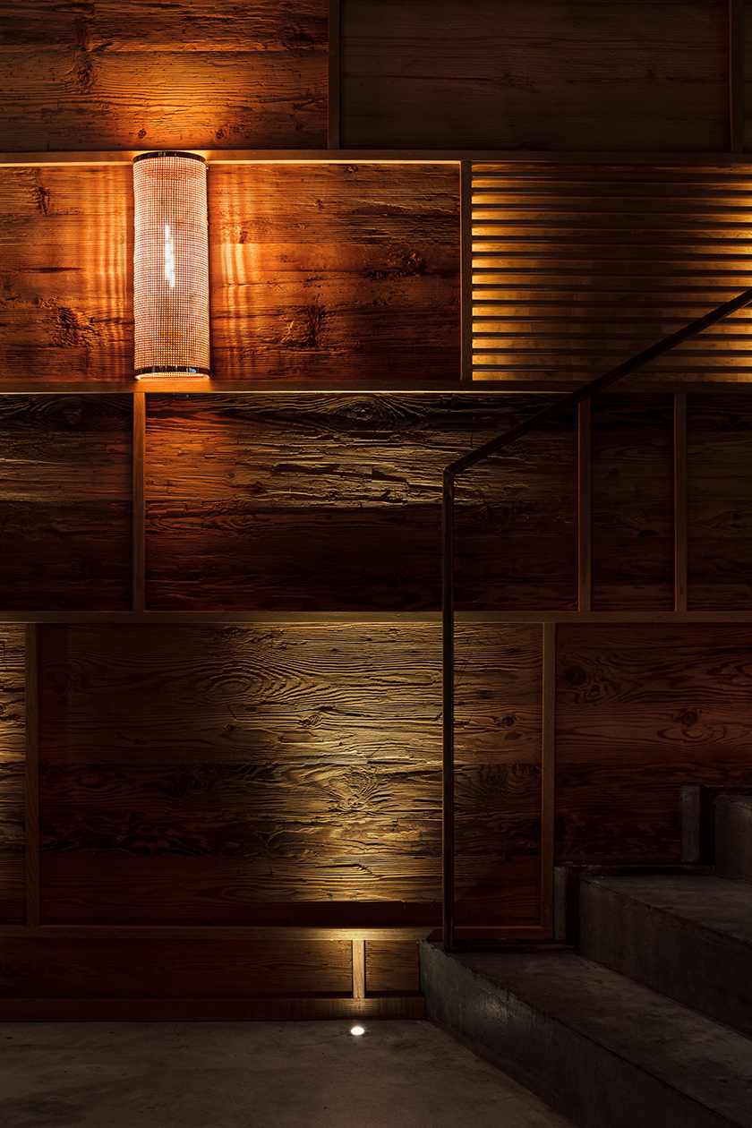
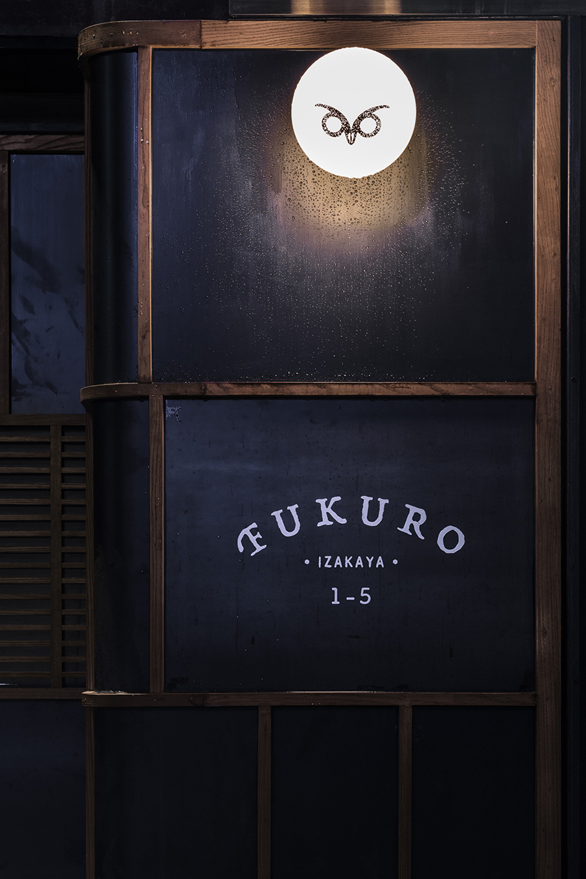
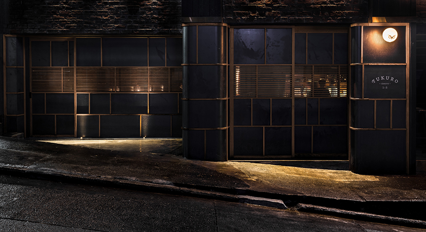
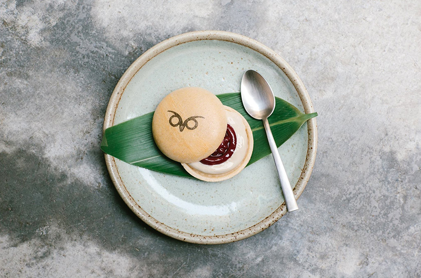
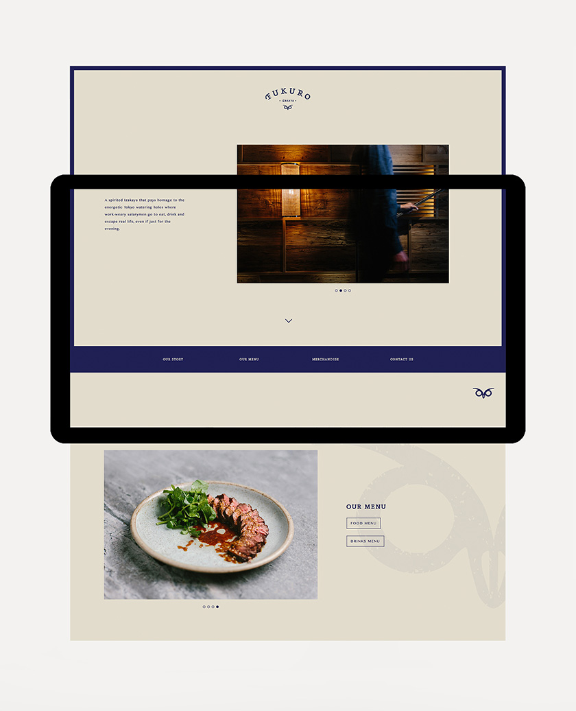
after a long day of work, wearied salarymen of tokyo trail back to the comforting glow of izakayas, where they take refuge and unwind with food, drinks and uninhibited conversations. echoing these nocturnal waterholes, fukuro embodies a mystical ambience, whilst exuding a warmth that sparks spirited interactions between visitors. as a messenger of the night and a protector from hardship in japanese symbolism, the owl icon manifests the outlet’s identity. the profusion of wood crafted by simple carpentry oozes an intimate and relaxed atmosphere for visitors to indulge in a spin on a quintessential japanese experience.
origin shangri la
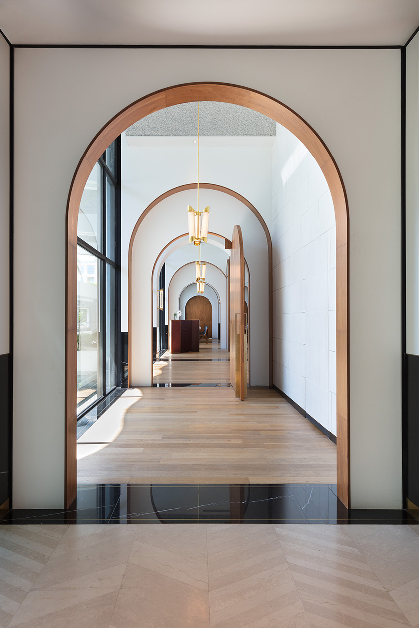
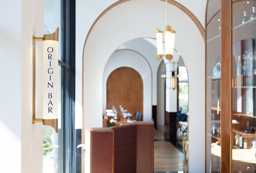
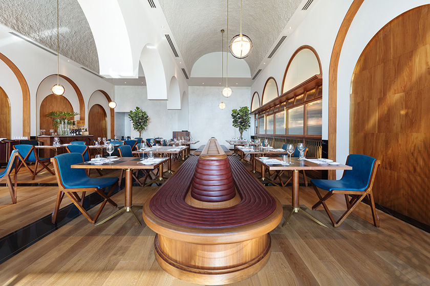
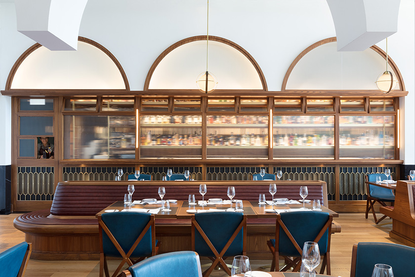
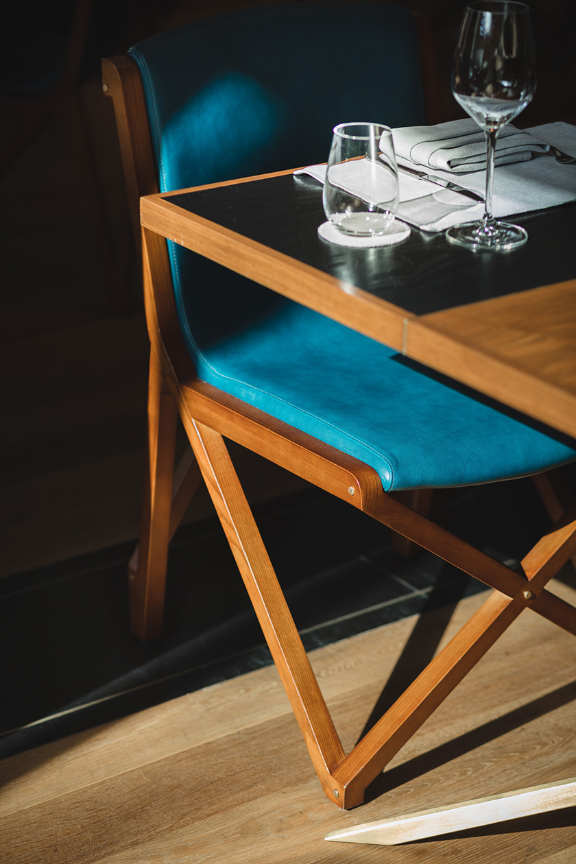
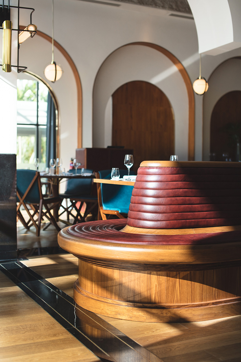
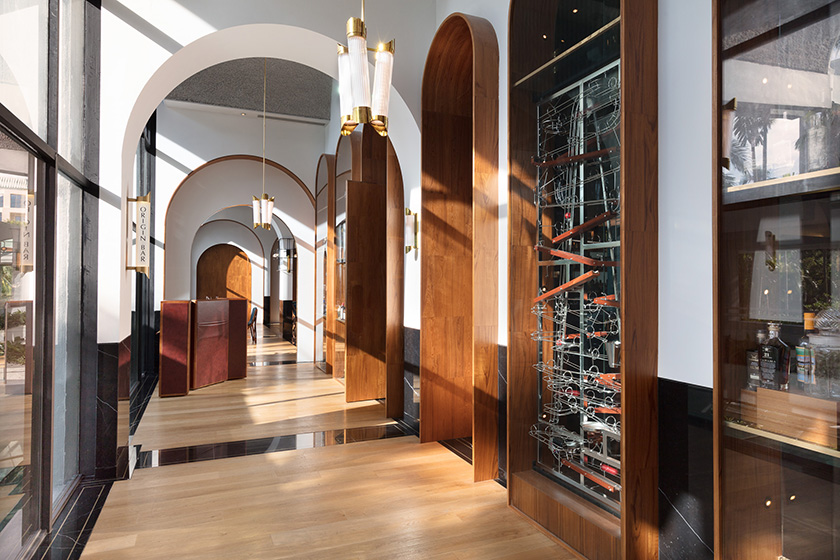
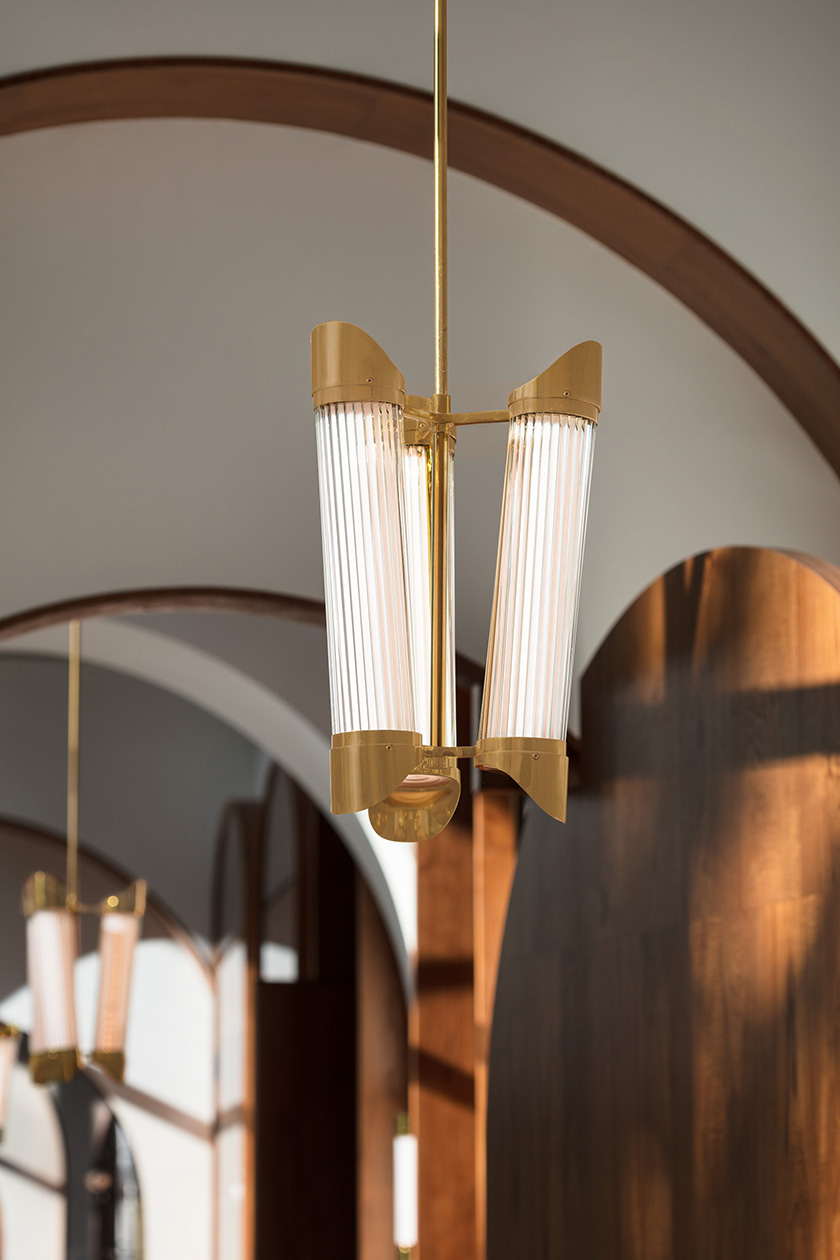
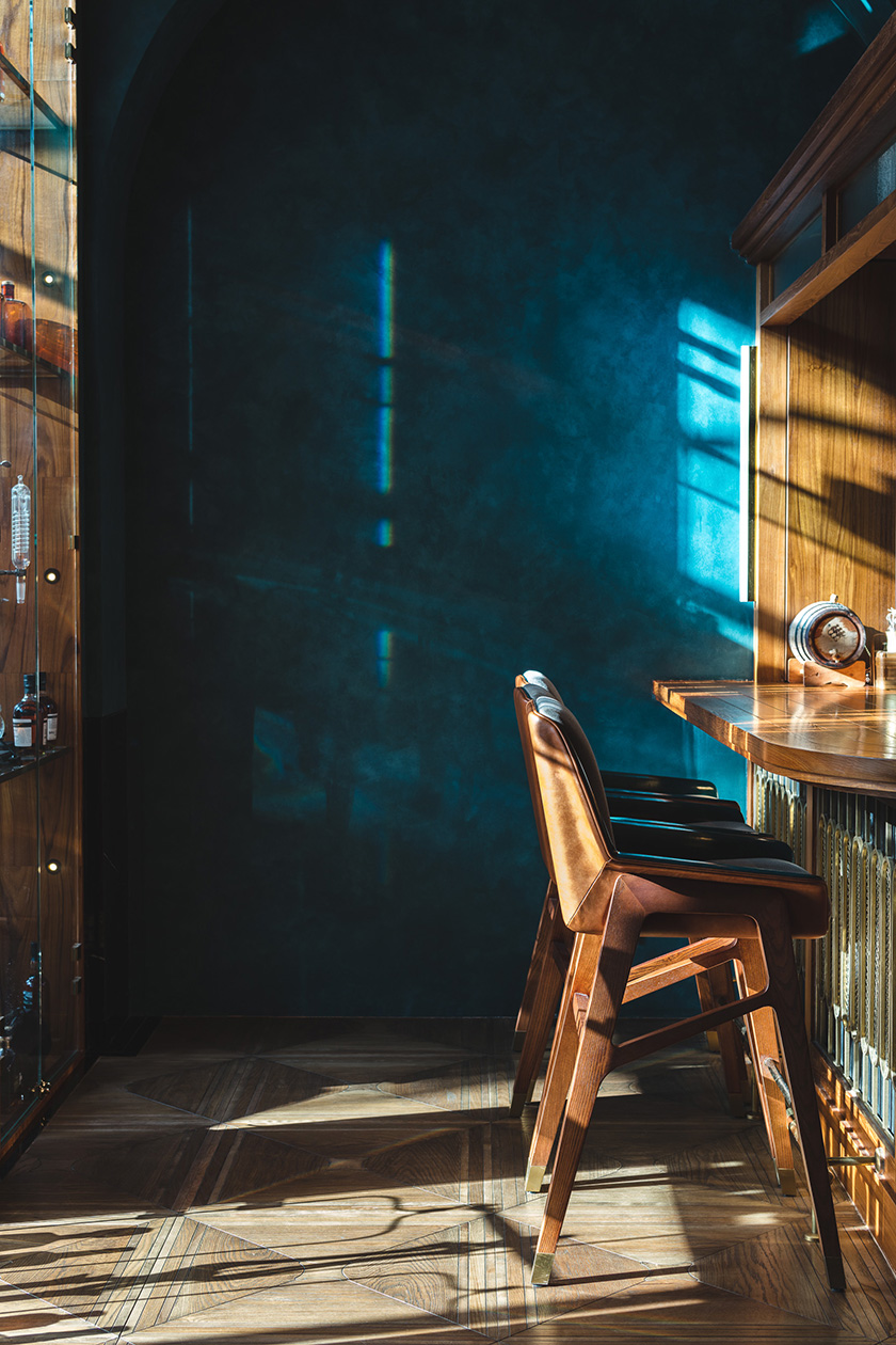
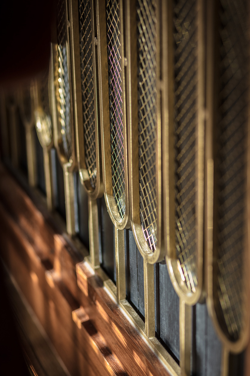
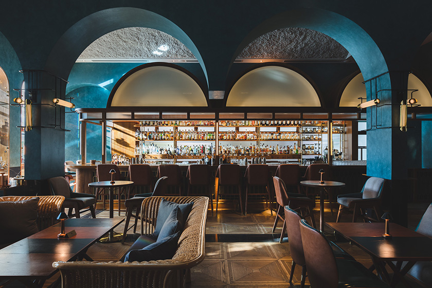
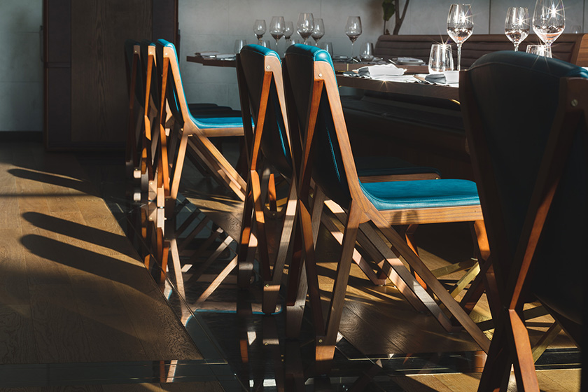
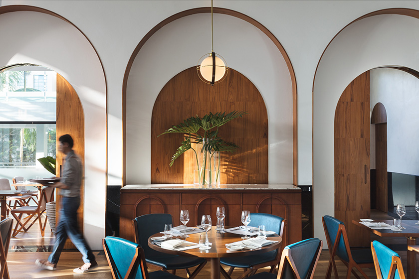
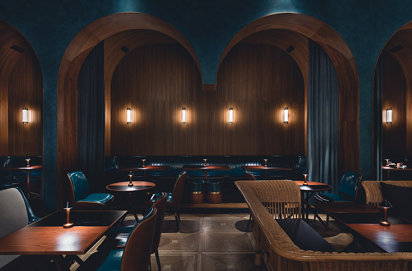
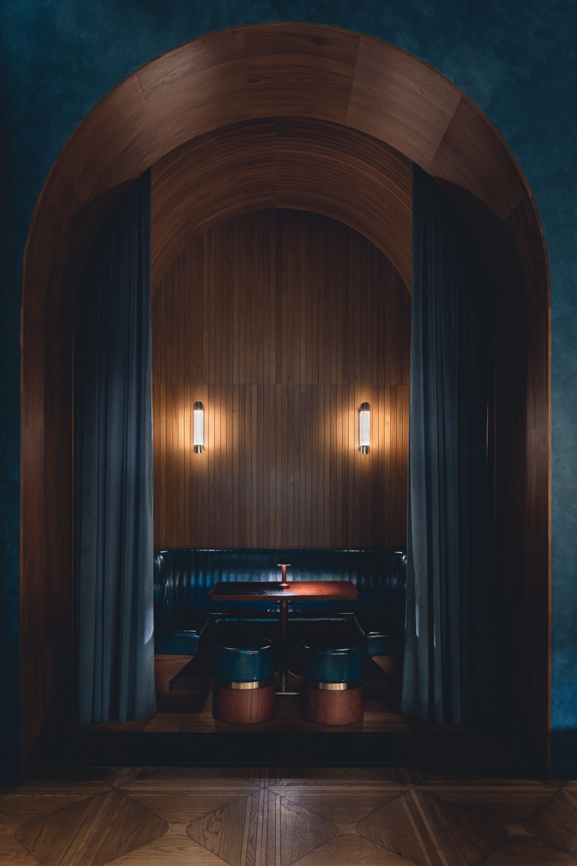
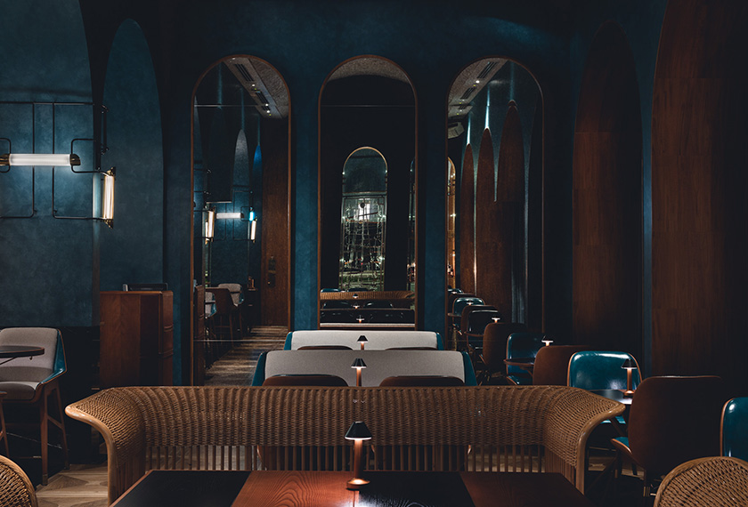
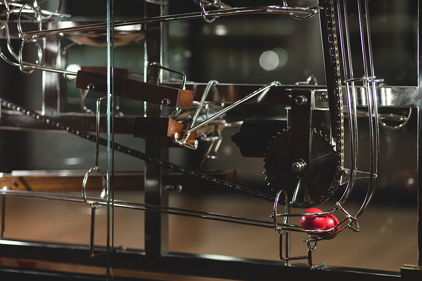
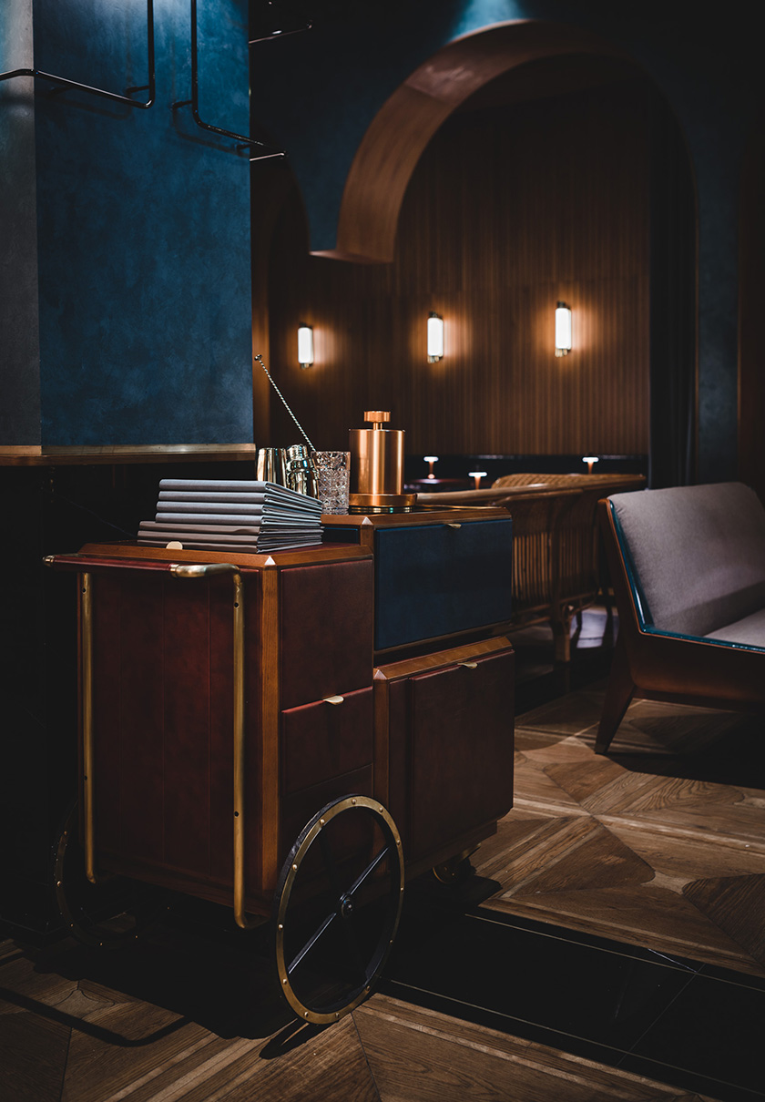
a station is the crossroads of millions of lives that intersect and pass within seconds, a point of convergence harbouring exchanges and ruminations; beginnings and endings. located in the original outlet of shangri-la in singapore, origin epitomises the hotel’s legacy, and honours south east asian produce. the existing arches carved into the space reminisced of station platforms and presented a befitting structure for execution. as diners travel through the bar, main dining, and private dining areas, they are taken on an evocative journey from the ticket counter, grand hall, platform, and finally to the intimate carriage. the curvatures mirrored in the interior and campaign furniture, in combination with the kinetics sculpture at the bar, guide visitors through a rhythm of travel.
the fleming
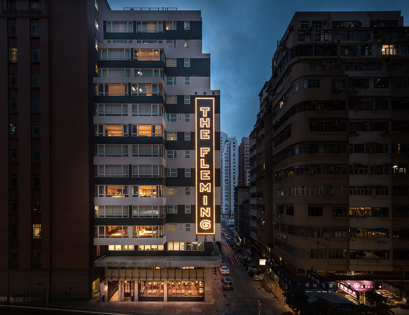
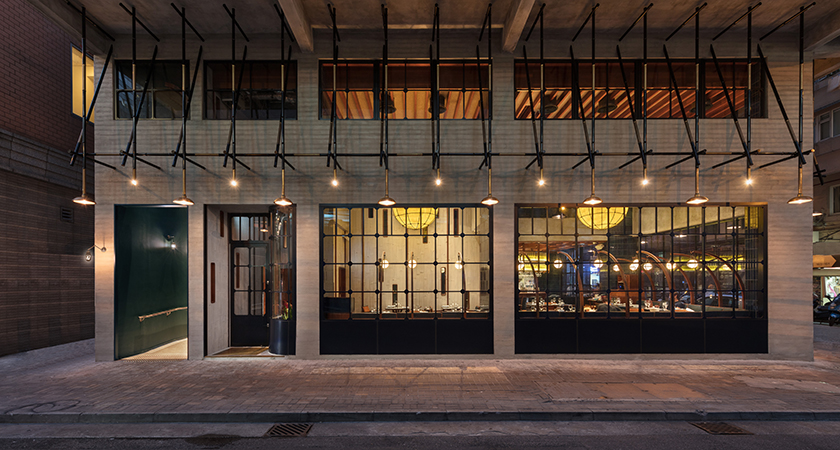
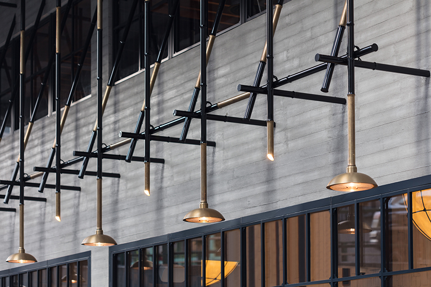
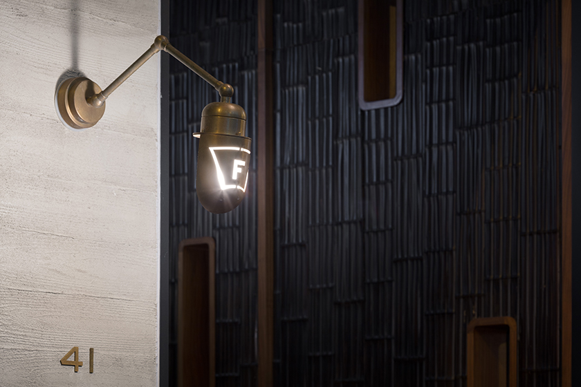
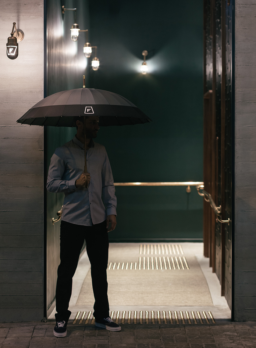
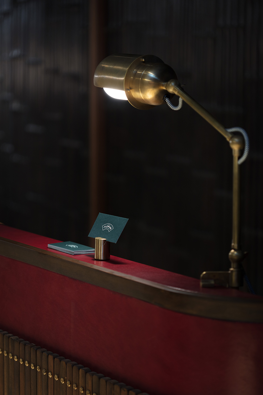
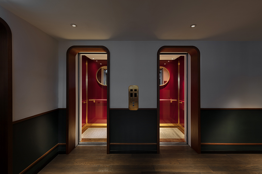
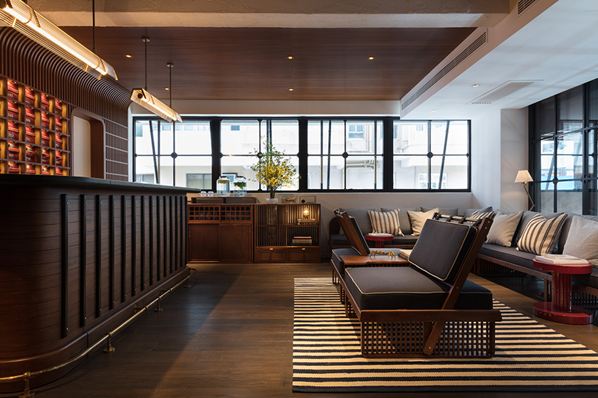
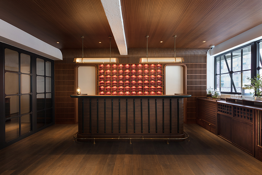
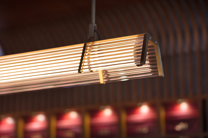
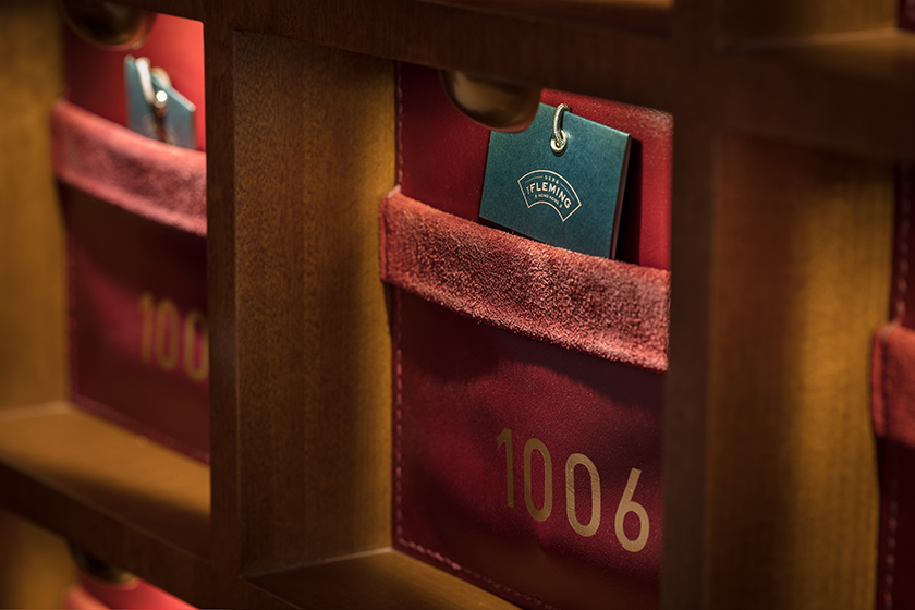
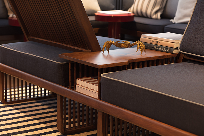
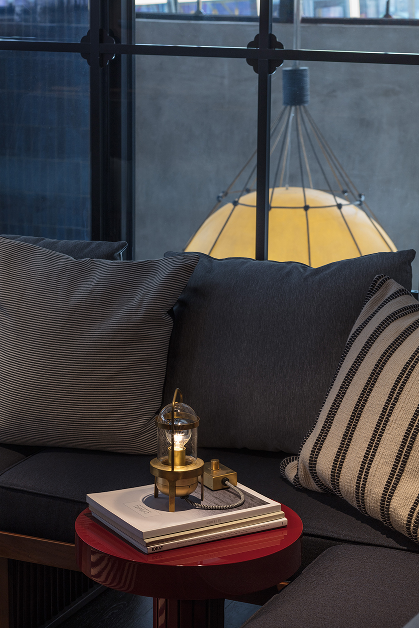
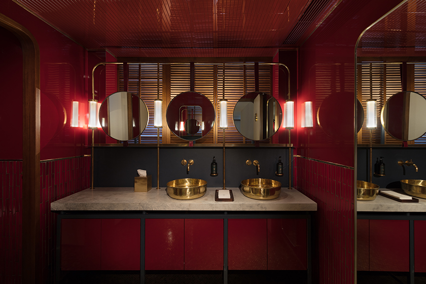
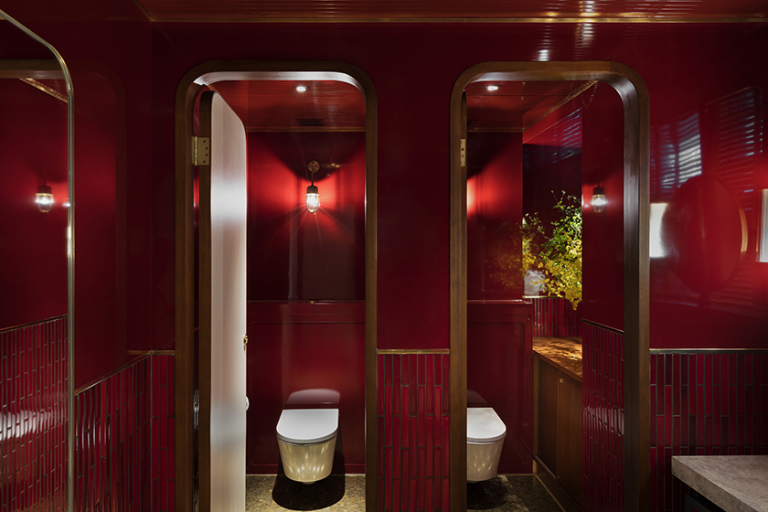
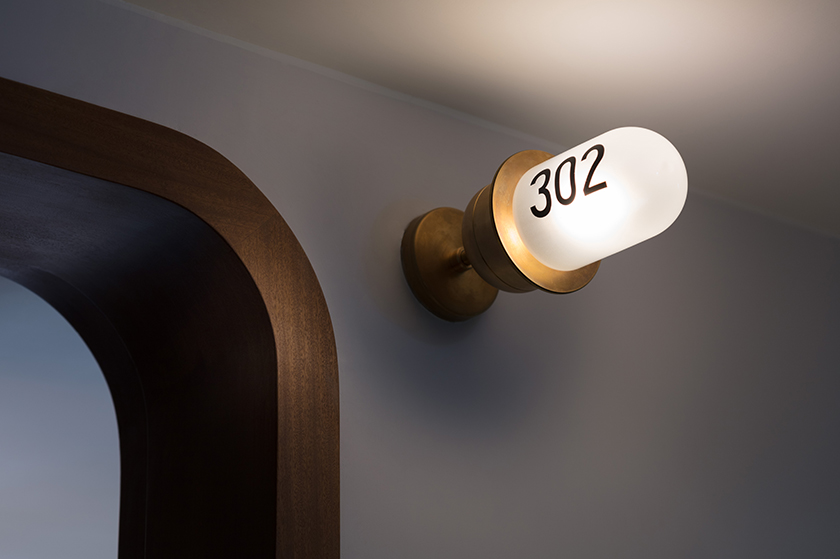
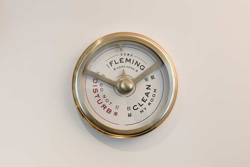
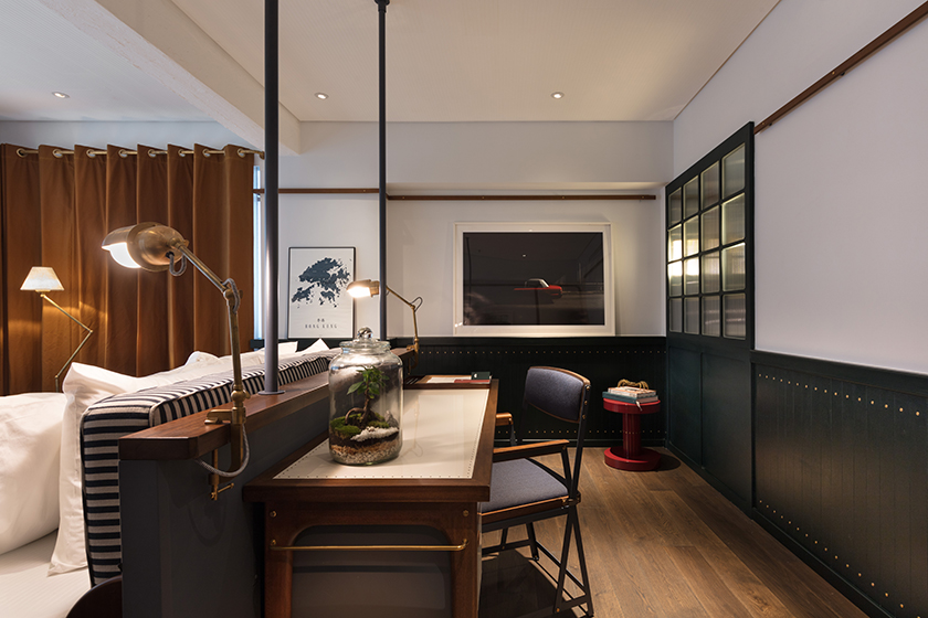
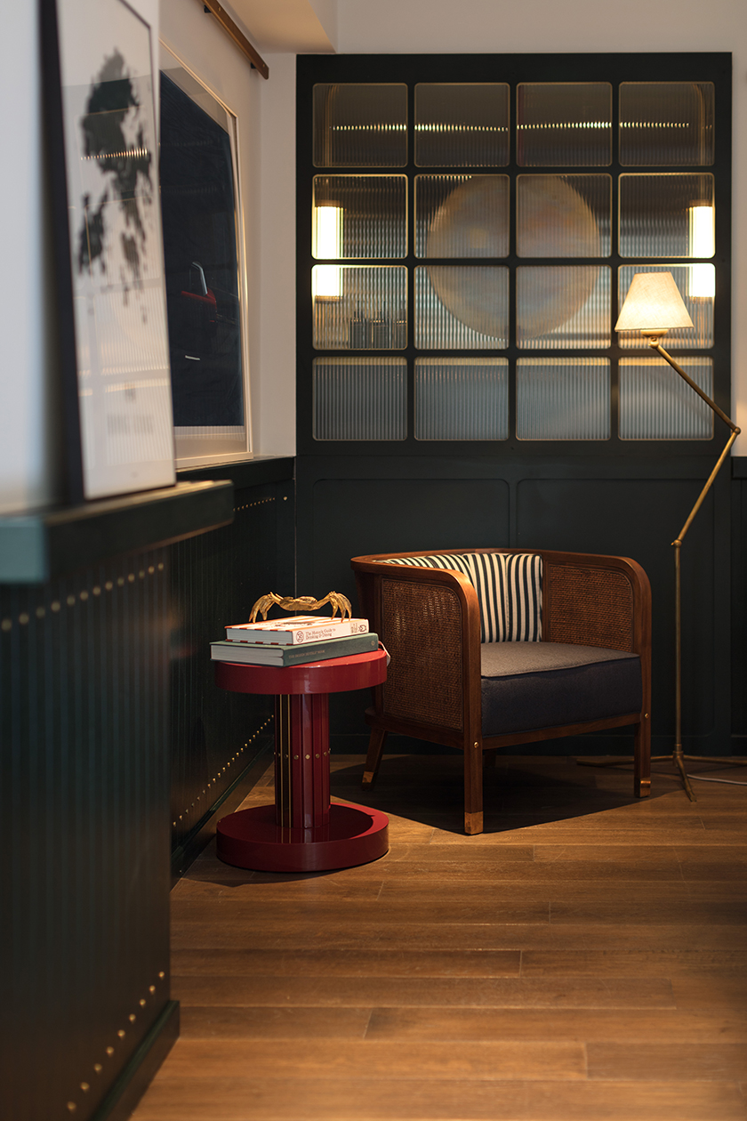
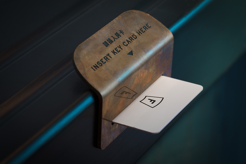
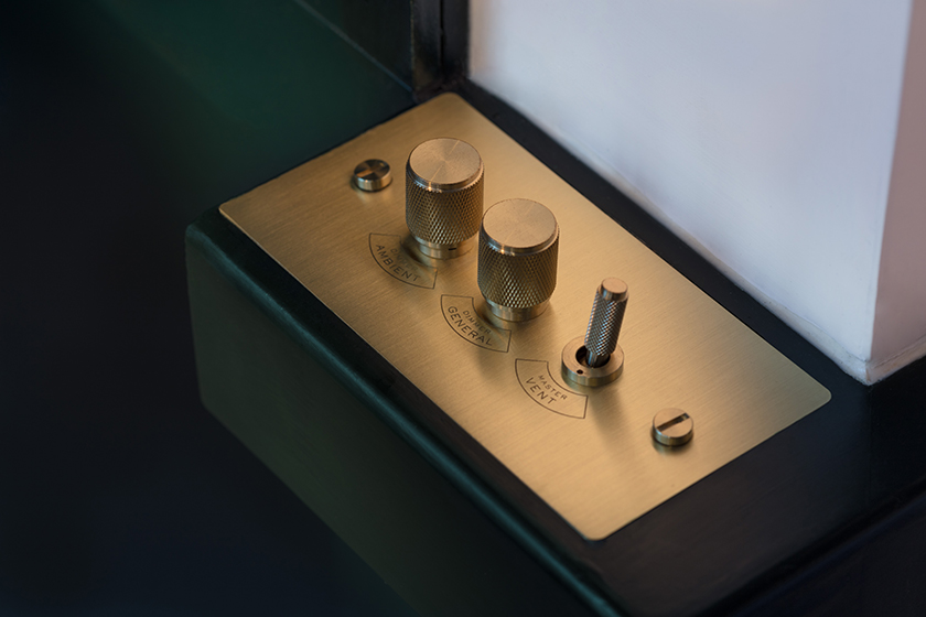
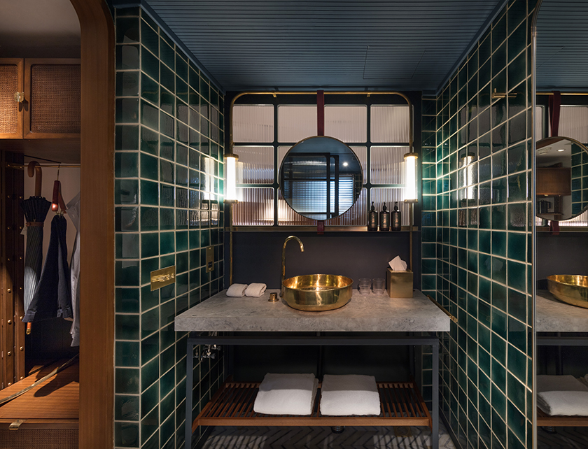
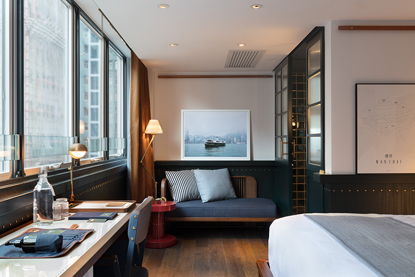
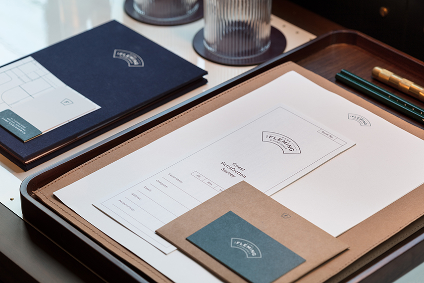
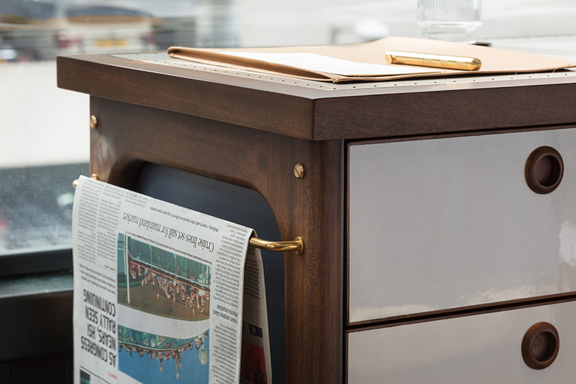
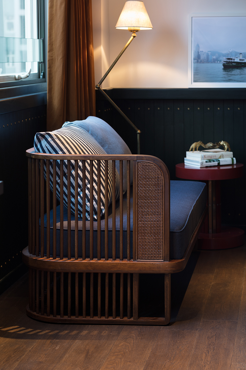
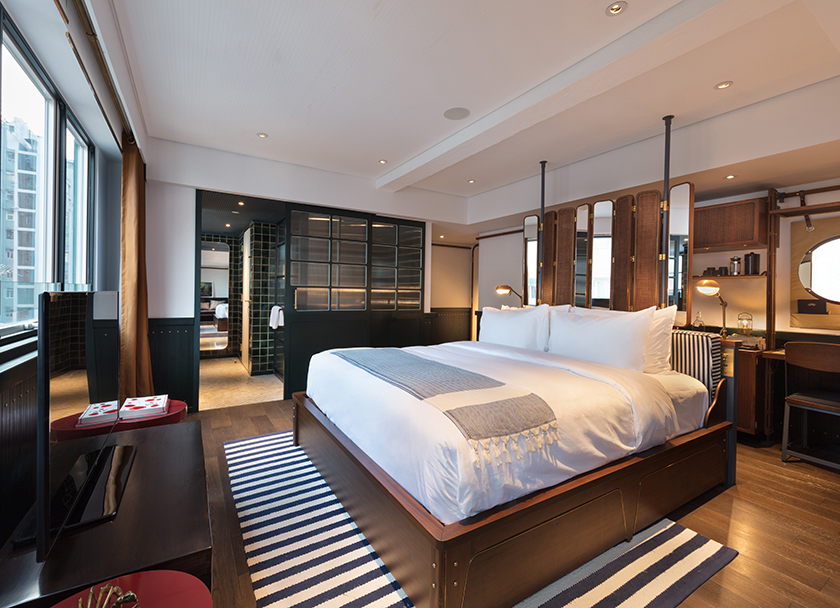
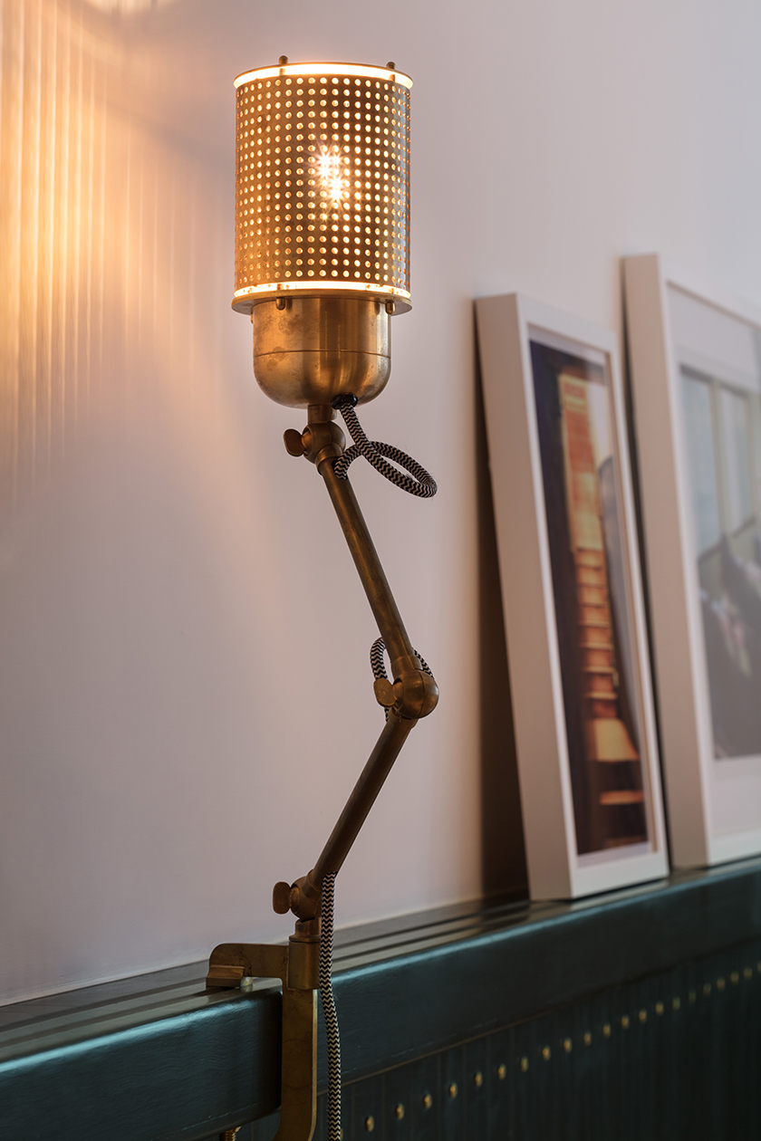
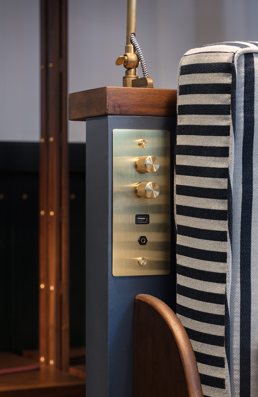
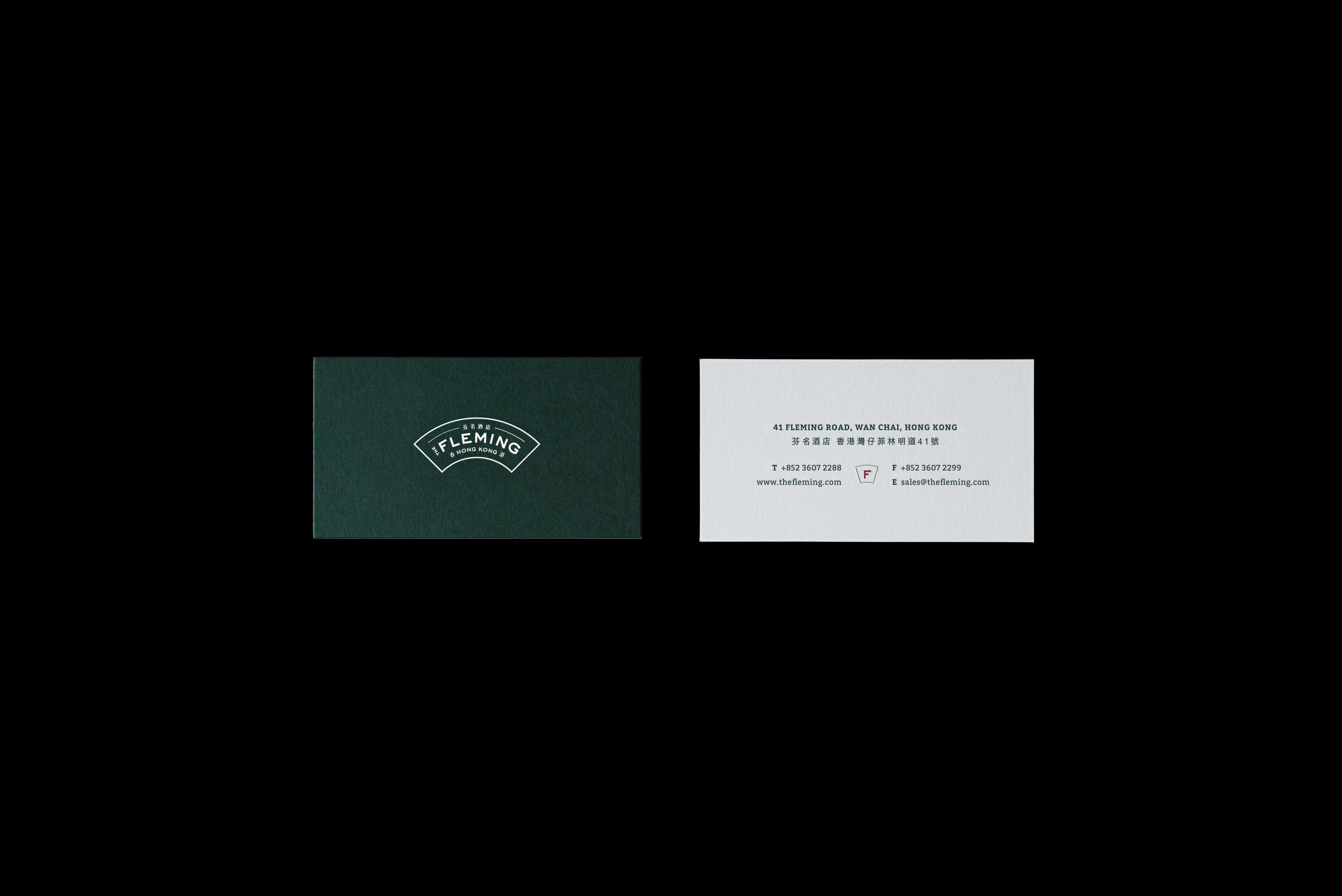
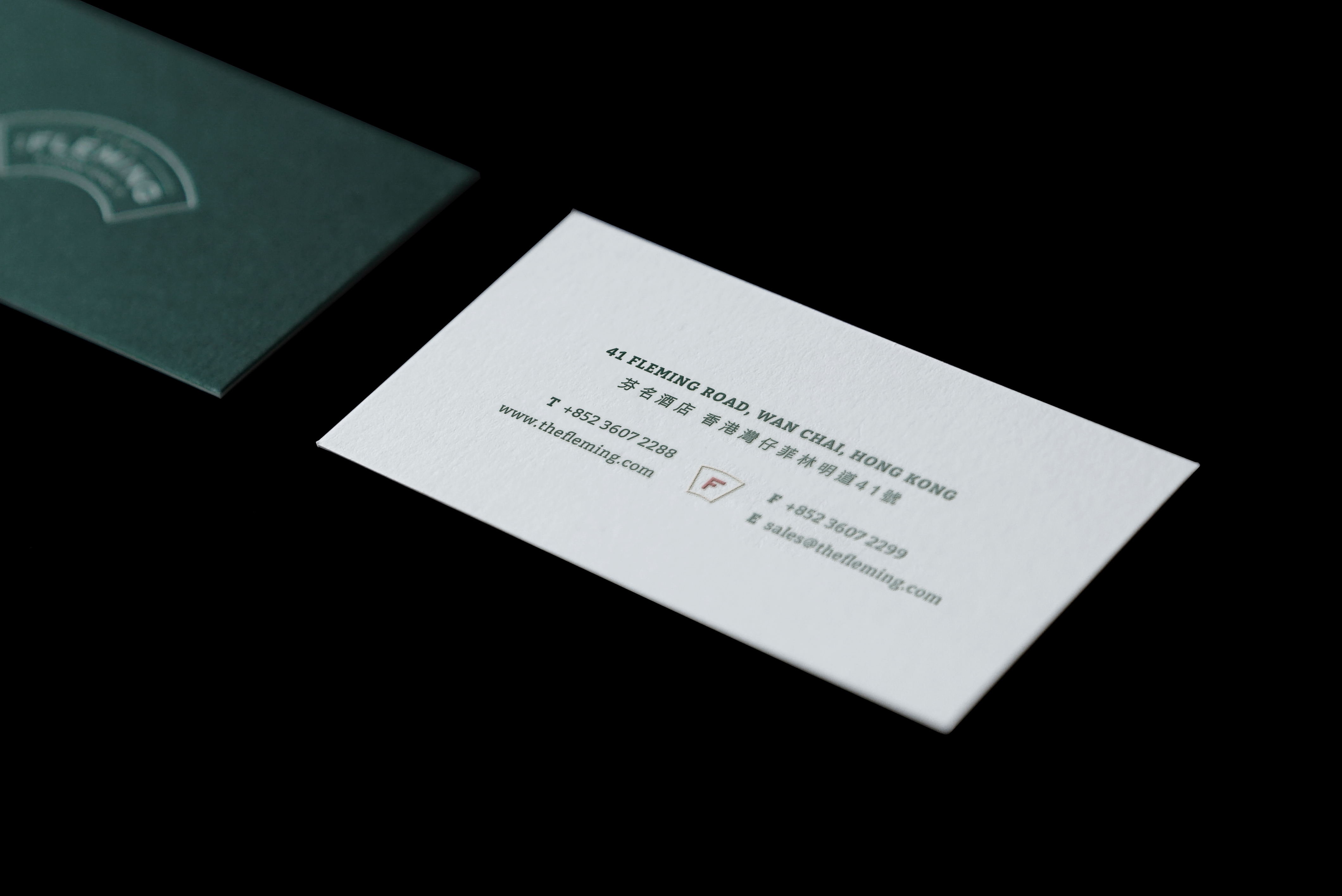
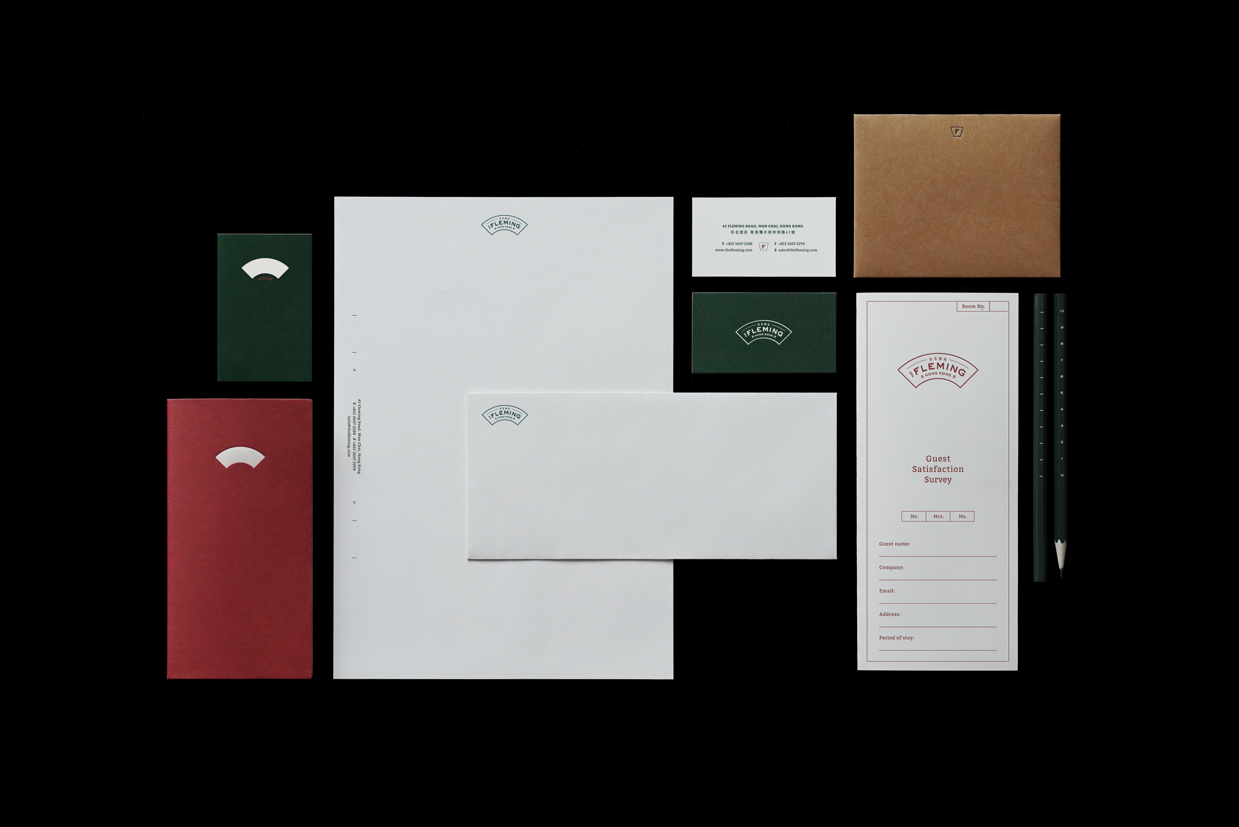
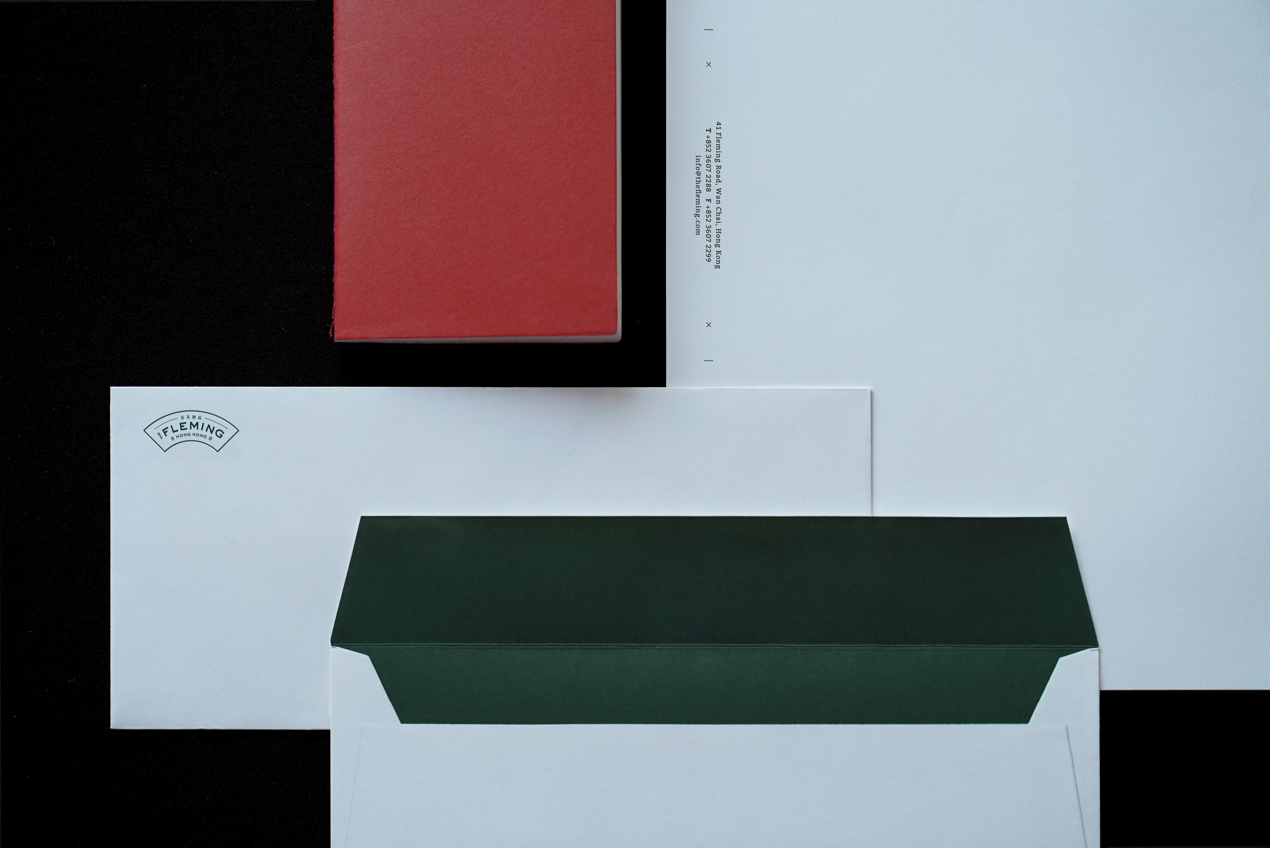
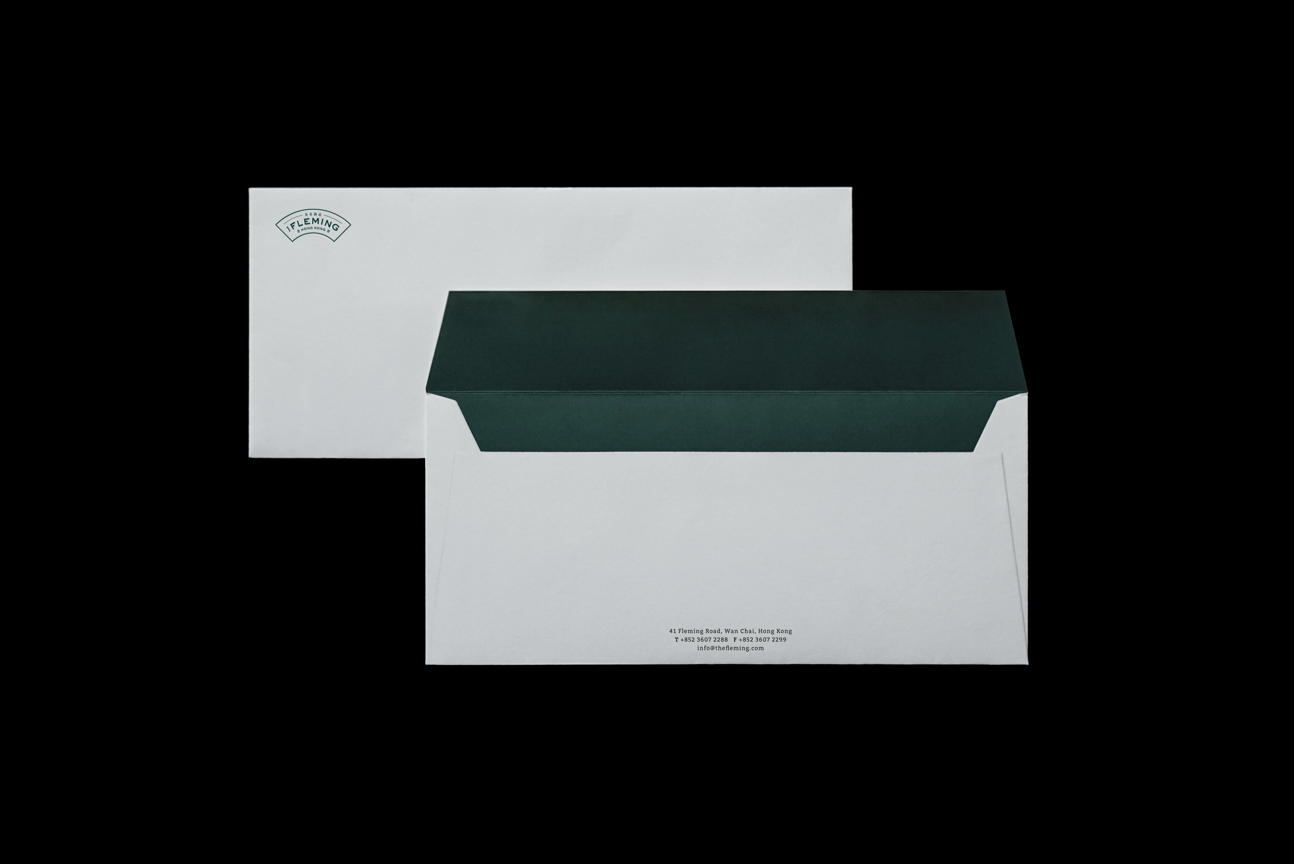
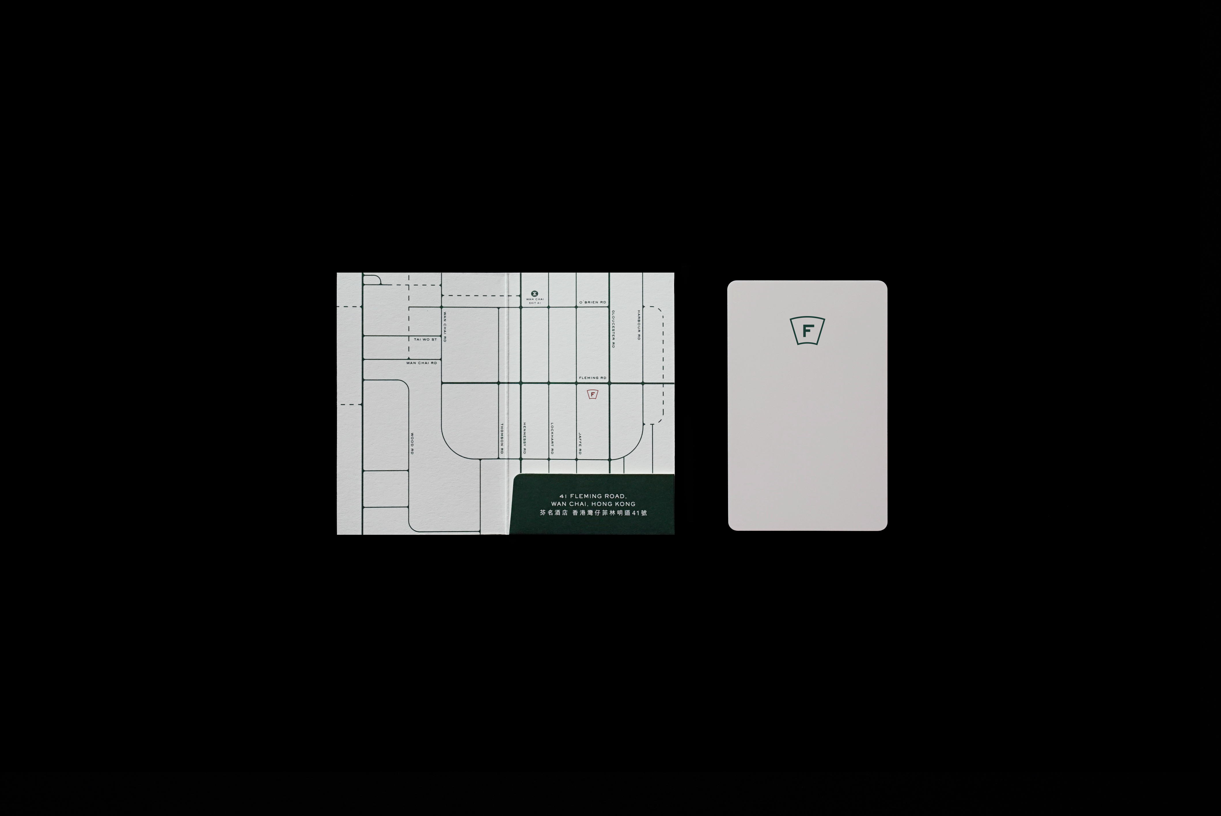
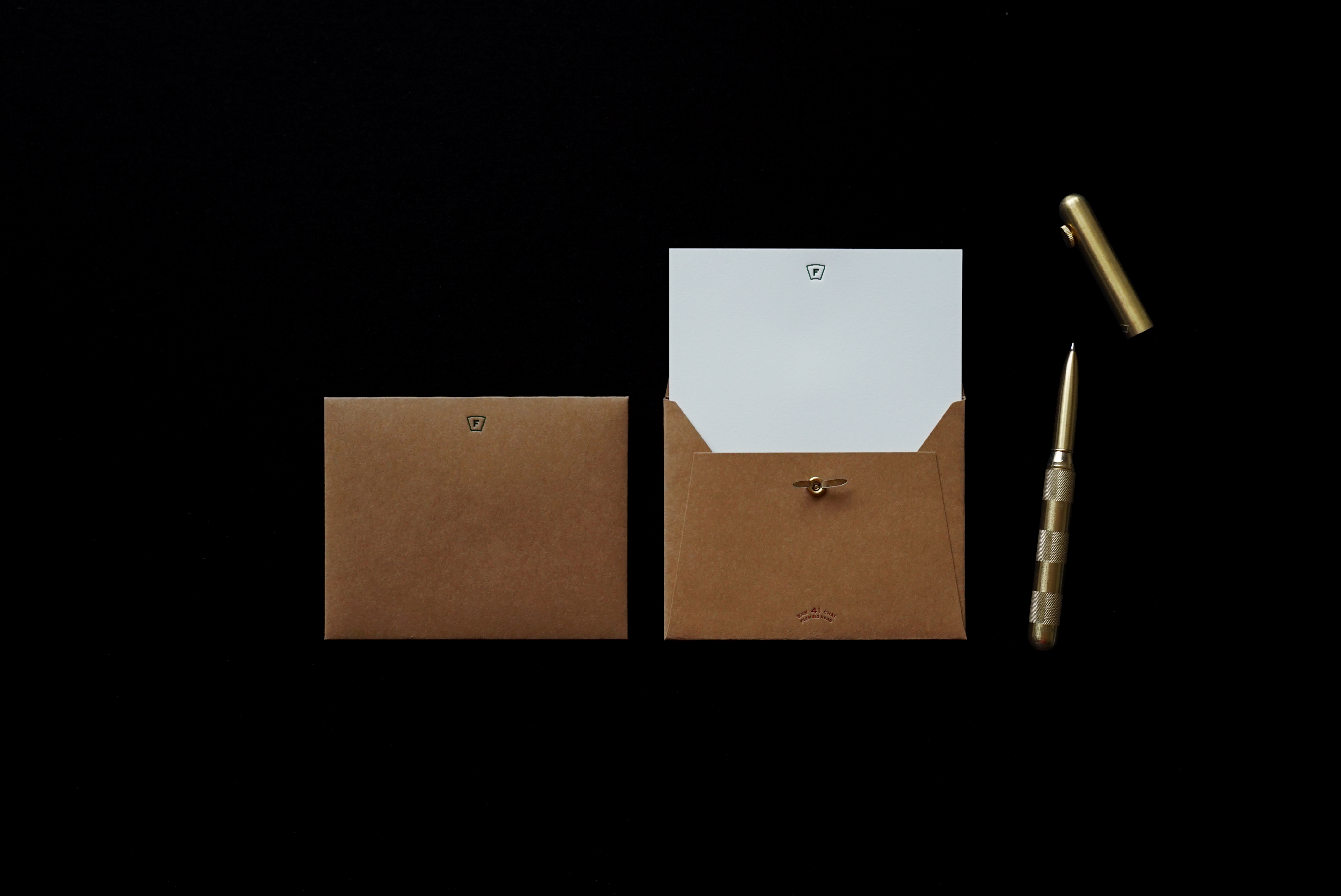
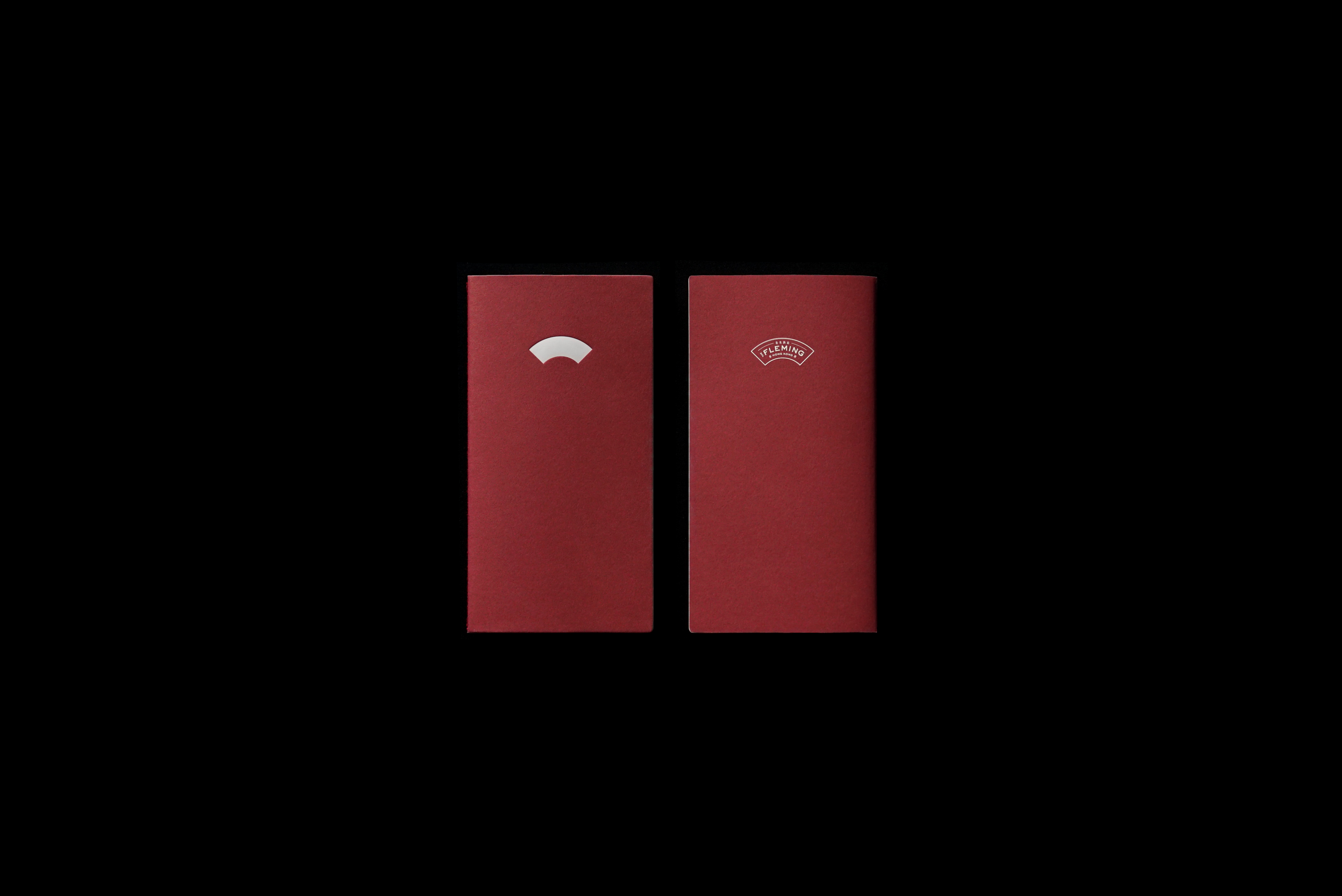
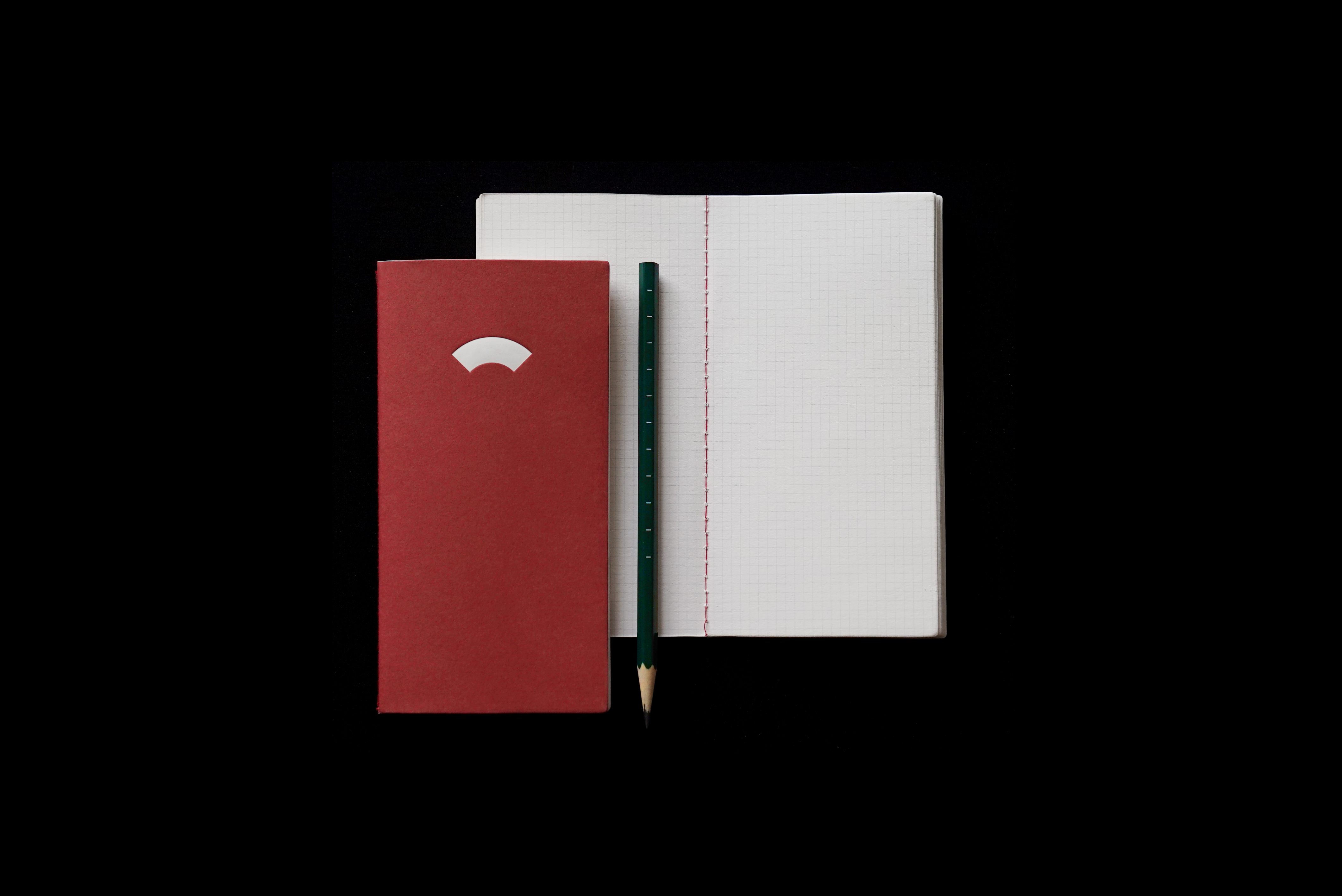
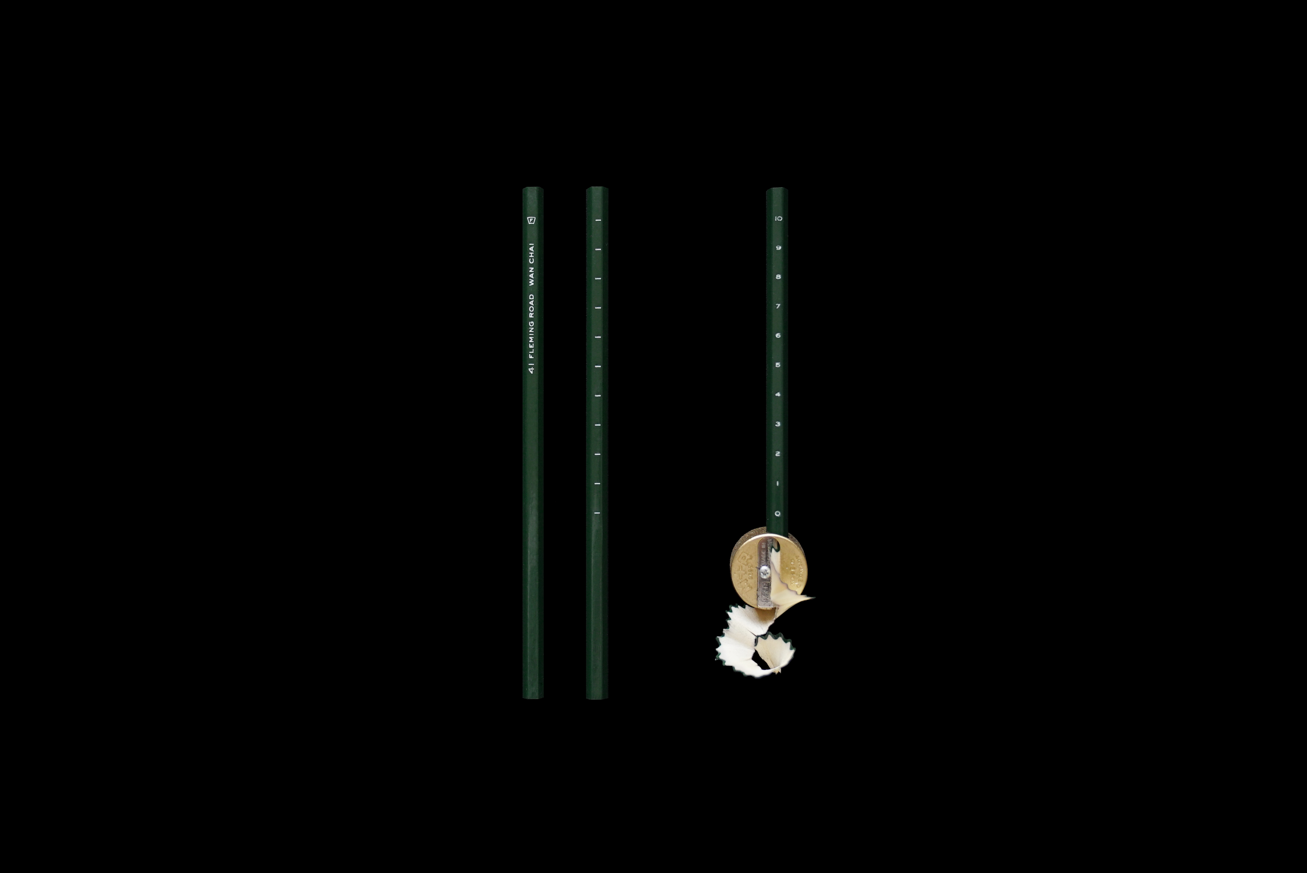
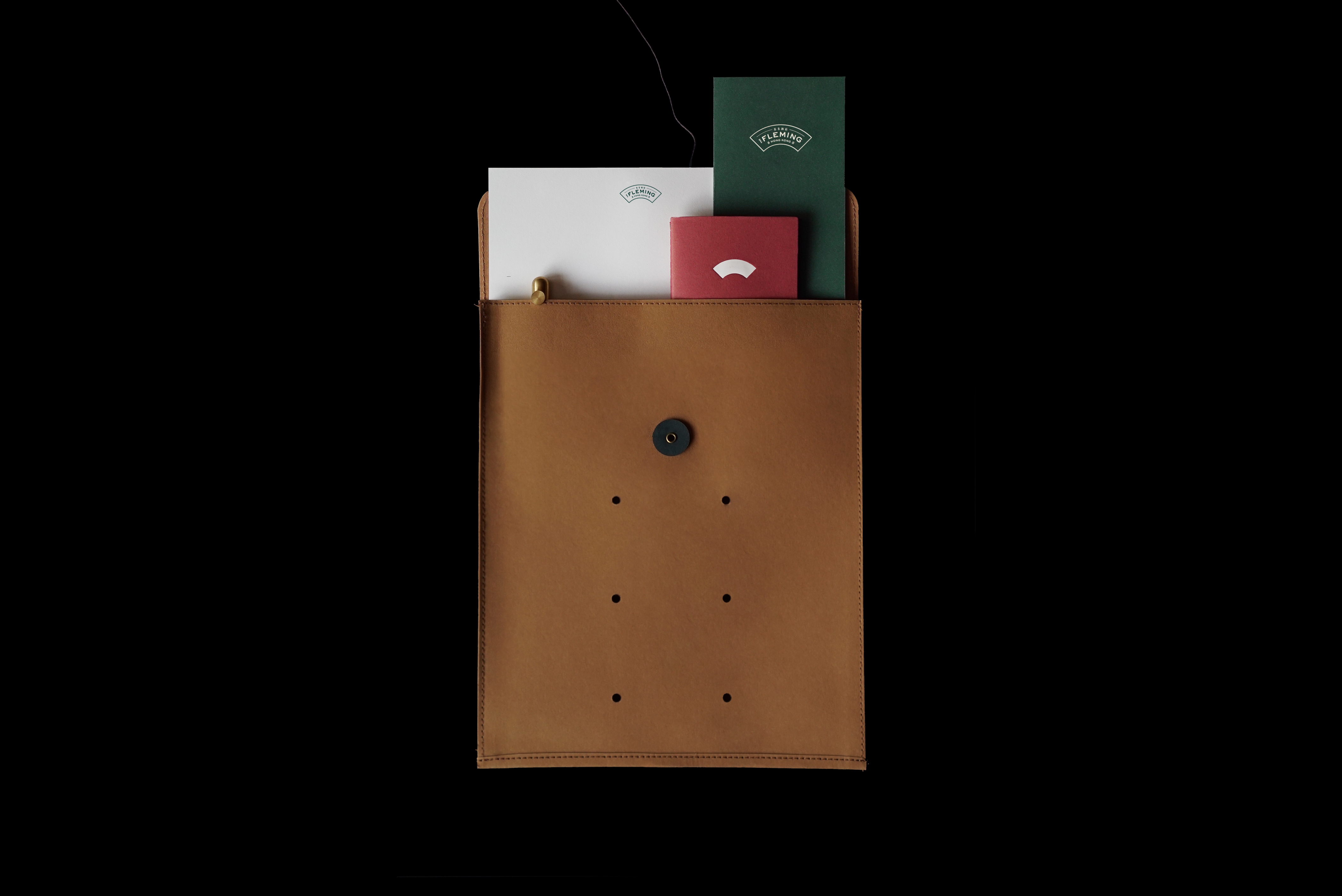
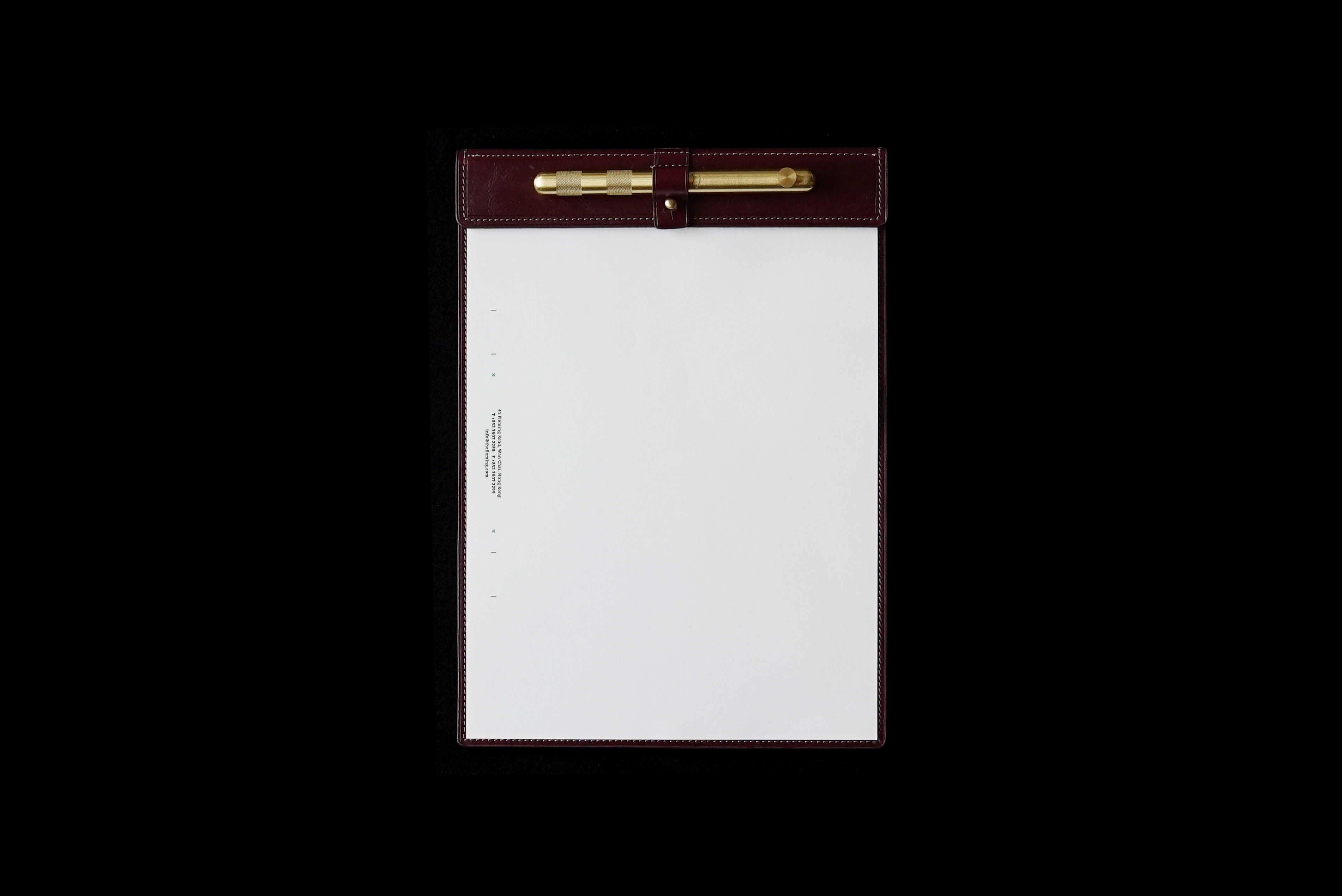
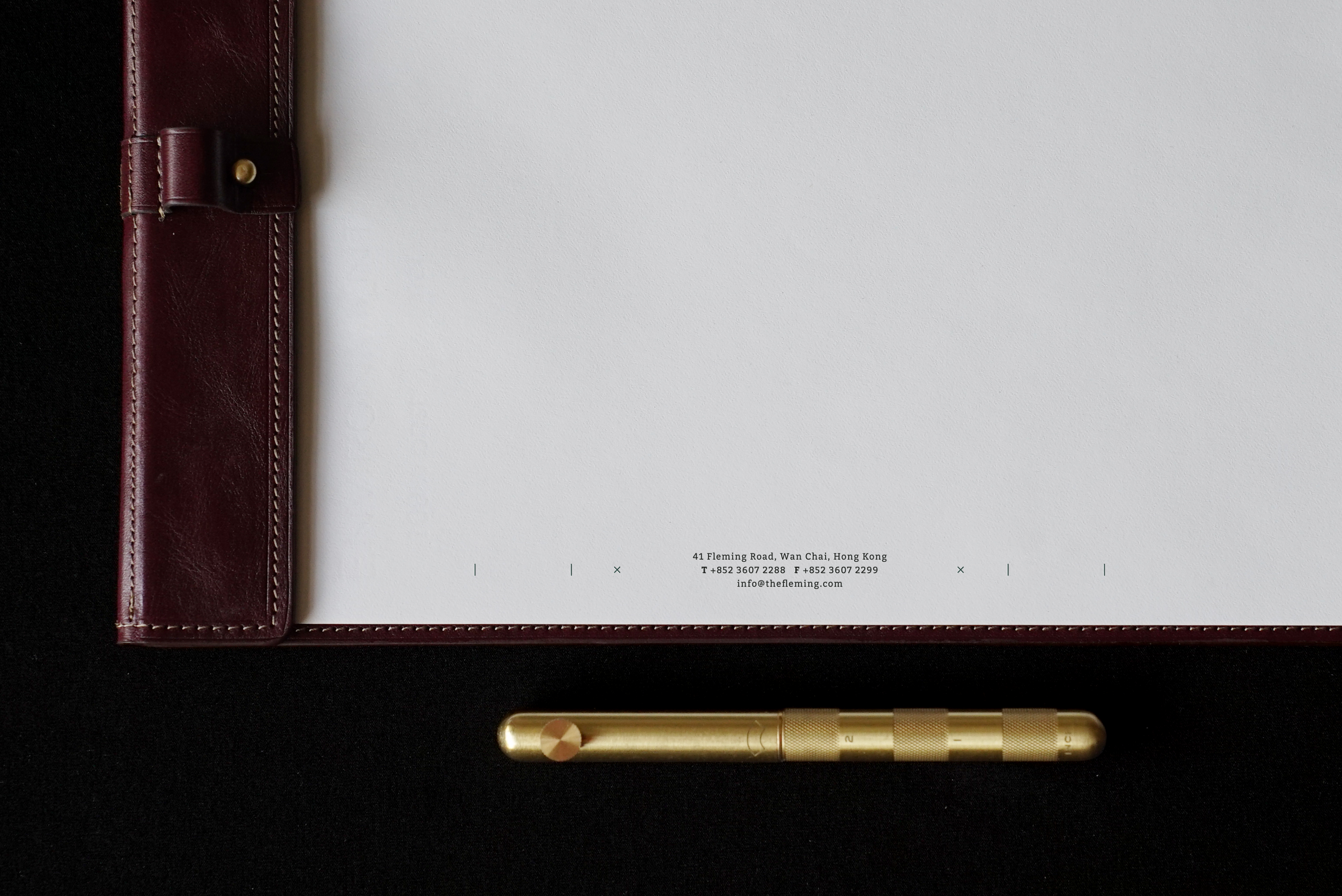
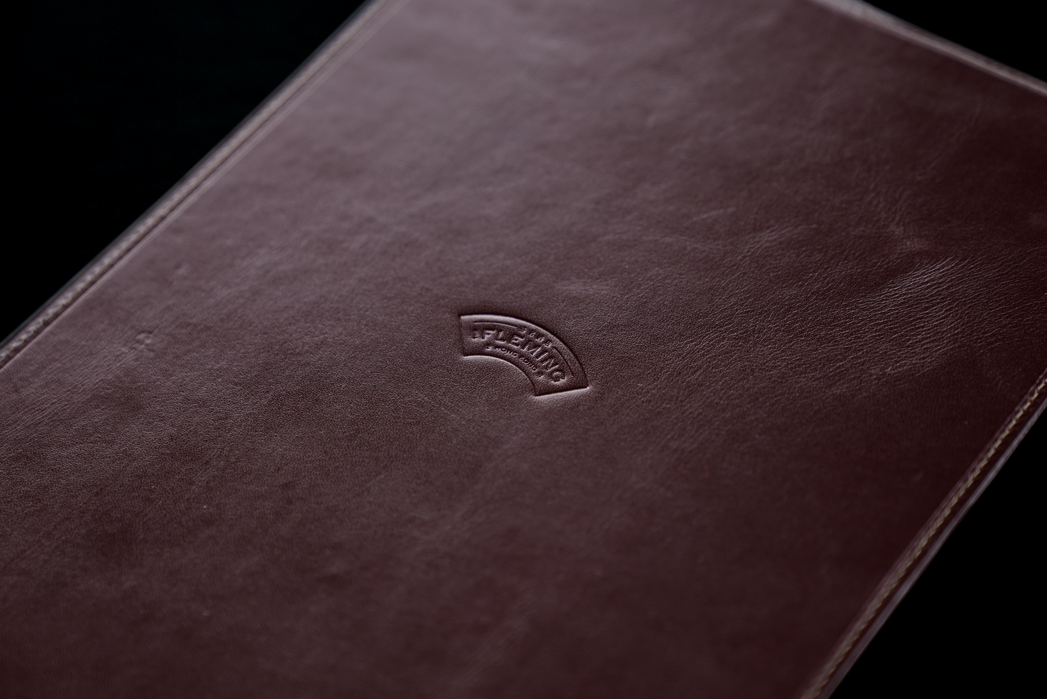
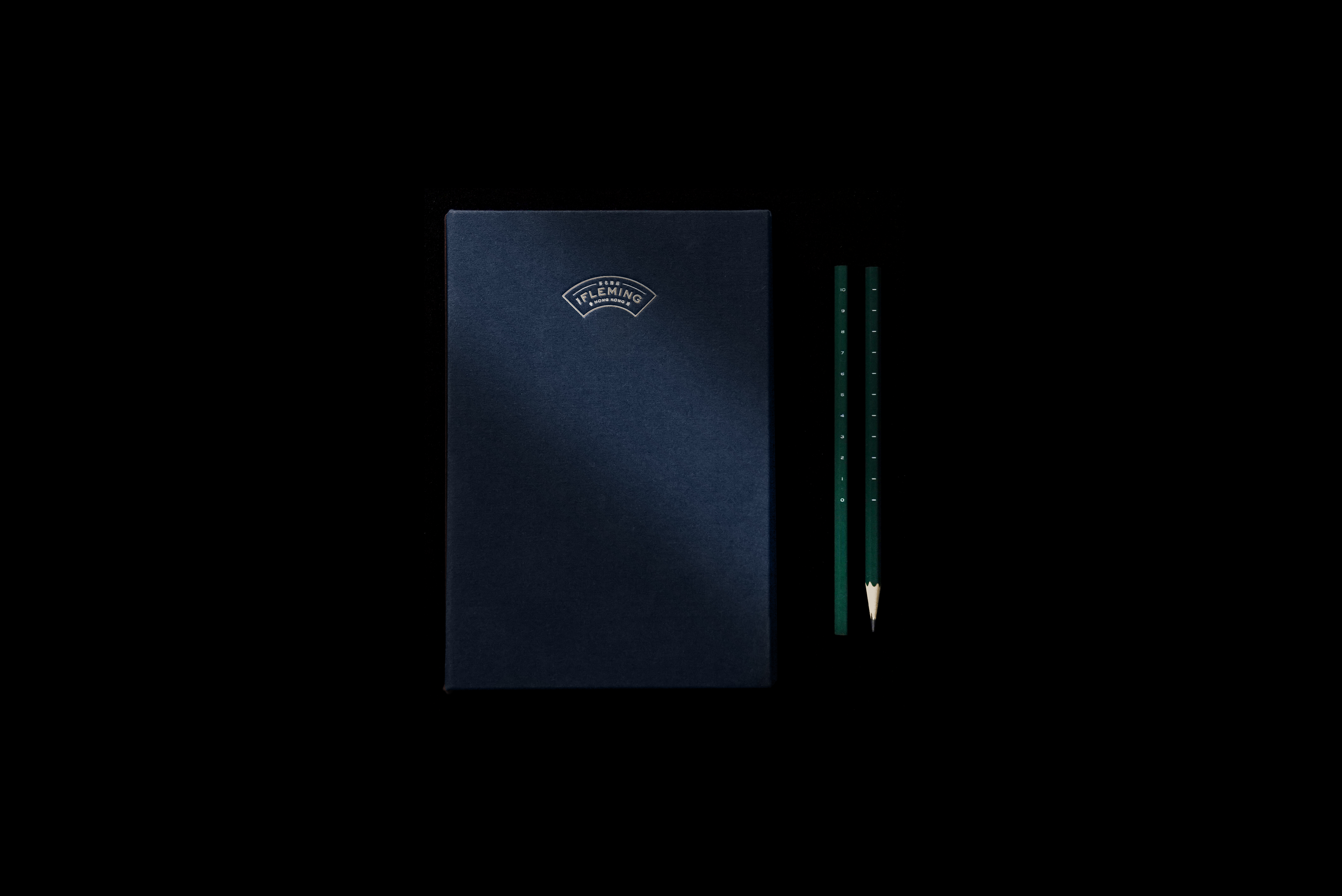
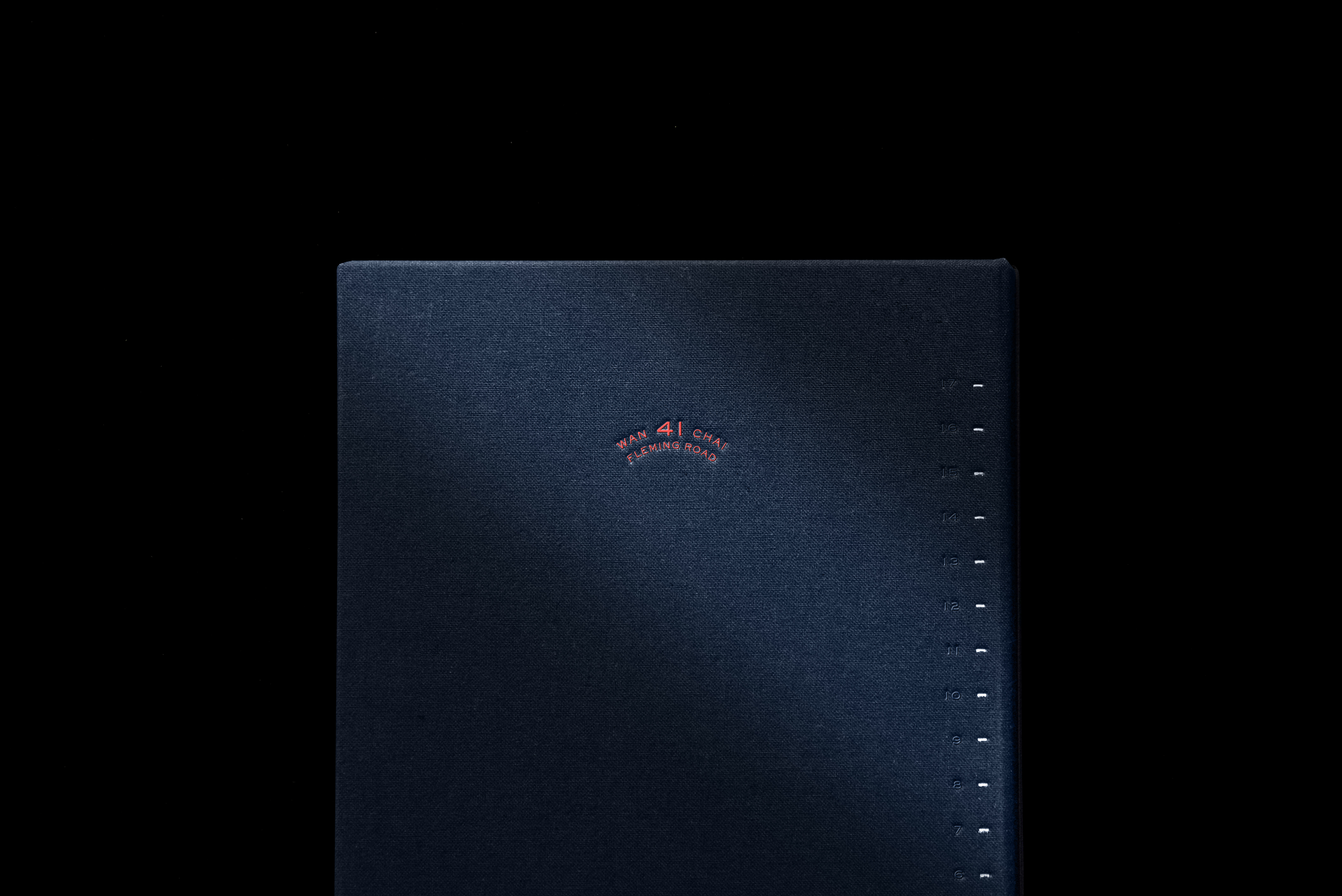
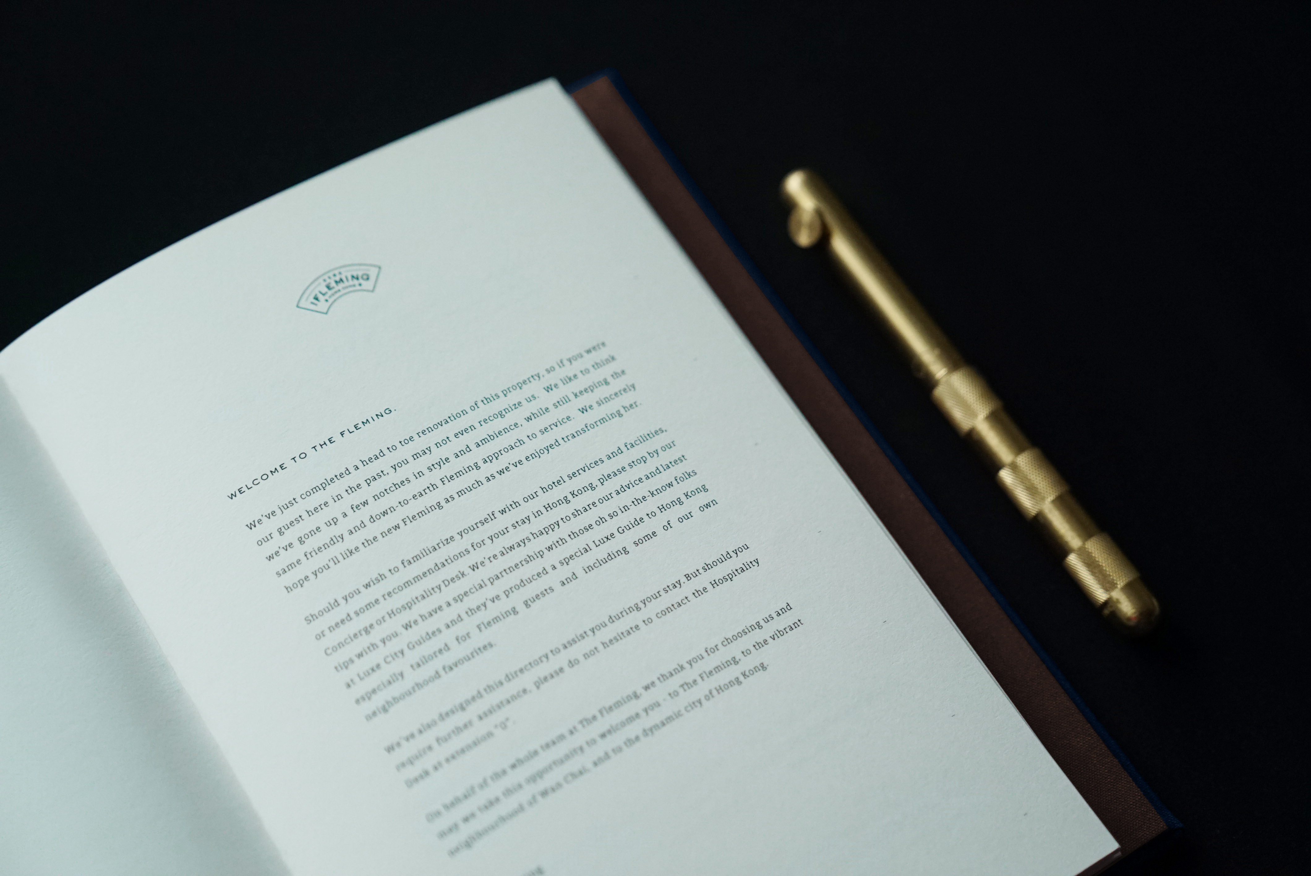
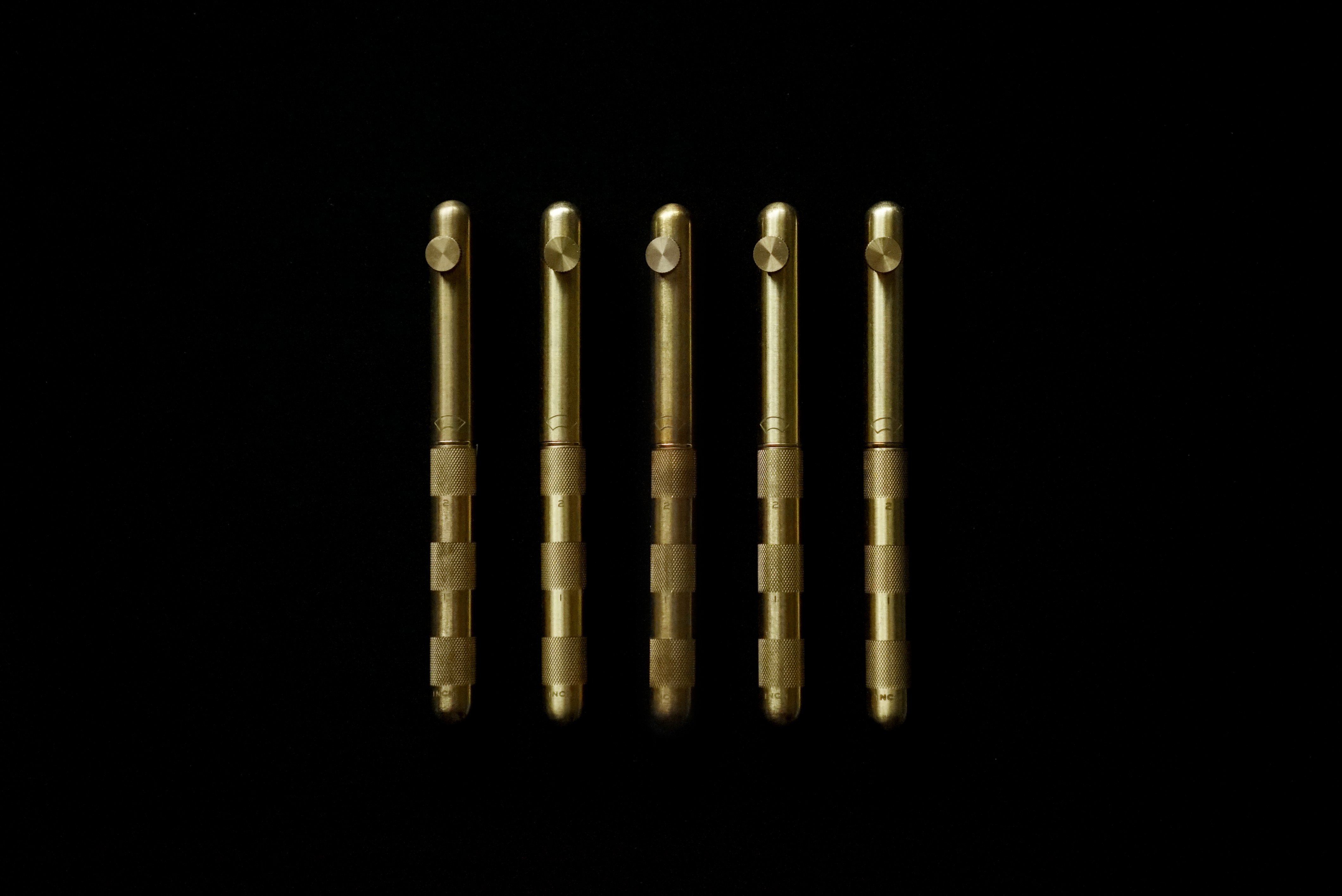
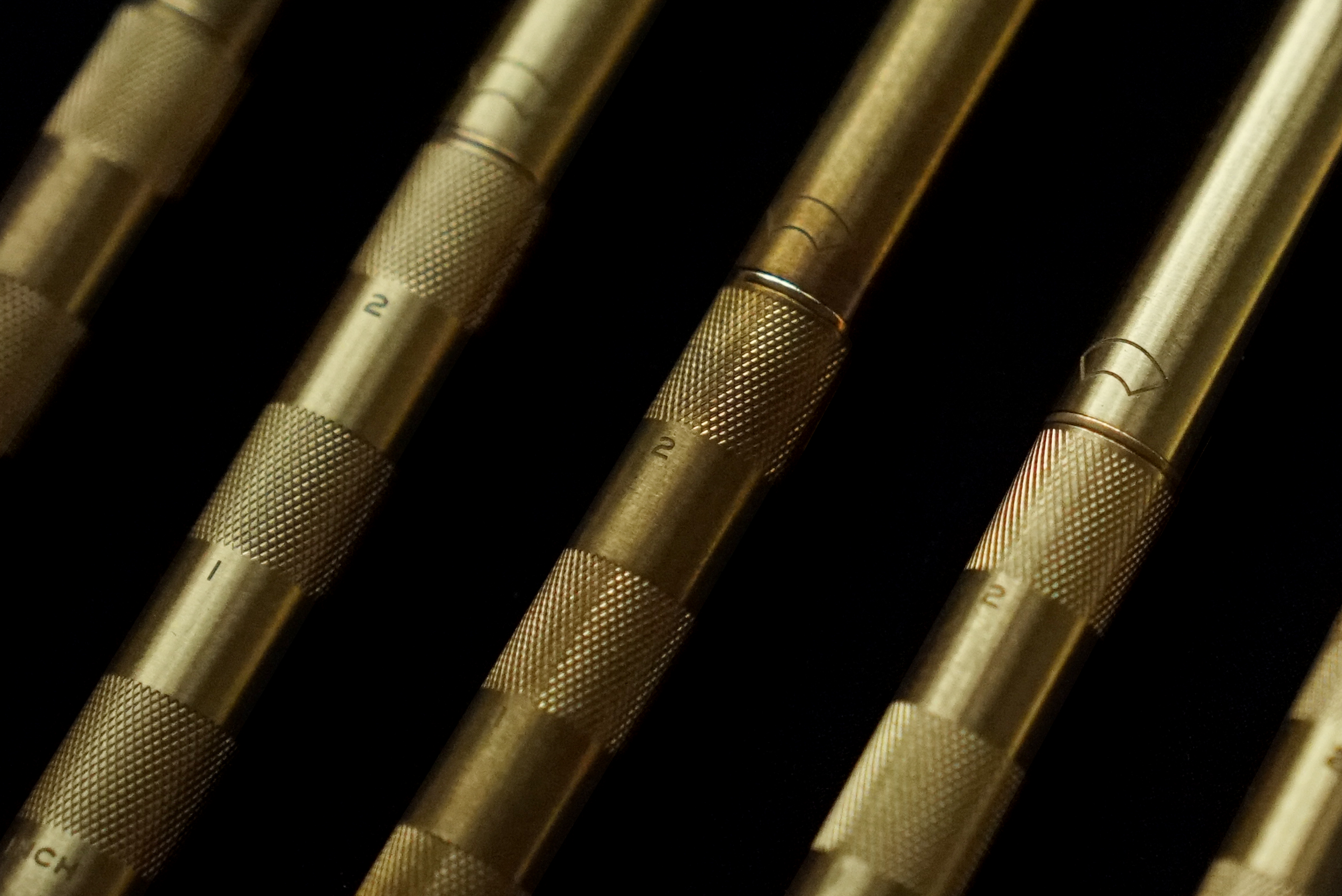
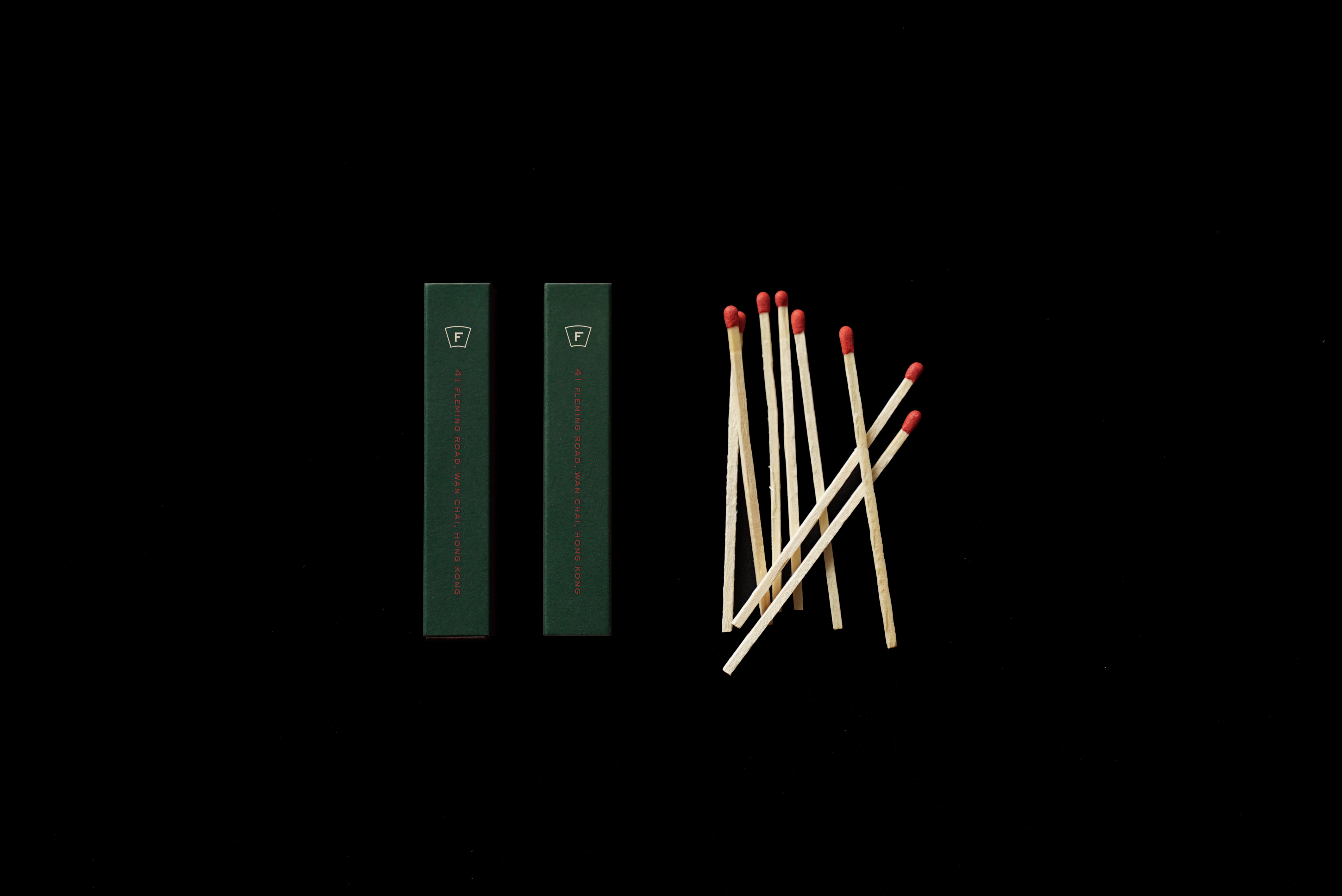
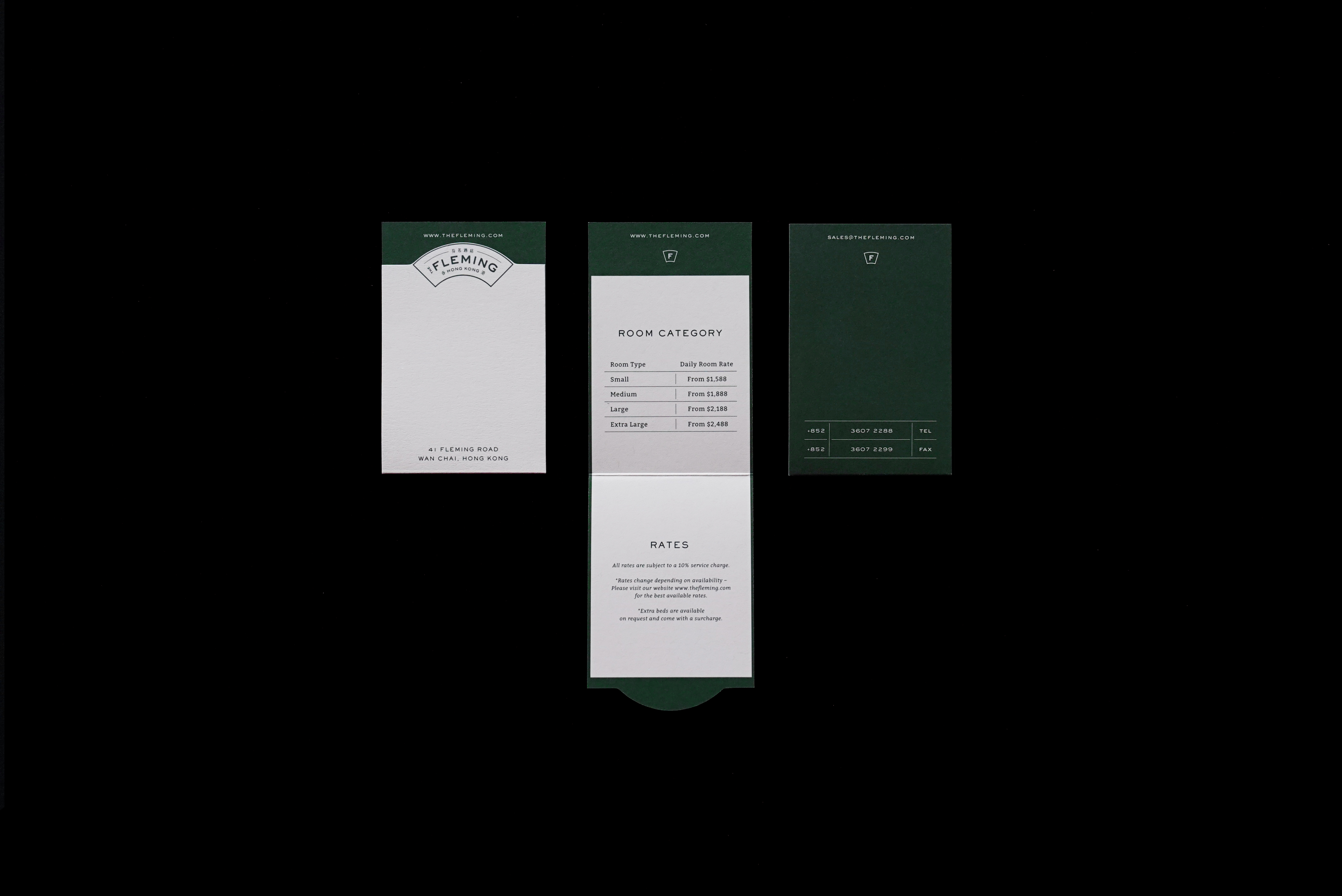
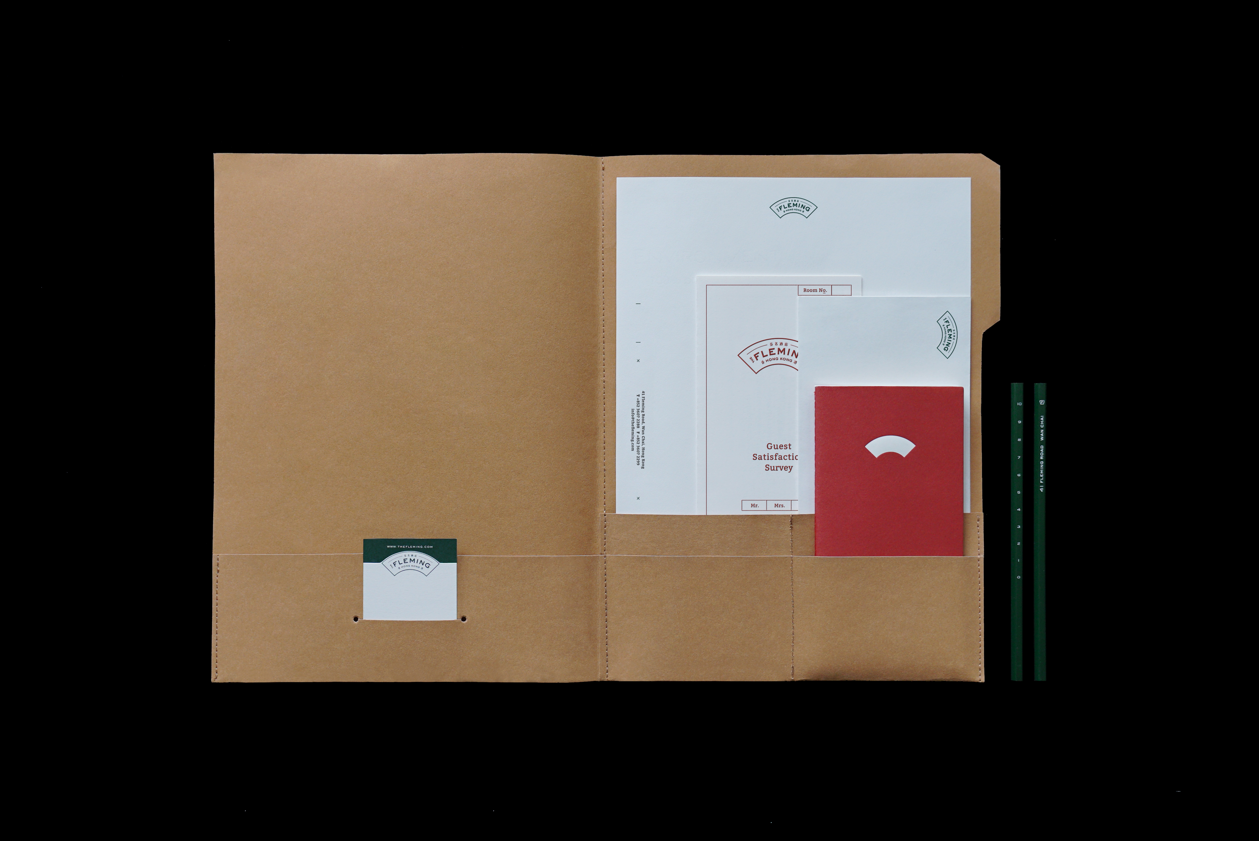
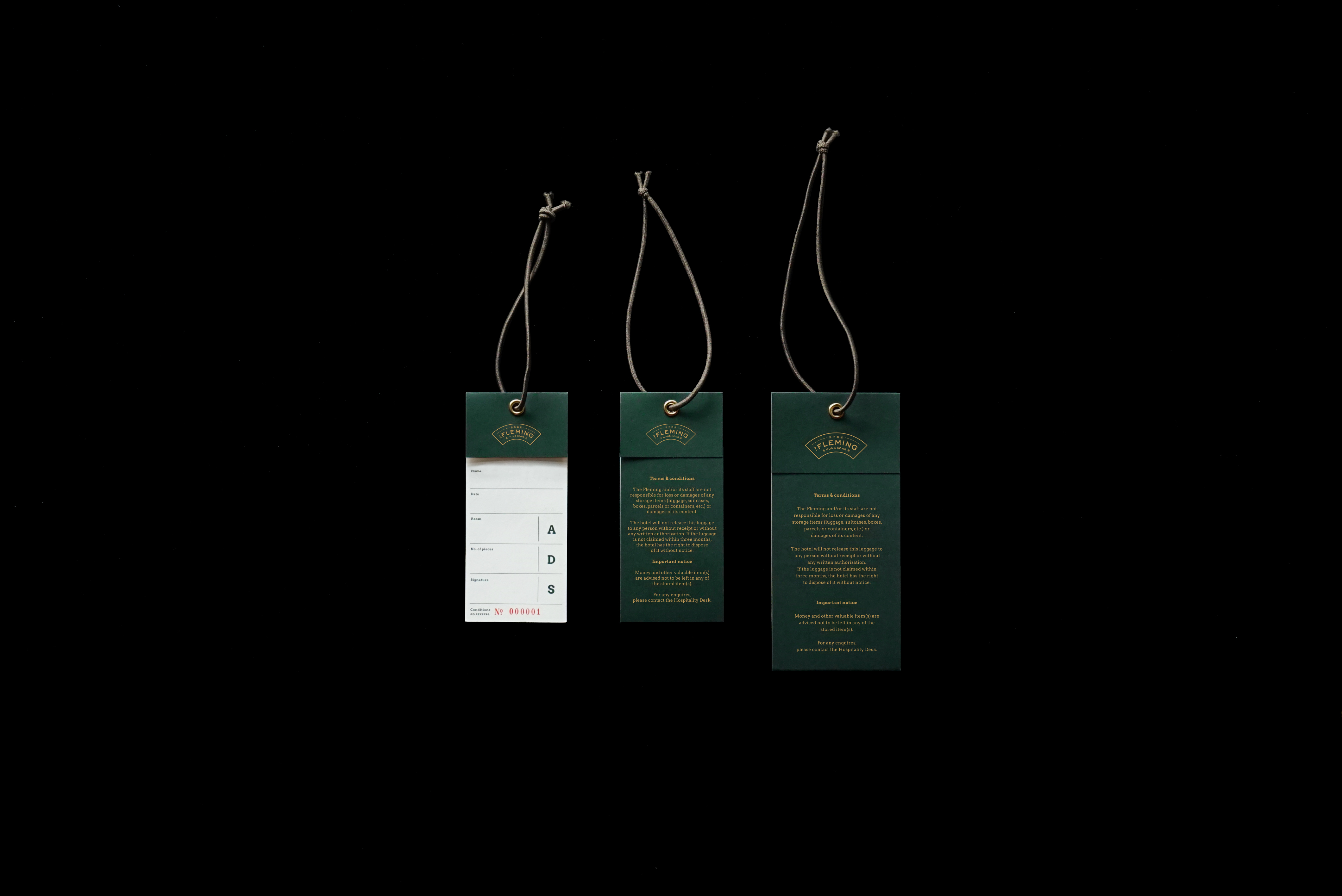
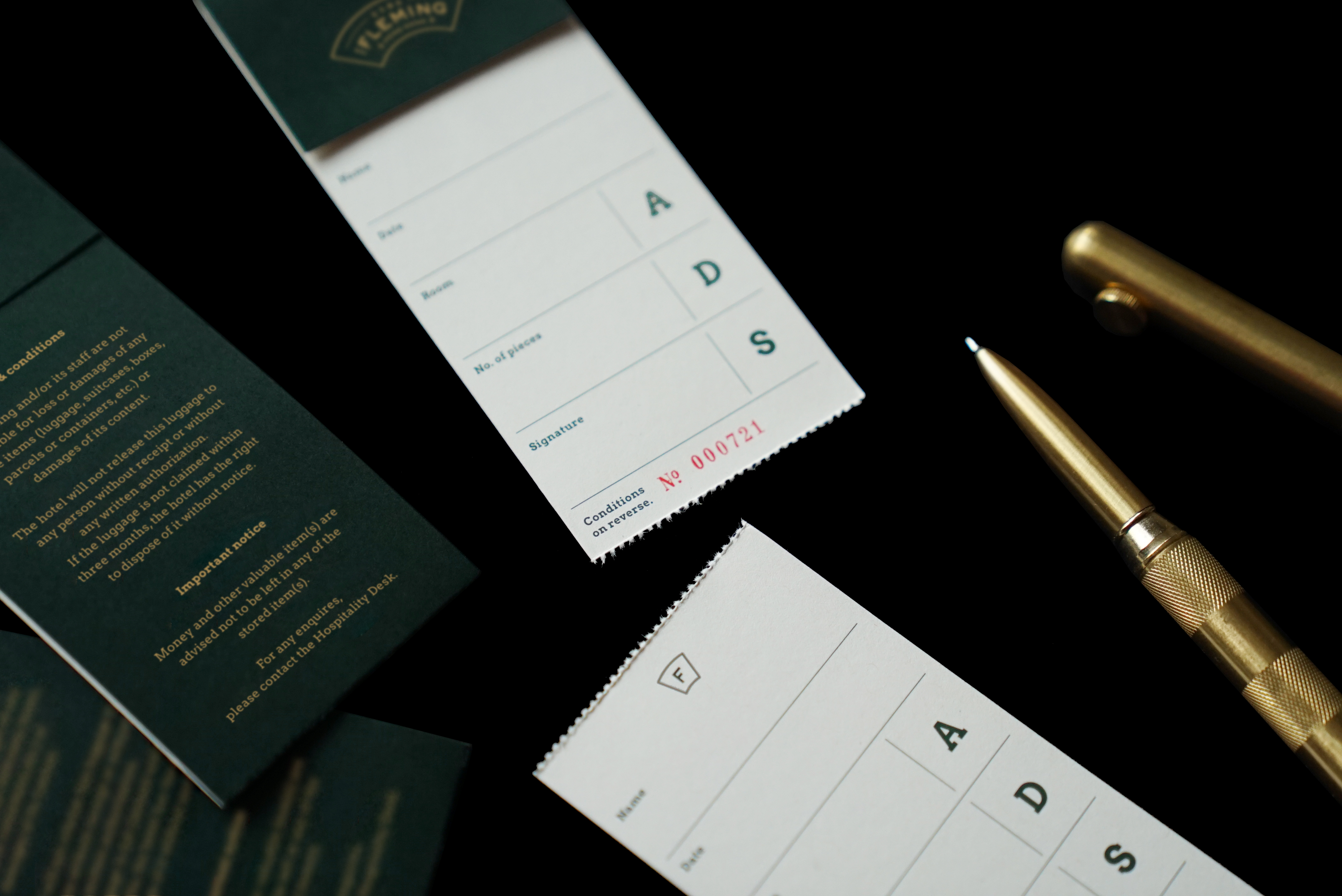
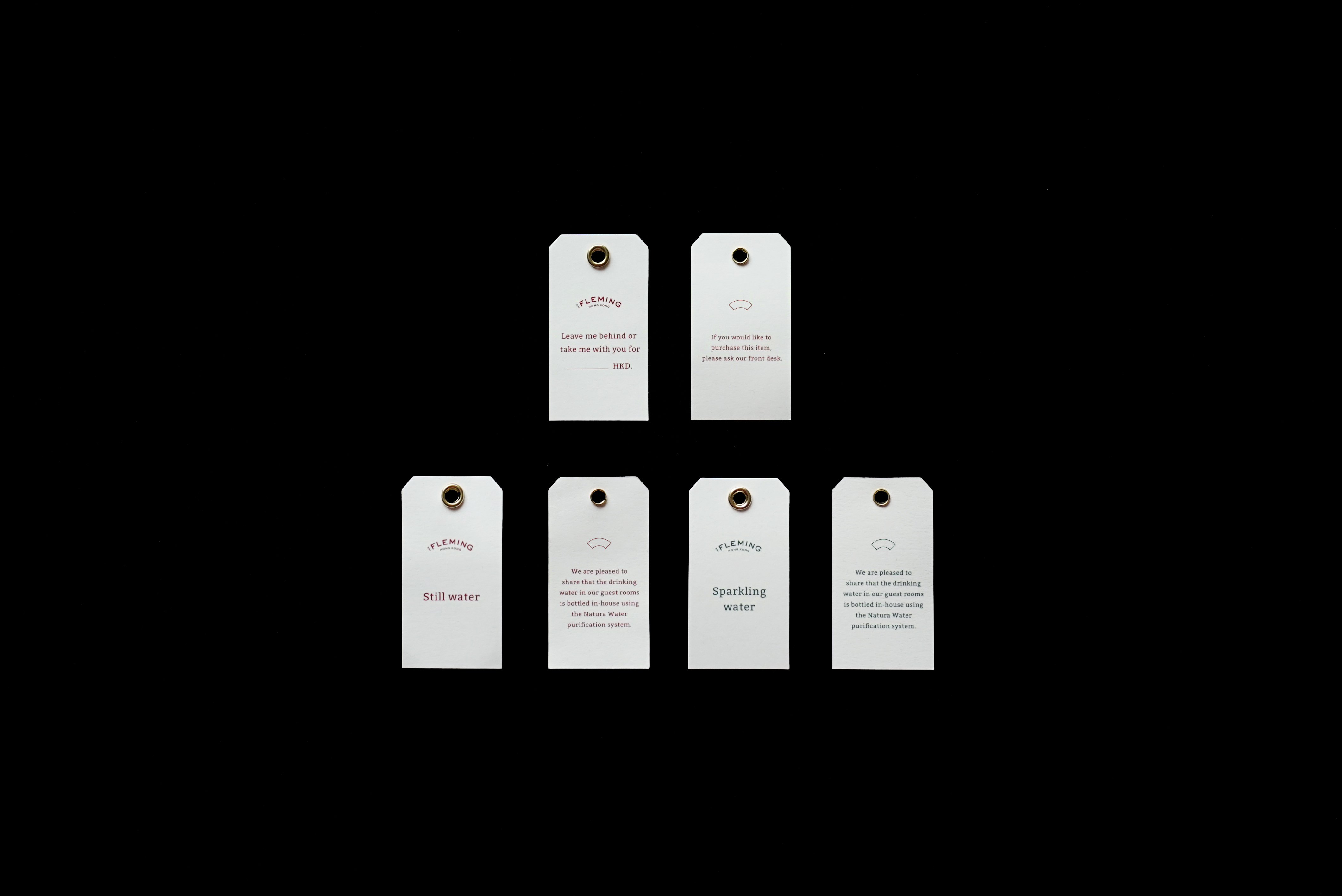
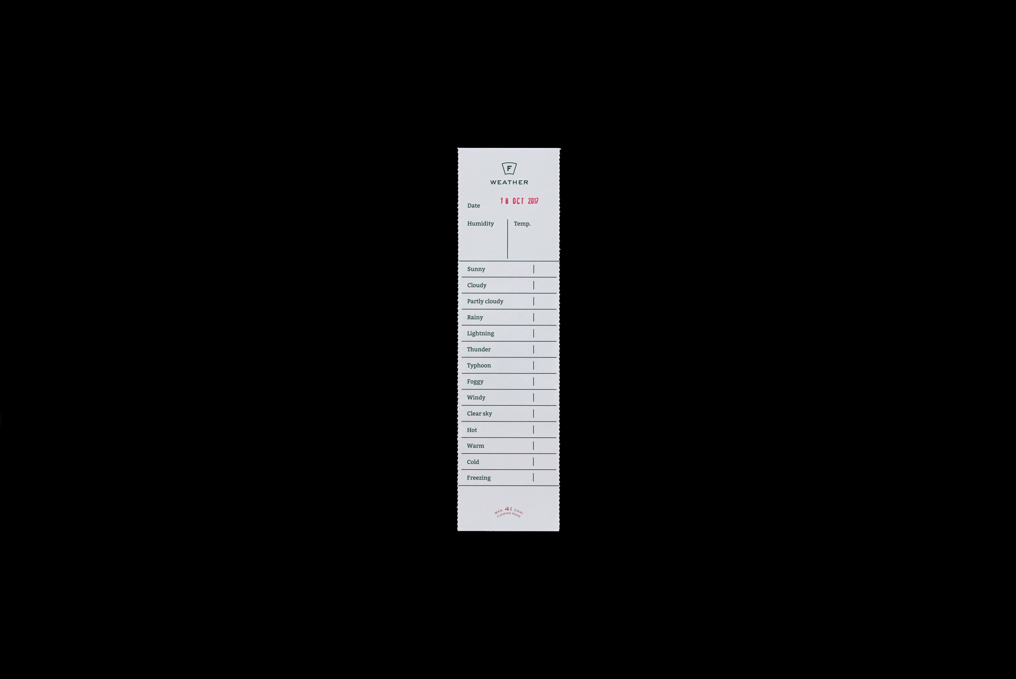
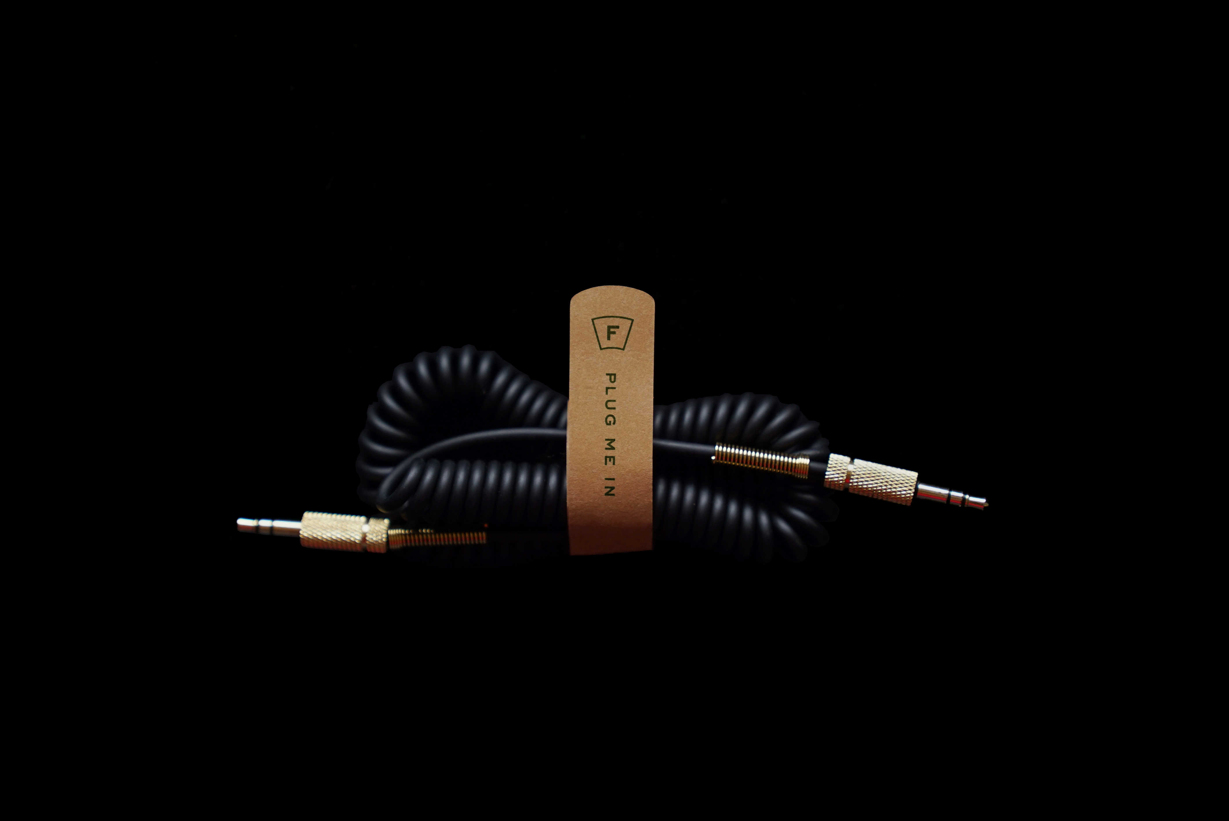
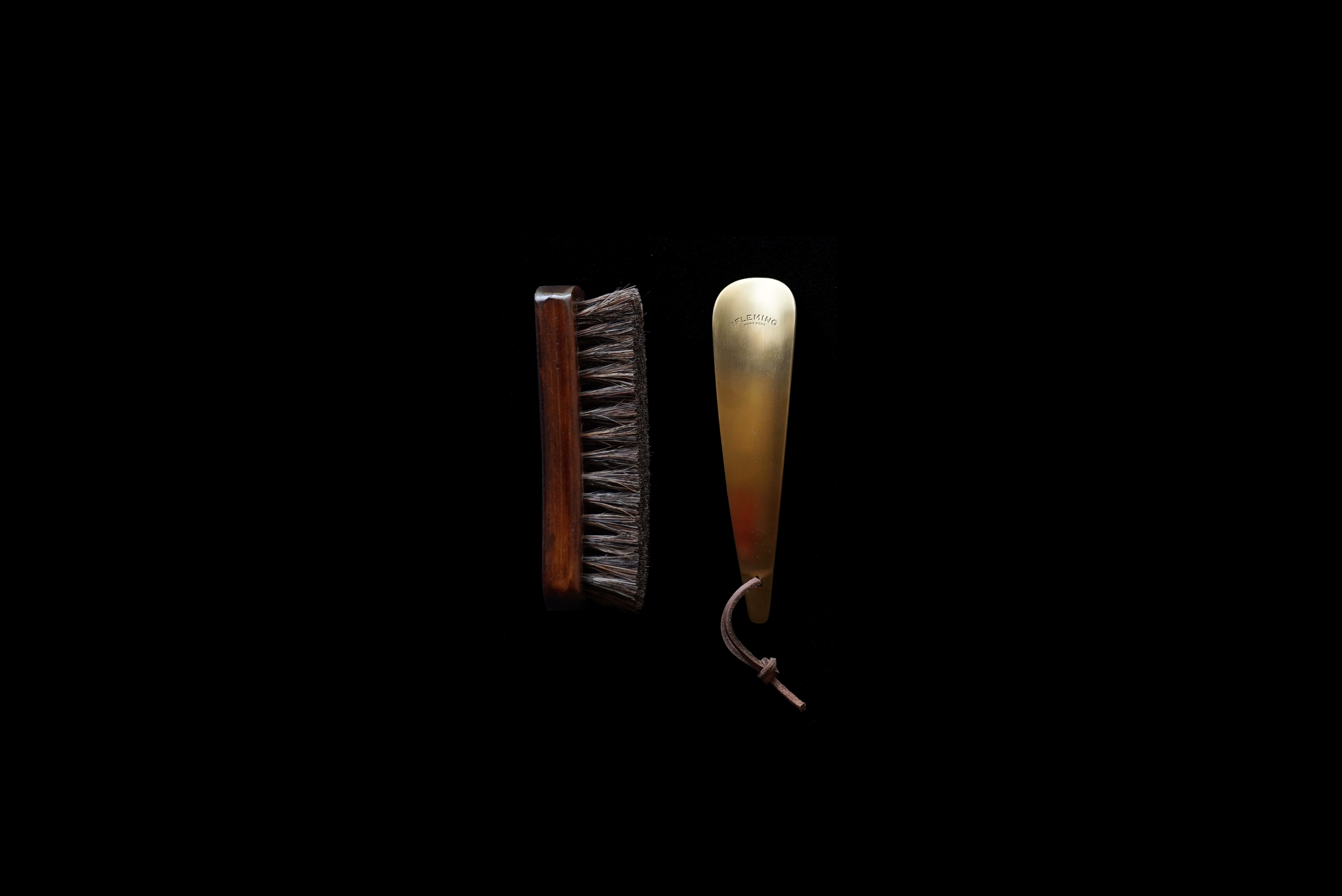
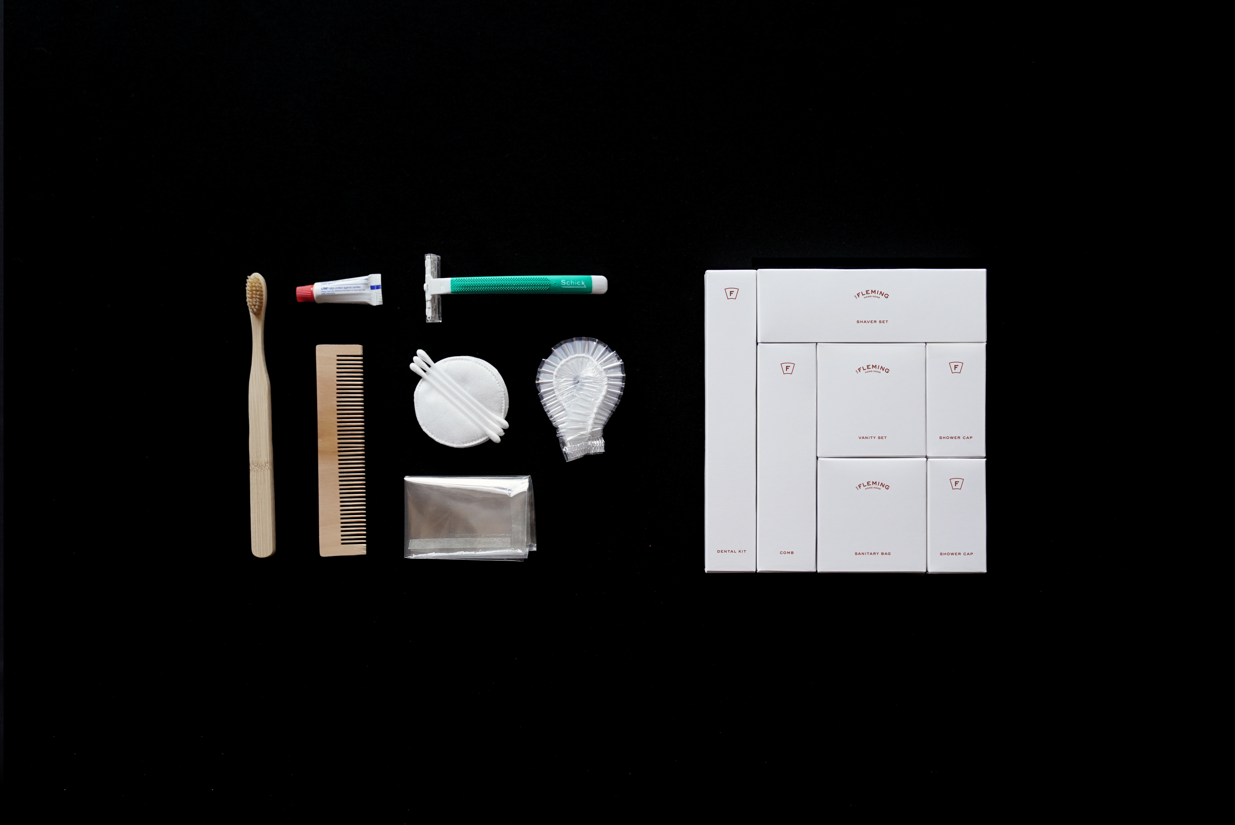
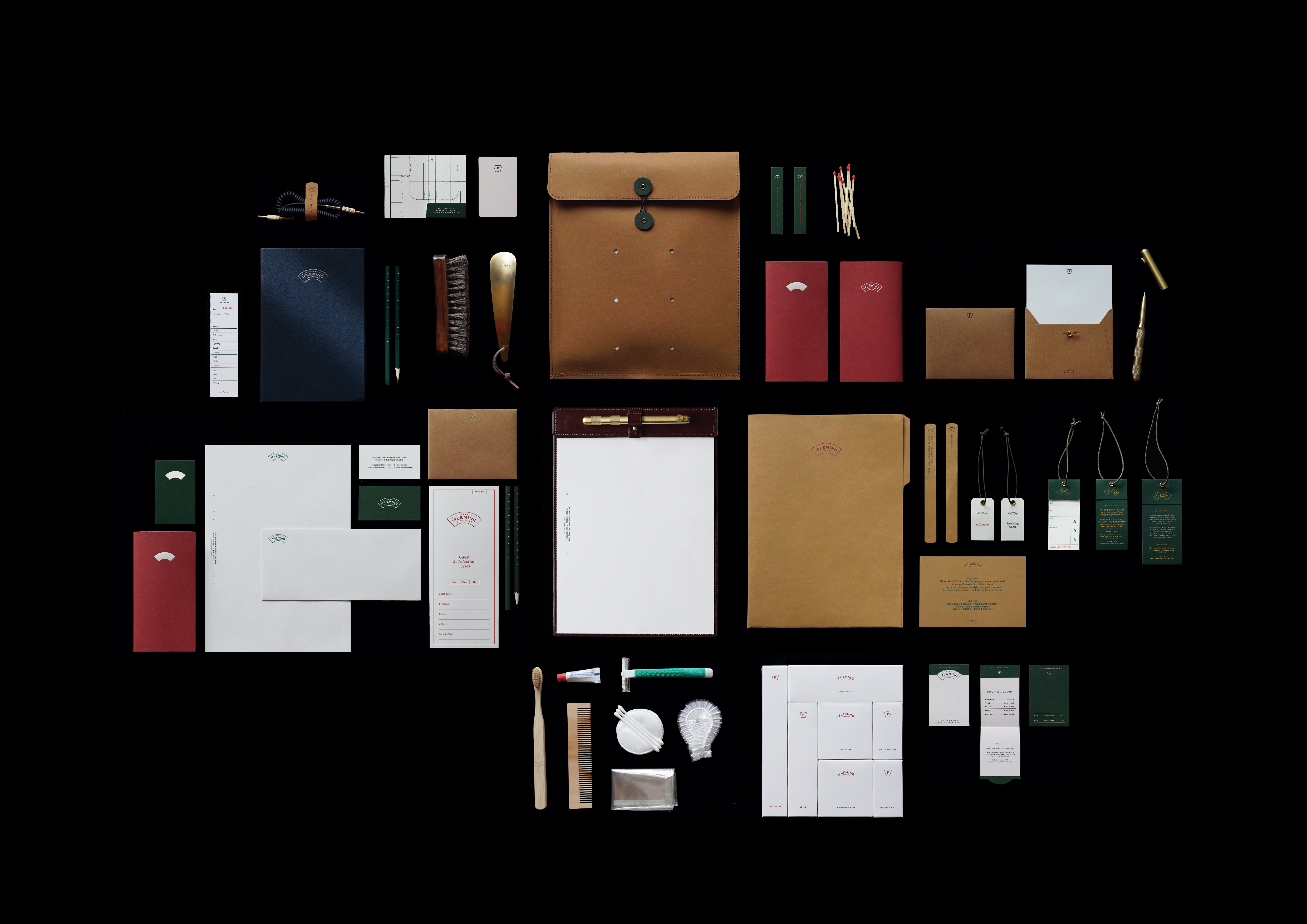
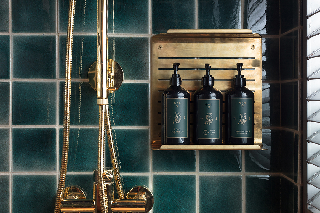
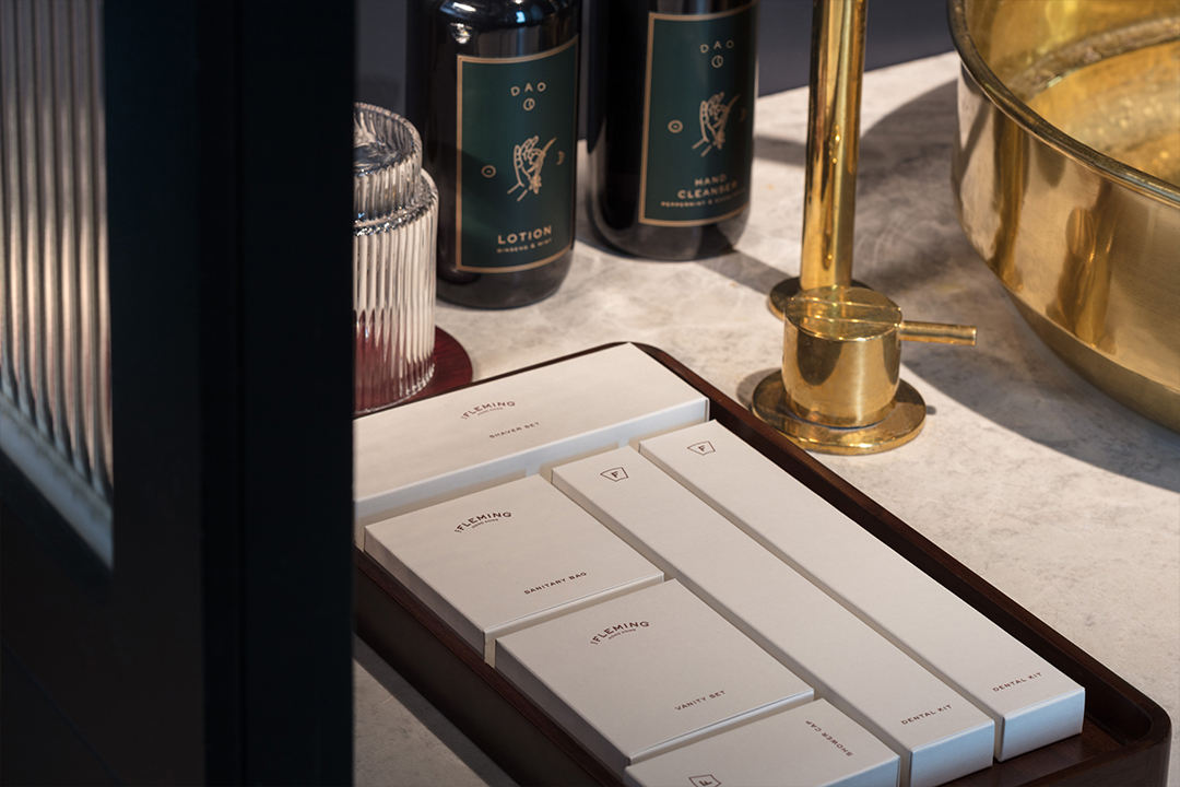
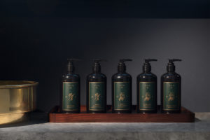
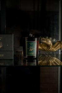
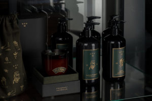
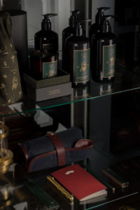
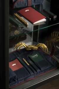
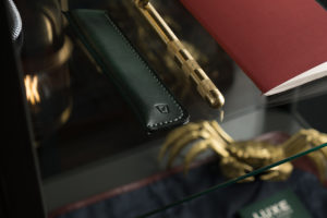
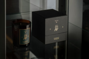
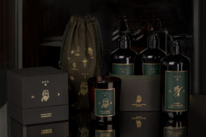
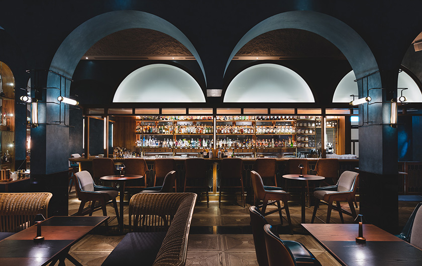
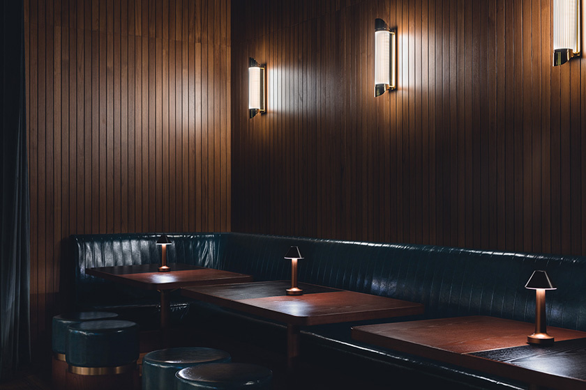
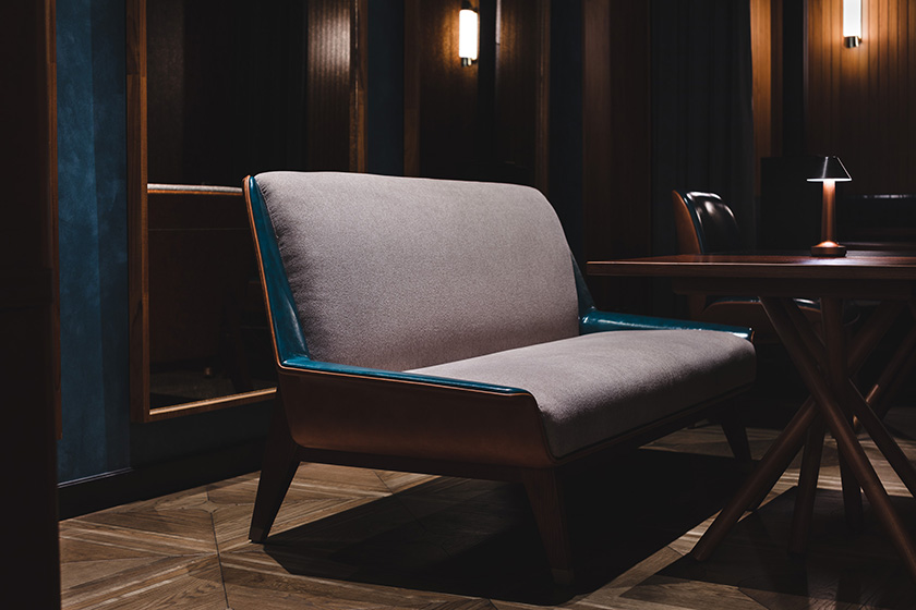
we were tasked to redesign and rebrand the fleming hotel, originally opened in 2006. a new take on the architecture, interior, products, and identity transformed the fleming into a 66-room boutique hotel that is a true reflection of hong kong. occupying a building from the 70s’, the hotel stands in wan chai close to victoria harbour front. the multilayered design concept draws inspiration from the location and history, leveraging Hong Kong’s maritime heritage and 70s’ industrial era to create a cultural, social and efficient character. one landmark that embodies these three elements is the star ferry — having connected people across the harbour for over a century, it is a piece of hong kong’s collective memory and identity. the star ferry, a unique and elegant icon of Hong Kong’s past and present, became the foundation for every design detail, including the custom designed furniture and lighting. nostalgia is further evoked by colours and scents: Carmine reds and bottle greens — hues seen on the hull of Hong Kong’s ferries, fishing boats, delivery trucks, and temples —and apothecary-inspired toiletries and custom aroma of sandalwood and amber notes, to deliver an authentic sense of place.
photographs by: dennis lo & judy chen
