scents of dao

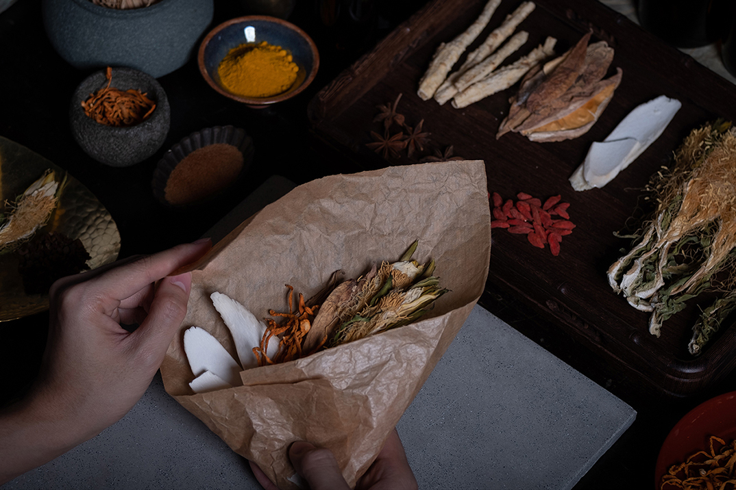
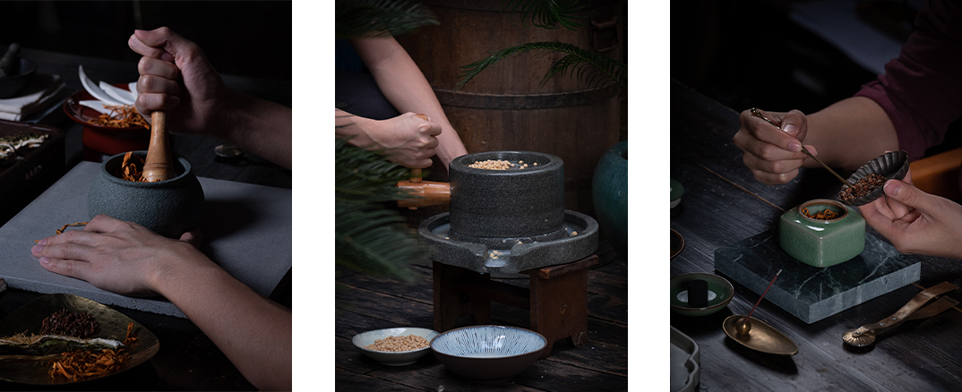
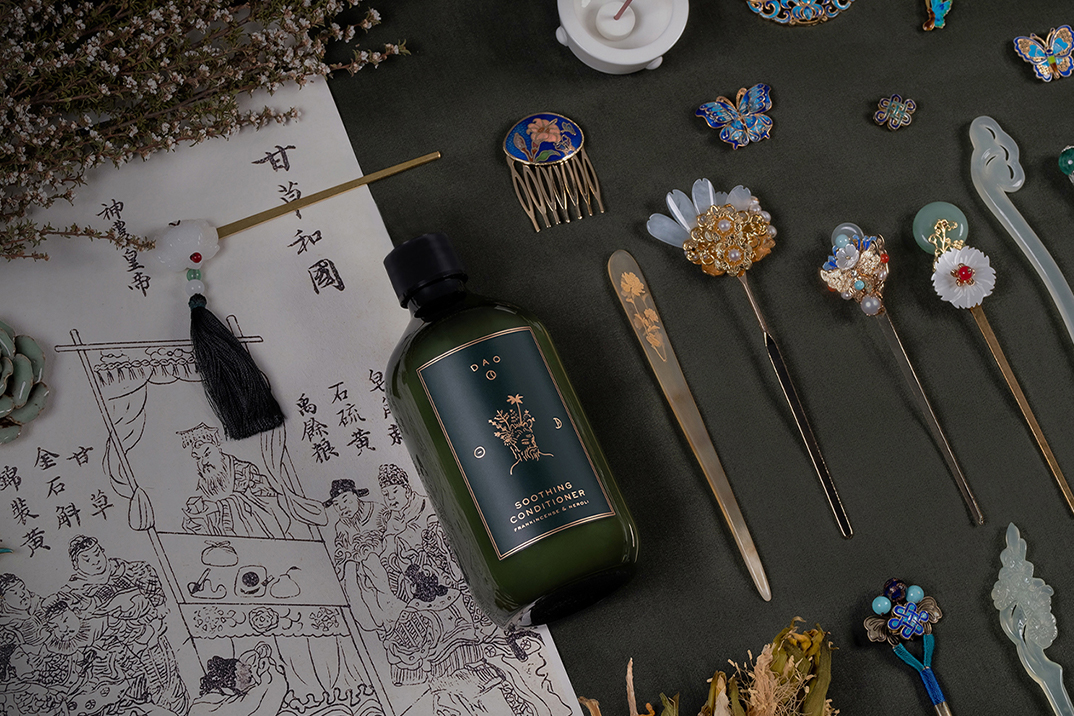
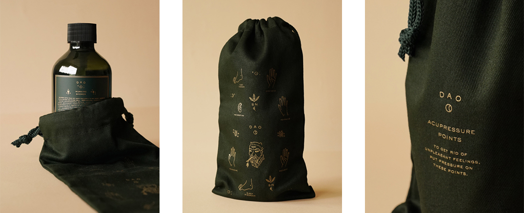
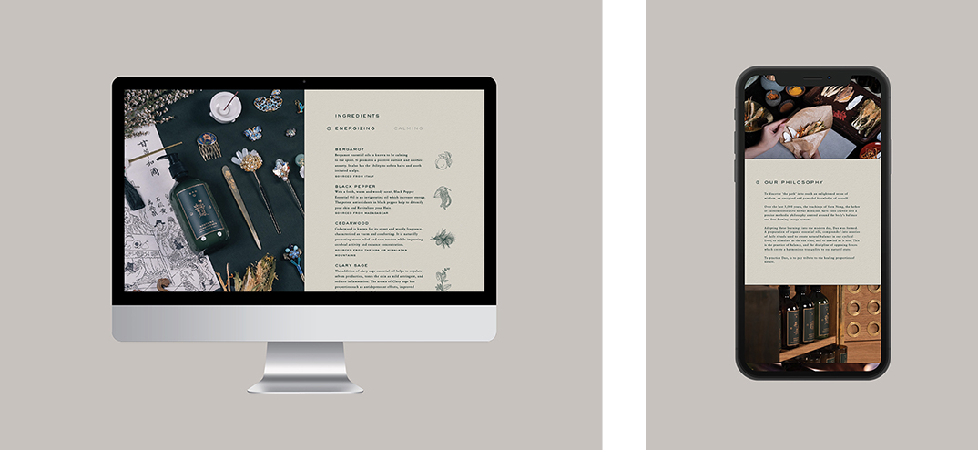
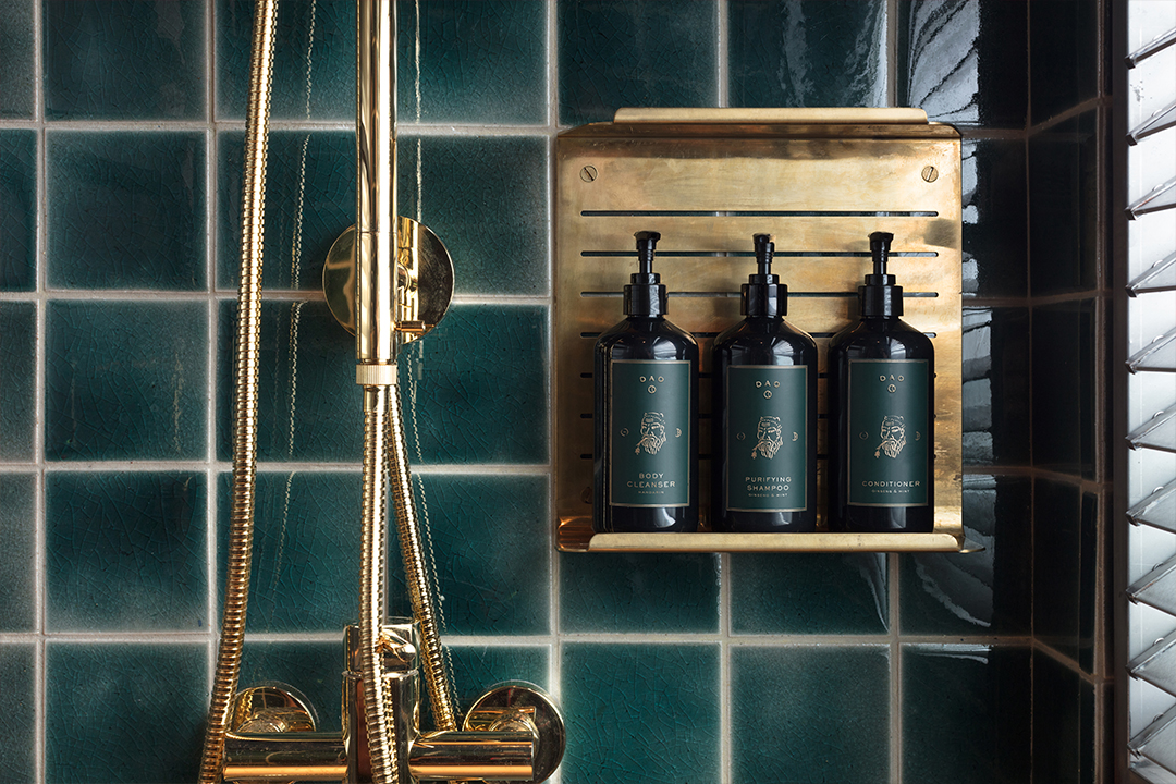
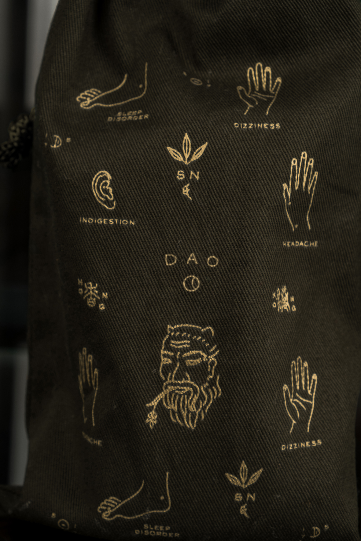
over the last 5,000 years, the teachings of shen nong, the father of eastern restorative herbal medicine, have been crafted into a precise methodical philosophy centred around the body’s balance and free-flowing energy systems.

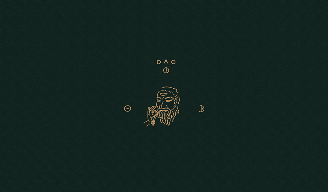
adopting these learnings into the modern day, scents of dao was formed.

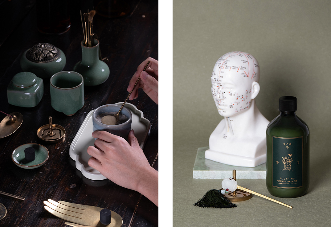
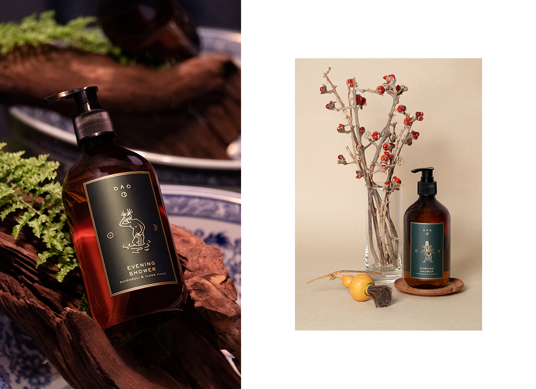
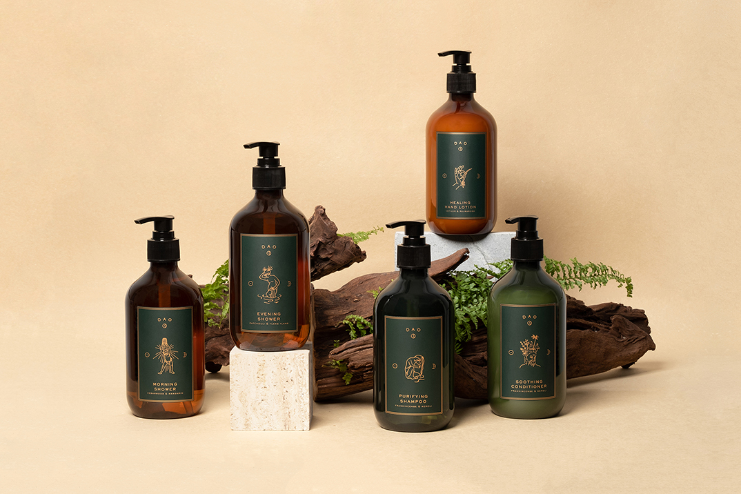
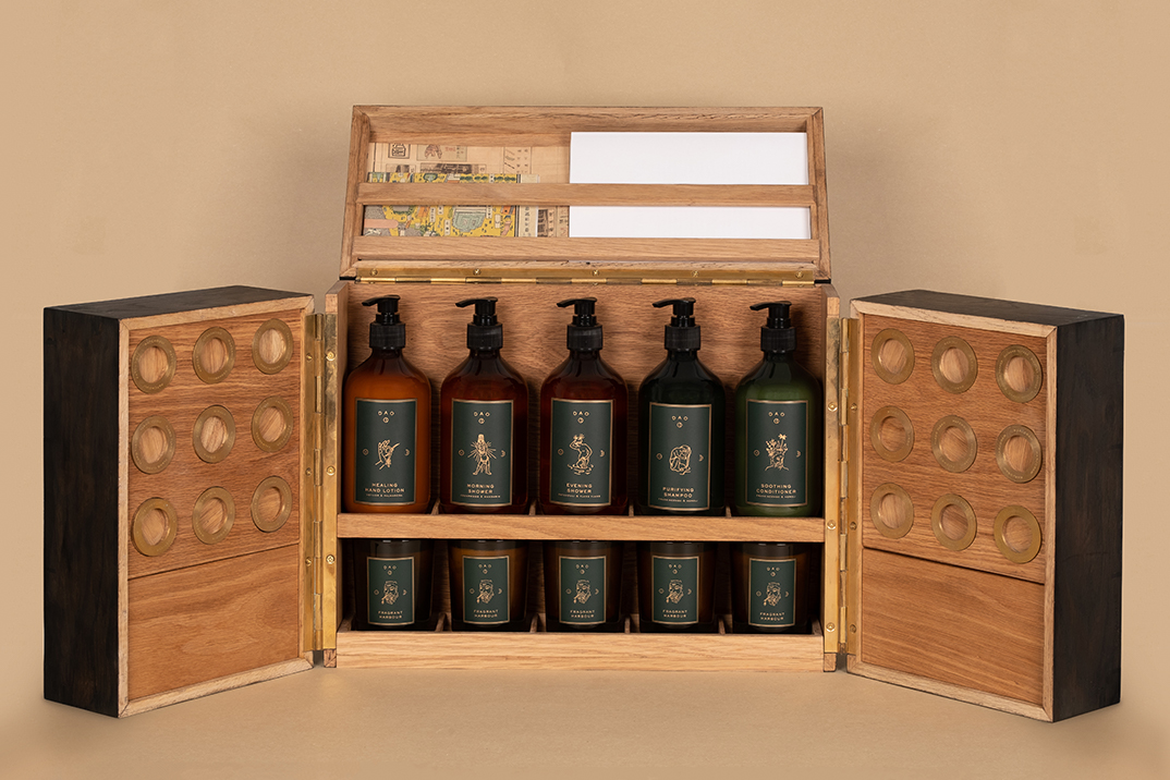
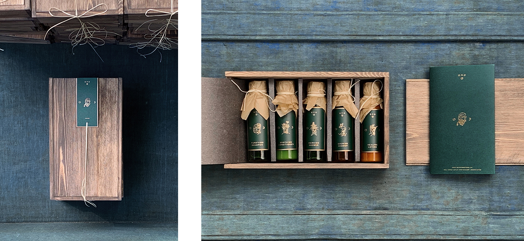
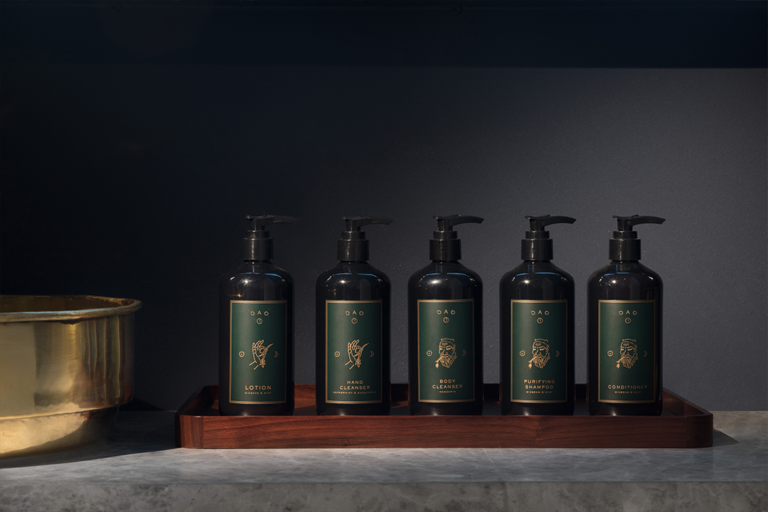
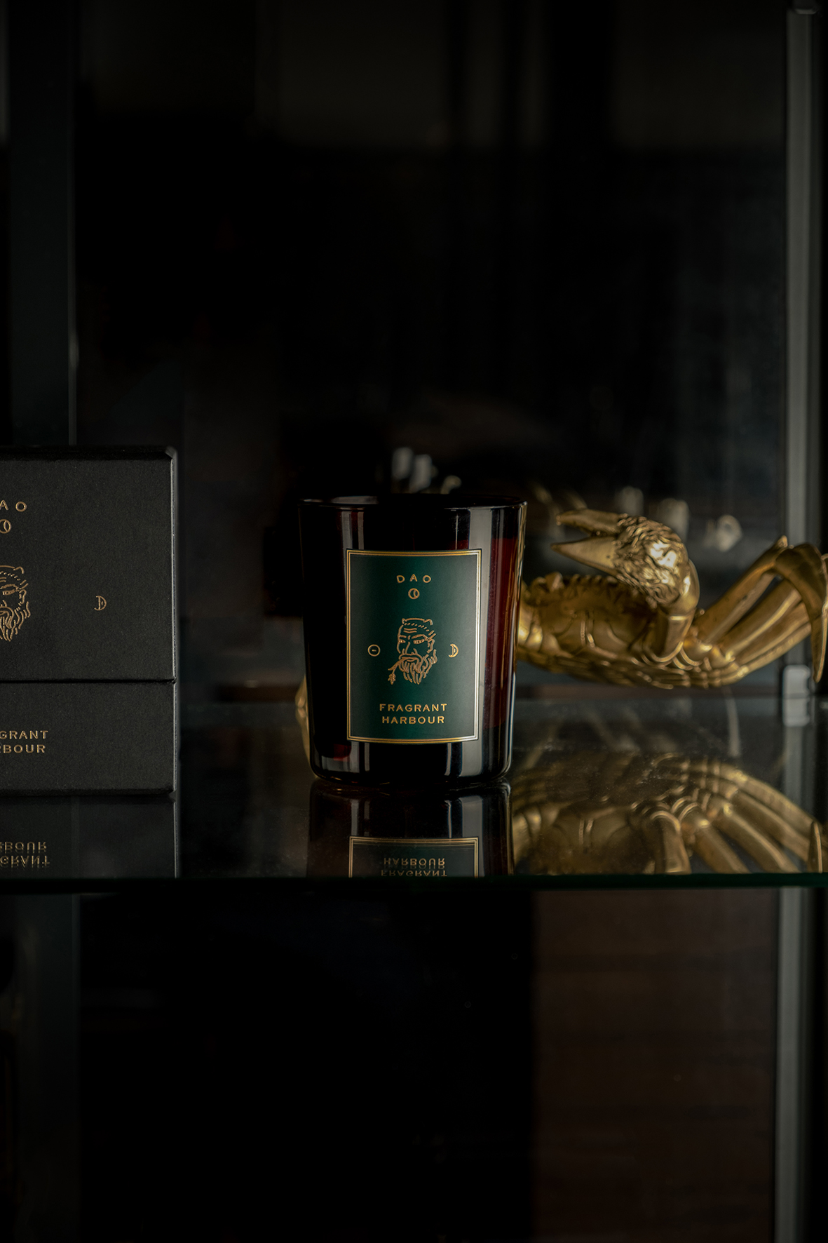
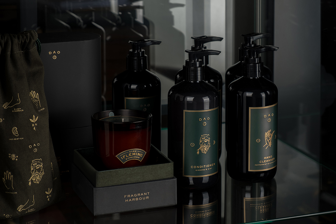
just as the moon circles the earth and the earth the sun, human bodies are energy systems that abide by the act of diurnal living. scents of dao unites two key elements, the sun and the moon, characterised through the merging of the two chinese symbols to become an anchor for day to night rituals that create natural harmony in our cyclical lives. this is the practice of balance and the discipline of opposing forces which create a harmonious tranquillity to our natural state.

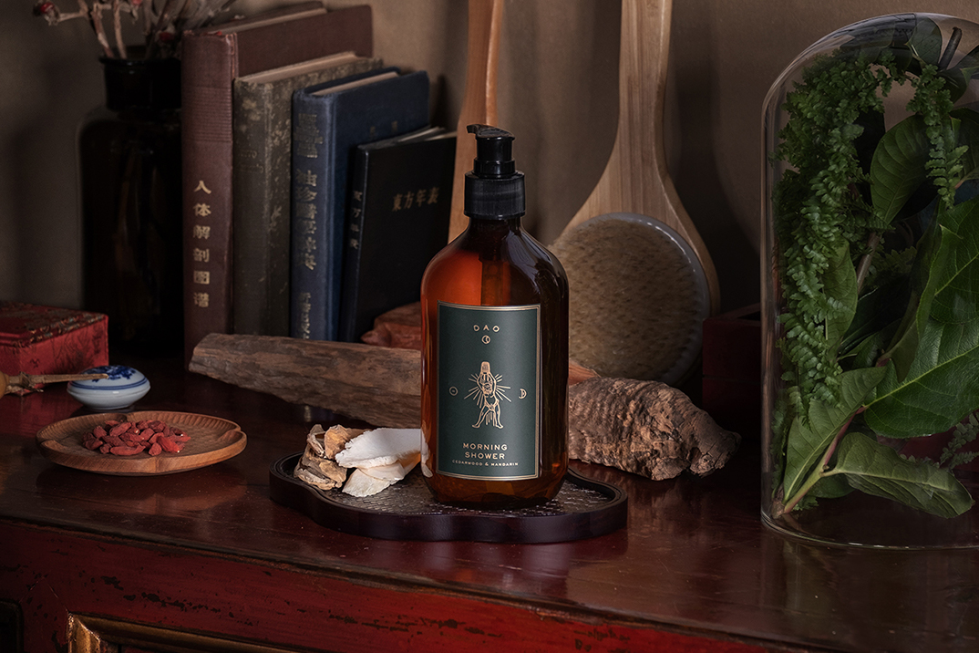
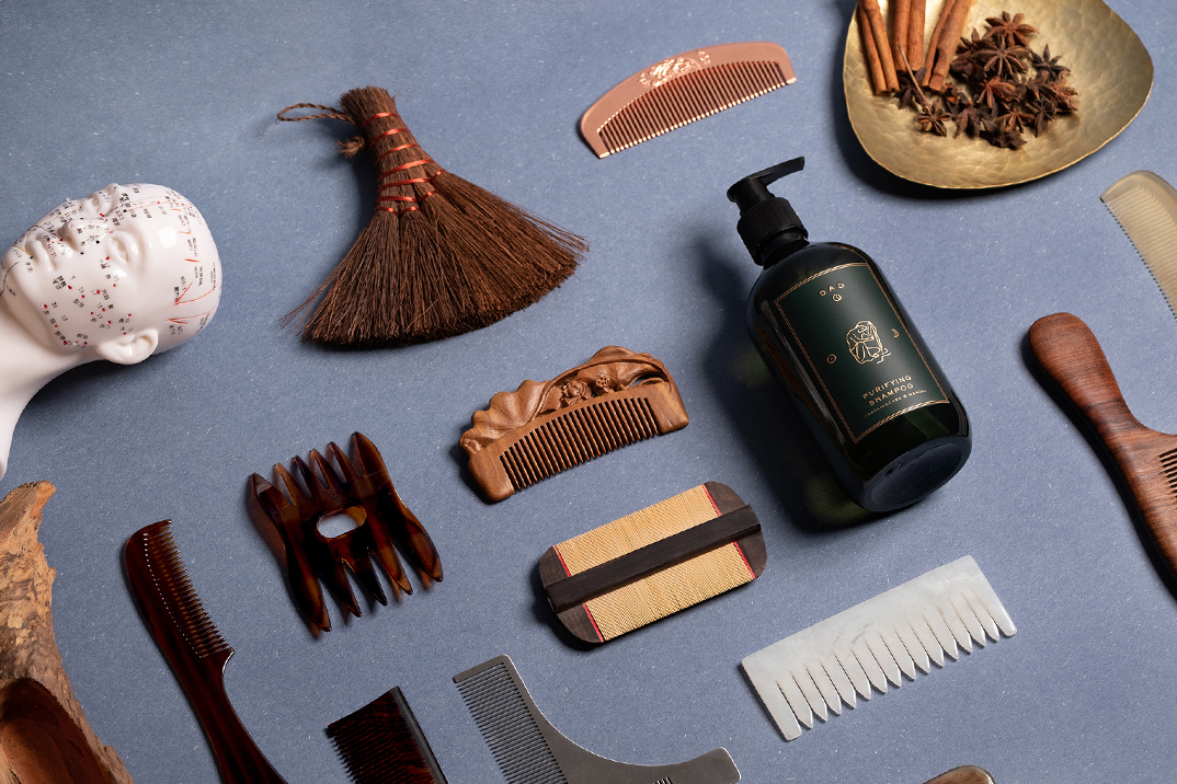
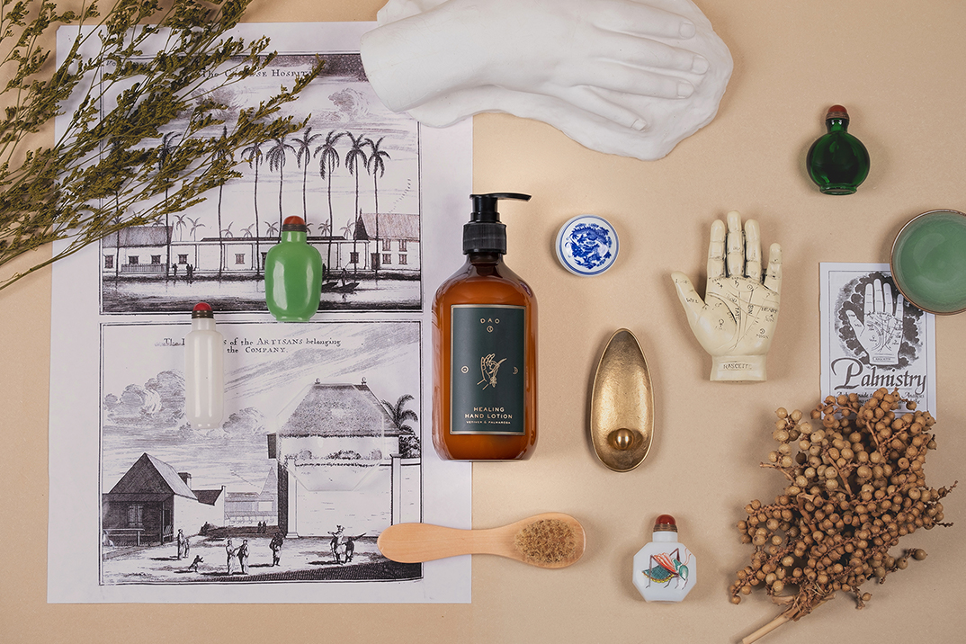
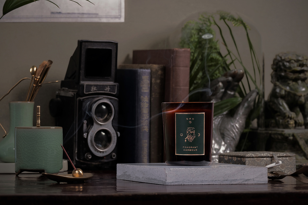
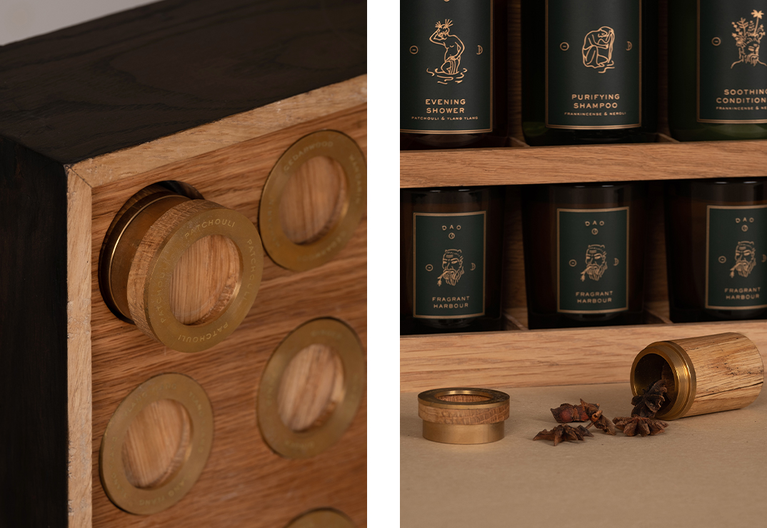
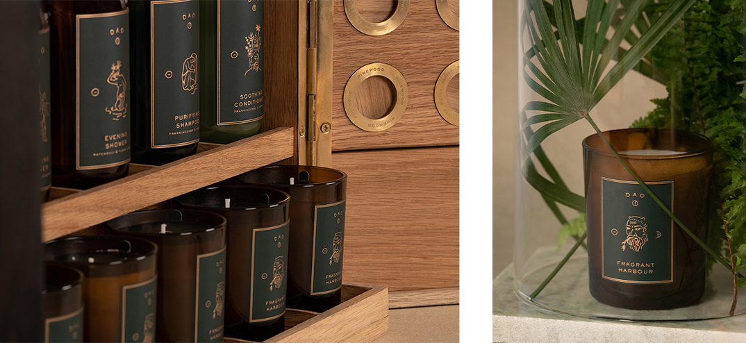
to practice scents of dao, is to pay tribute to the healing properties of nature.

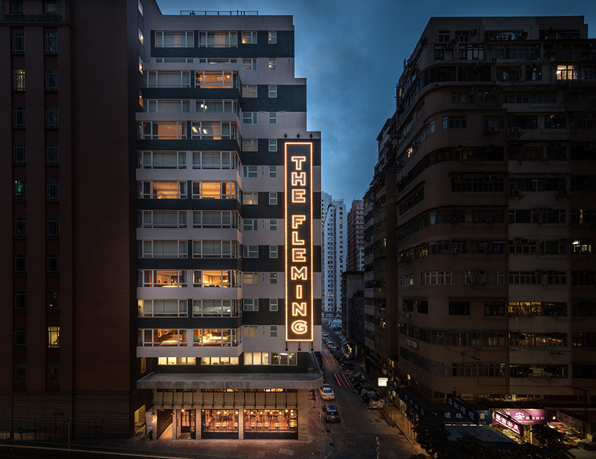
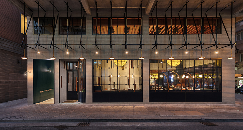
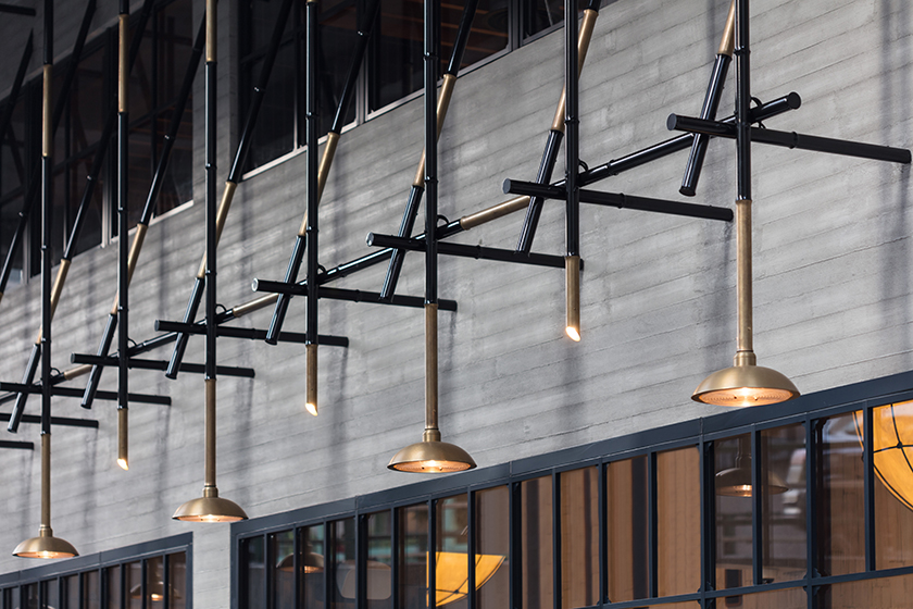
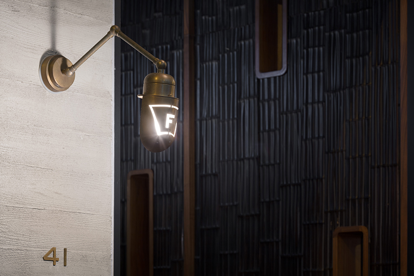
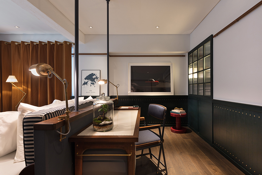
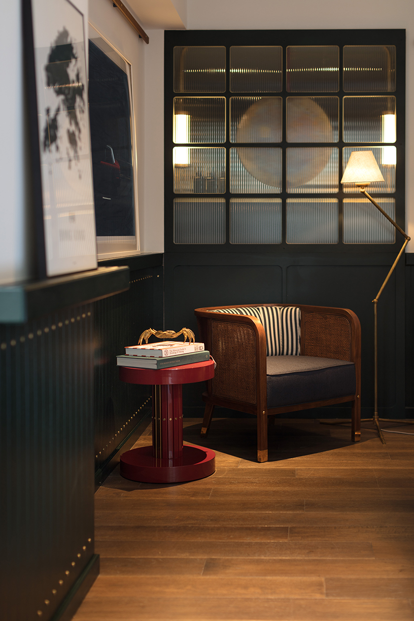
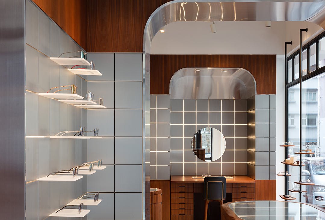
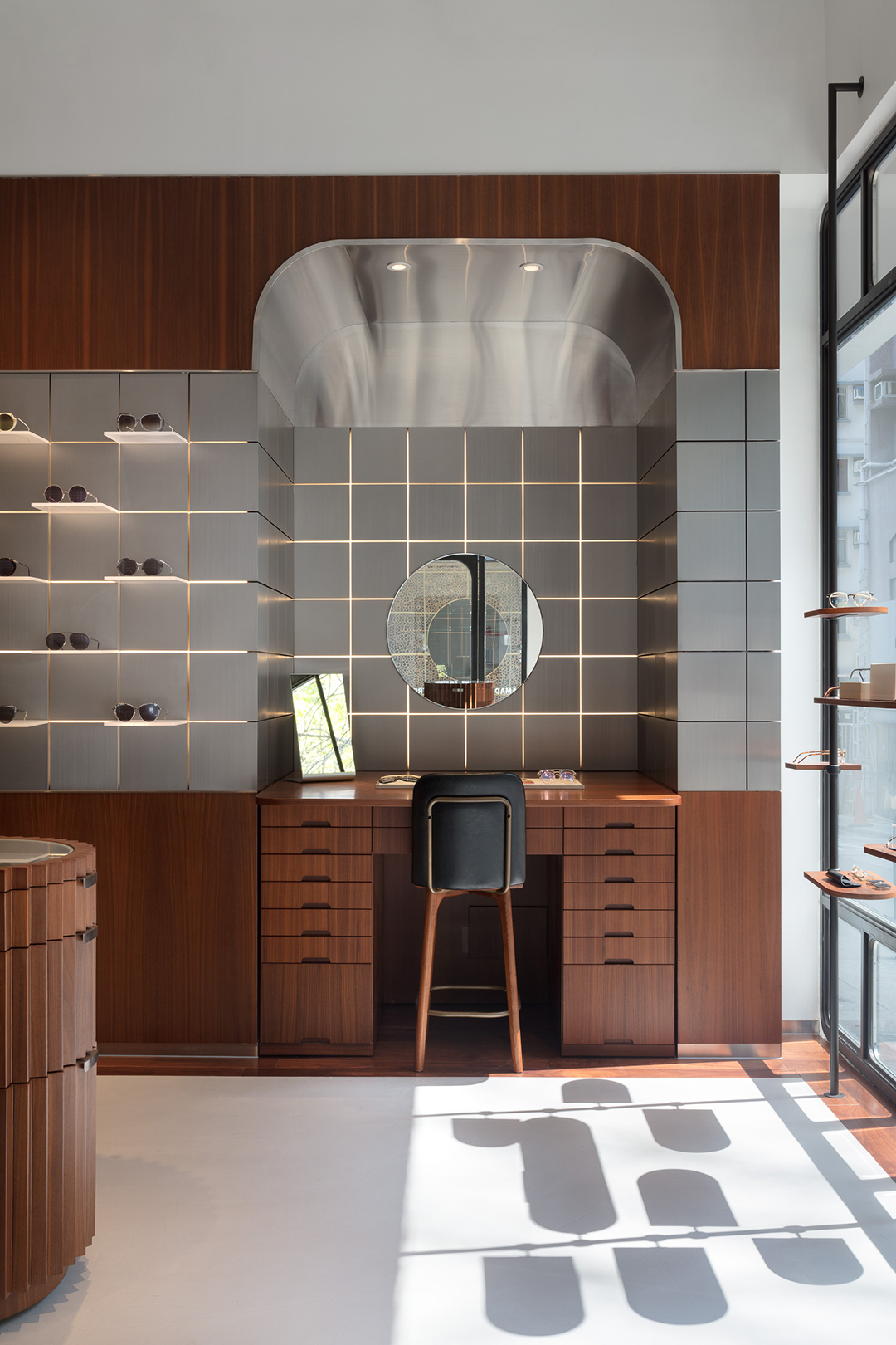
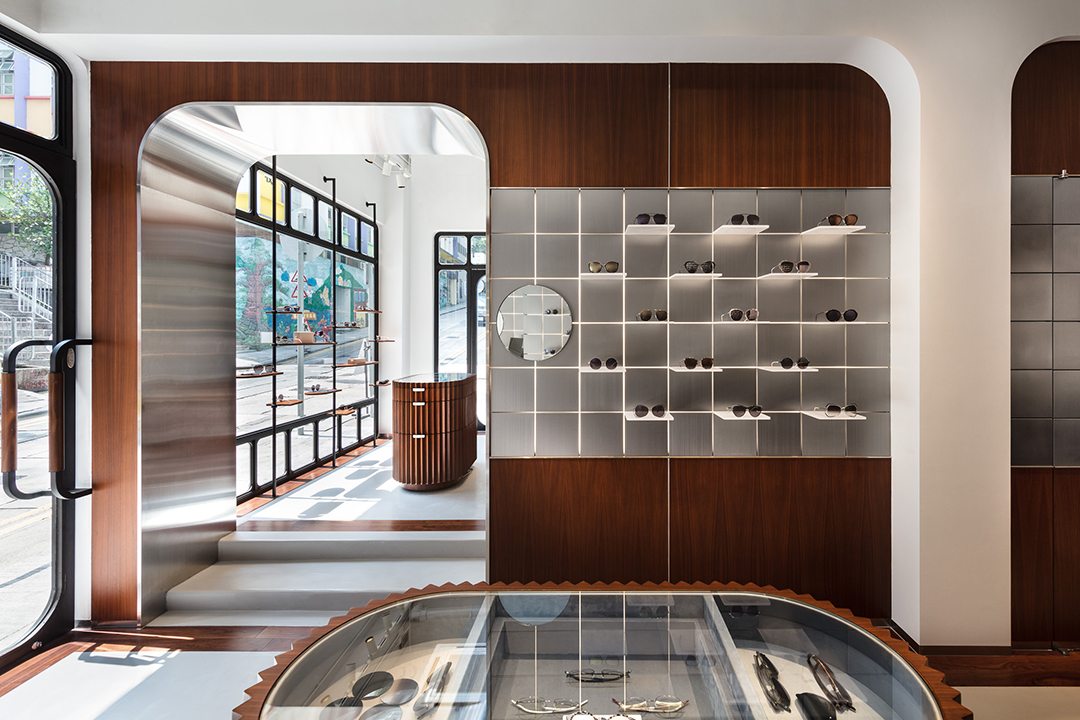
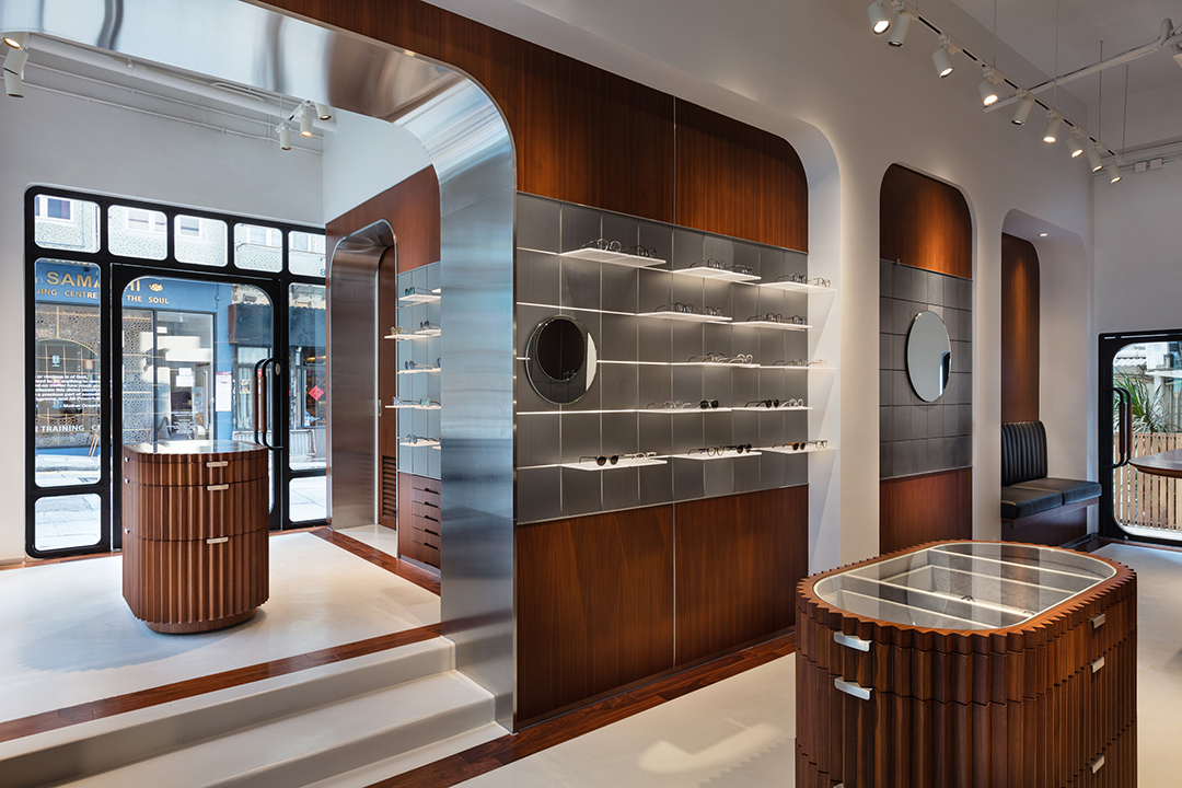
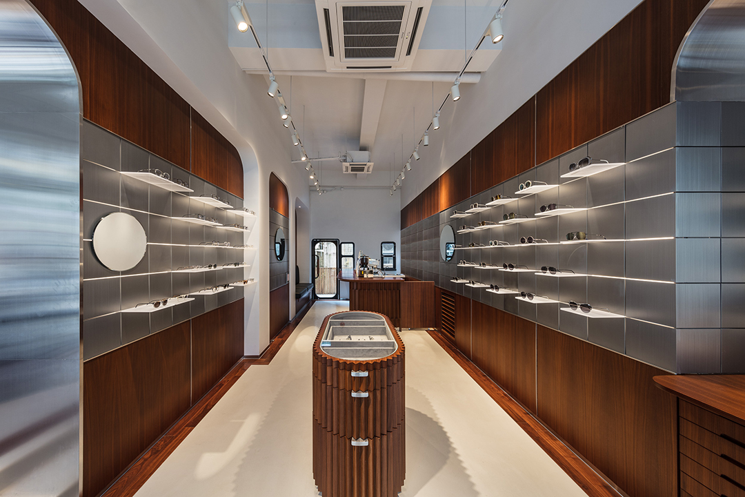
photographs by: vita mak & judy chen


fukuro

after a long day of work, wearied salarymen of tokyo trail back to the comforting glow of izakayas, where they take refuge and unwind with food, drinks and uninhibited conversations. echoing these nocturnal waterholes, fukuro embodies a mystical ambience, whilst exuding a warmth that sparks spirited interactions between visitors. as a messenger of the night and a protector from hardship in japanese symbolism, the owl icon manifests the outlet’s identity. the profusion of wood crafted by simple carpentry oozes an intimate and relaxed atmosphere for visitors to indulge in a spin on a quintessential japanese experience.

the fleming

we were tasked to redesign and rebrand the fleming hotel, originally opened in 2006. a new take on the architecture, interior, products, and identity transformed the fleming into a 66-room boutique hotel that is a true reflection of hong kong. occupying a building from the 70s’, the hotel stands in wan chai close to victoria harbour front. the multilayered design concept draws inspiration from the location and history, leveraging Hong Kong’s maritime heritage and 70s’ industrial era to create a cultural, social and efficient character. one landmark that embodies these three elements is the star ferry — having connected people across the harbour for over a century, it is a piece of hong kong’s collective memory and identity. the star ferry, a unique and elegant icon of Hong Kong’s past and present, became the foundation for every design detail, including the custom designed furniture and lighting. nostalgia is further evoked by colours and scents: Carmine reds and bottle greens — hues seen on the hull of Hong Kong’s ferries, fishing boats, delivery trucks, and temples —and apothecary-inspired toiletries and custom aroma of sandalwood and amber notes, to deliver an authentic sense of place.

photographs by: dennis lo & judy chen


khromis

like a prism dispersing monochromatic light into a spectrum of colours, khromis is a catalyst for transformation. each frame empowers the individual to reveal a whole palette of emotions and personalities. resembling a pair of glasses, the logo is also an expression of refracted light paths. the interior uses mirrors to create reflections and perspective, manoeuvring light to display the product in the best possible way. a touch of wood warms up the interior, along with the coffee bar in the corner, creating a comfortable atmosphere for a multi-sensory experience.

sulwhasoo cny campaign

behind the story of this cheeky well-travelled rat, is a collaboration that transcends cultural and creative borders. korea’s leading holistic beauty brand, sulwahsoo, and paris’s 18th century pattern maker, antoinette poisson, came together to develop sulwhasoo’s limited edition chinese new year packaging. we were challenged to create a global campaign out of antoinette poisson’s pattern of peonies, heart-links, and this year’s zodiac protagonist— the rat. staying true to the two dimensional nature of antoinette poisson’s work, we brought the packaging alive by revealing a whole world within the pattern and taking viewers on an enchanting journey past city landmarks and sulwhasoo’s signature product.


trudon

founded in 1643, maison trudon is the oldest candle manufacturer. maison trudon extends its savoir faire and unveils a line of personal fragrance. substance accompanied the brand with its communication strategy, global branding, packaging, print and digital design. our challenge was to subtly express the rich brand heritage whilst reinterpreting a modern approach.

view the site

Brand Identity


Digital


financial times

“shape your knowledge” was a yearlong integrated campaign directed at educating key media buyers and media planners throughout asia pacific.

the objective was to drive awareness and educate media buyers on identifying the financial time’s readership and profiles. a seamless campaign was created by sending a bonsai tree to key media buyers with an online media kit showcasing newsfeed, widgets on readership profiles and case studies on the financial times. to recapture their attention, a care package was sent 6 months later to convey the bonsai’s relation to the brand’s trust, integrity and wisdom.

ft_award

Direct Mailing

ft_advertising_00 ft_advertising_01 ft_advertising_02 ft_advertising_03 ft_advertising_04

Advertising

ft_advertising_05

Digital

ft_advertising_06 ft_advertising_07

a boy named sue

a boy named sue – a multi-brand ecommerce store, offering a collection of socially and eco conscious for one’s sartorial desires. a boy named sue was inspired by a classic johnny cash song who’s father named him sue and faced ridicule his whole life. sue learns his name is to make him tough and strong-willed reflecting the brand’s promise of strong quality aesthetics and personality.

the identity was designed on a system by which it could be effortlessly redefined to create a series of new shapes. much like there is no one singular solution to eco-fashion, the form needed to be dynamic and transitional. the packaging and stationary also follow the system of the visual identity, with bold folds and bright patterns lining the seams, the visuals embrace a refined eclecticism. the website was the final piece of the puzzle, an interactive space that came together as a curated, easy to navigate and intuitive experience.

Identity

aboynamedsue_identity_00 aboynamedsue_identity_01 aboynamedsue_identity_03 aboynamedsue_packaging_004 aboynamedsue_packaging_05

Digital

aboynamedsue_digital_05 aboynamedsue_digital_06 aboynamedsue_digital_07

la vache!

paying homage to the classic parisian steak & frites la vache! brings forth the parisian bistro culinary staple to hong kong’s restaurant scene.

we were inspired by the french cartoonist jean-jacques sempé’s humorous style and created a playground for him to express his witty la vache! moments: tables, walls, coasters, wine labels, toilet paper…

view the site

Identity

lavache-identity-substance-01 lavache-identity-substance-02 lavache-identity-substance-03 lavache-identity-substance-04 lavache-identity-substance-05 lavache-identity-substance-06 lavache-identity-substance-07 lavache-identity-substance-08 lavache-identity-substance-09

Digital

lavache-identity-substance-10

madam sixty ate

we created the exploits of a mythical person that reflected the chef’s vision and the surprise pairing of ingredients. madam sixty ate is a mysterious adventurer and eclectic writer who delights us with her palate and imagination. her world view is modern with a twist, mirroring the style of food. her surreal experiences and astounding stories are reflected consistently throughout the brand using paintings, journal entries within menus, coasters and ultimately through the cuisine. the journey from discovering a new restaurant to after dinner farewell is a reflection of the journey madam has when she discovers the variable species which capture our imaginations.

view the site

msa_awards

Branding

000

001

002

003

004

005

_57X6723

006

_MG_5281_t

IMG_5276_t

P1010358

Digital

msa_digital_01

msa_digital_02

Interior

_MG_5342_t

IMG_3962

msa_deco_03

msa_deco_04